Parklife Press is grateful to have earned a lot of repeat business for business cards — new hires, change of information, and promotions all require updates and re-orders. But seeing and working on cards for new clients is always fun, and here are a few new ones to show you.
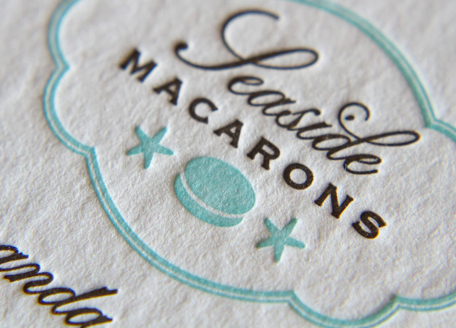
Using the "dessert first" philosophy, we open with this confection of a card for Seaside Macarons of La Jolla, California. The logo and design were custom-made by Parklife Press. The card features three custom inks printed on 450g Wild stock (a brown, a cheerful robin's egg blue, and a lighter tint of that blue, used as the pattern on the lower half of the card).
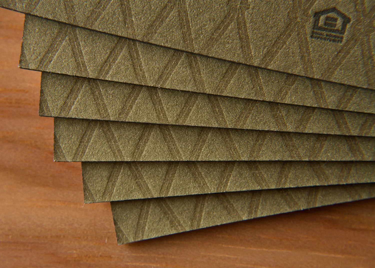
Next we have Broker/Realtor Van Fletcher, of Raleigh. Each side is printed with two custom inks. The sides are then glued back to back (a process called "duplexing"), trimmed to size, then edge-painted. The front features a two-color logo with key illustration and the back has two letterpress inks printed on top of a flat offset-printed flood. This gives the back a textured, almost quilted appearance. They are truly luxurious cards.
And last but not least, we have these art deco inspired cards for Leyla Gans of Morrisville. The cards are eye-catching for many reasons, perhaps most notably the die-cut rounded edges — the angular graphic starburst design is balanced by the card's contours. They're printed in Midnight and Gold inks on 500g Radient White Somerset stock.


