Posts tagged monogram
Cascading Gold Foil Invitations
2019-09-28-Parklife-Press-7.jpg

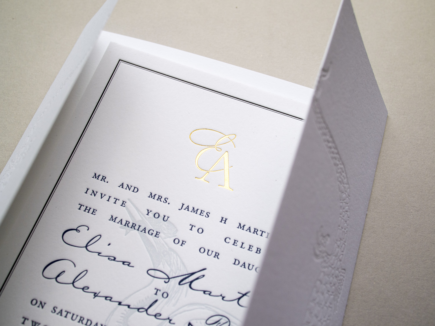
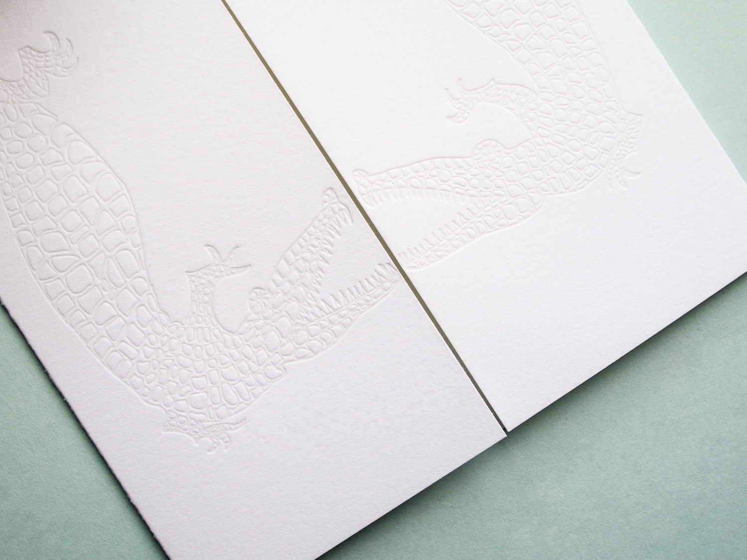
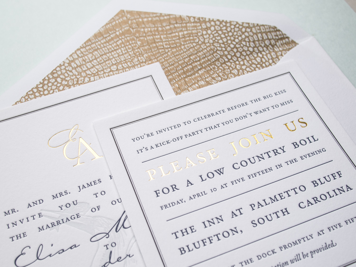
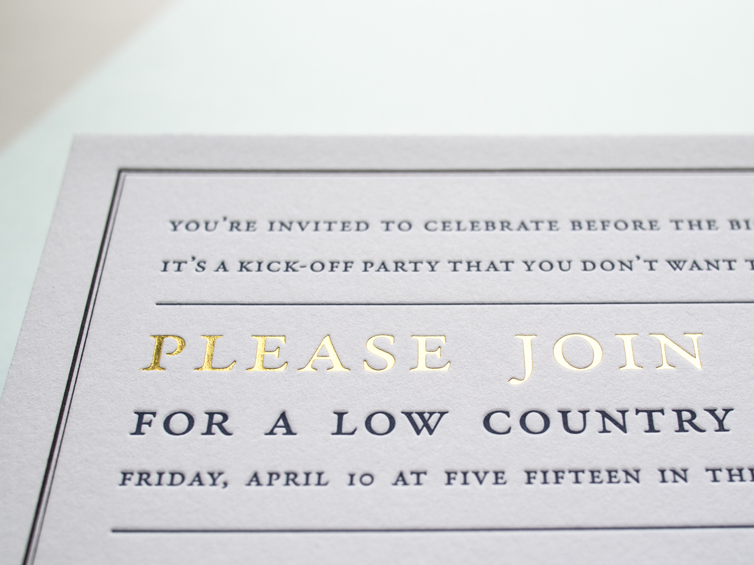
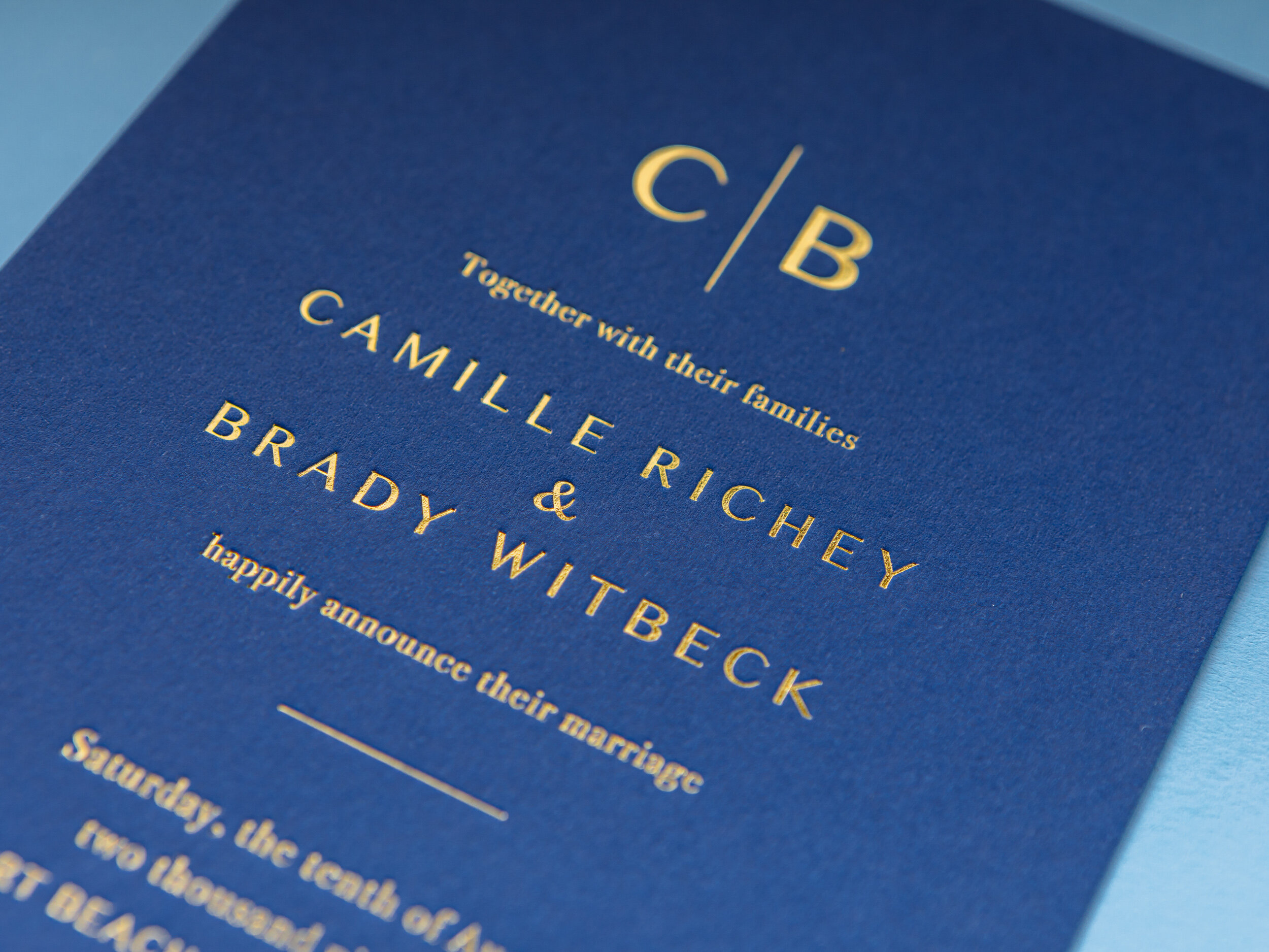
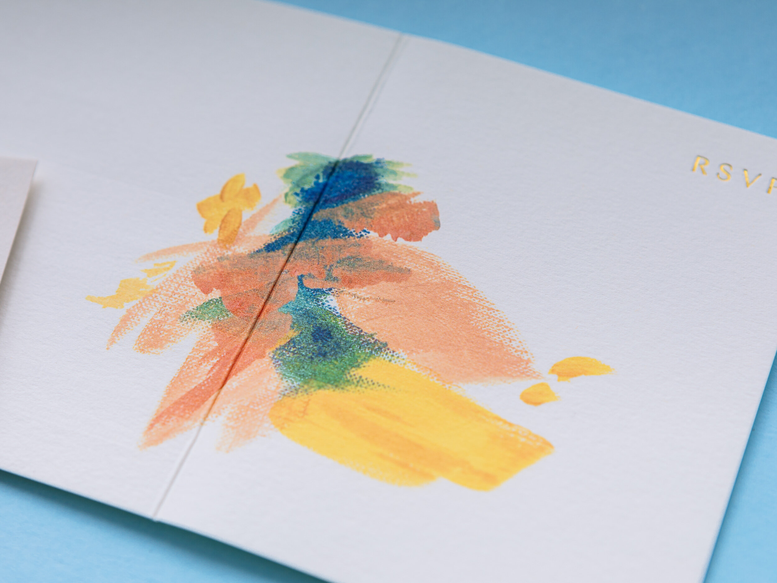
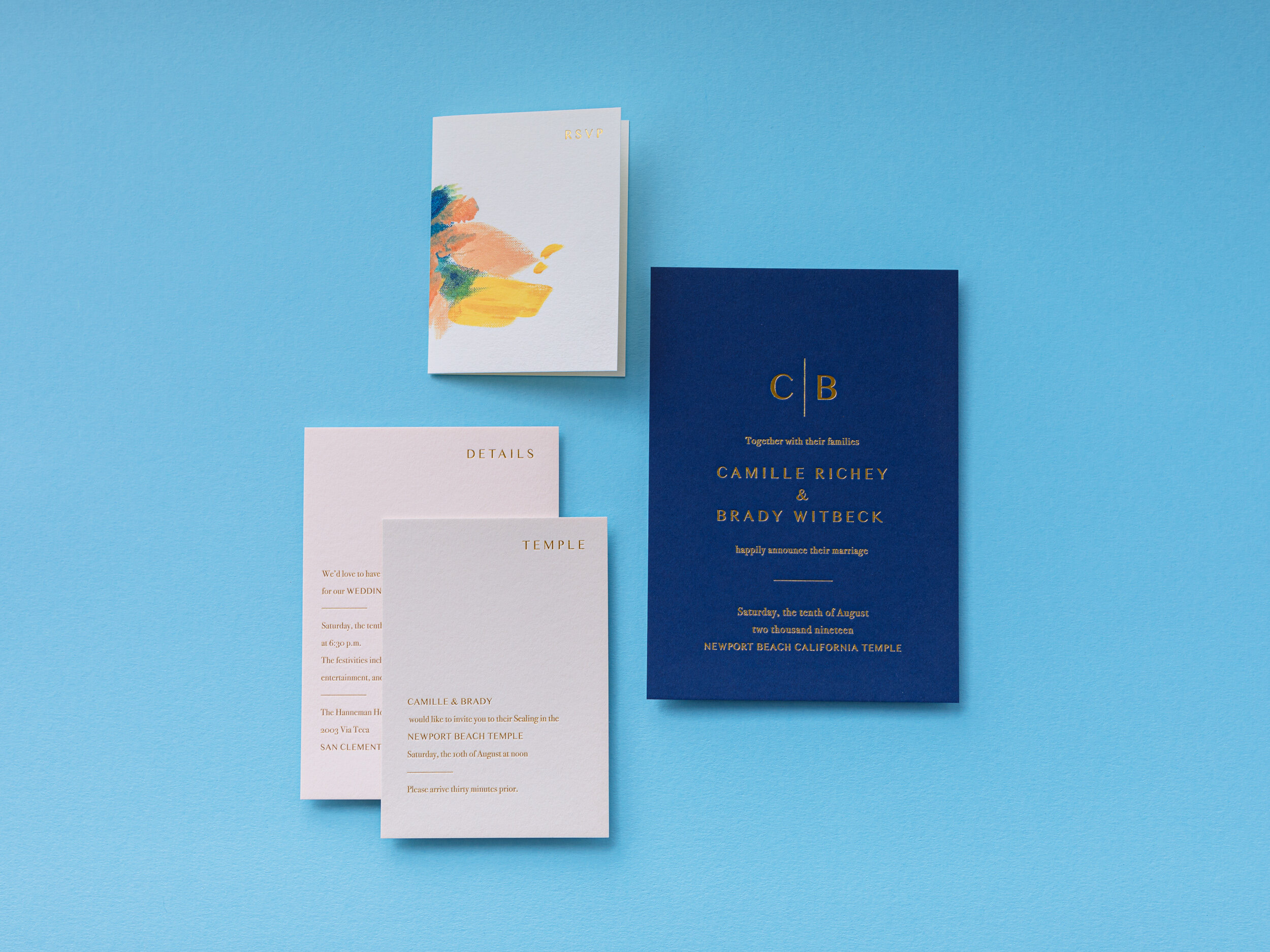
Check out this stunning yet restrained client-designed set we printed with Gold Shine foil on various shades of Colorplan paper. The painting on the reply card was digitally printed β€” it’s an original piece of artwork by the mother of the bride.

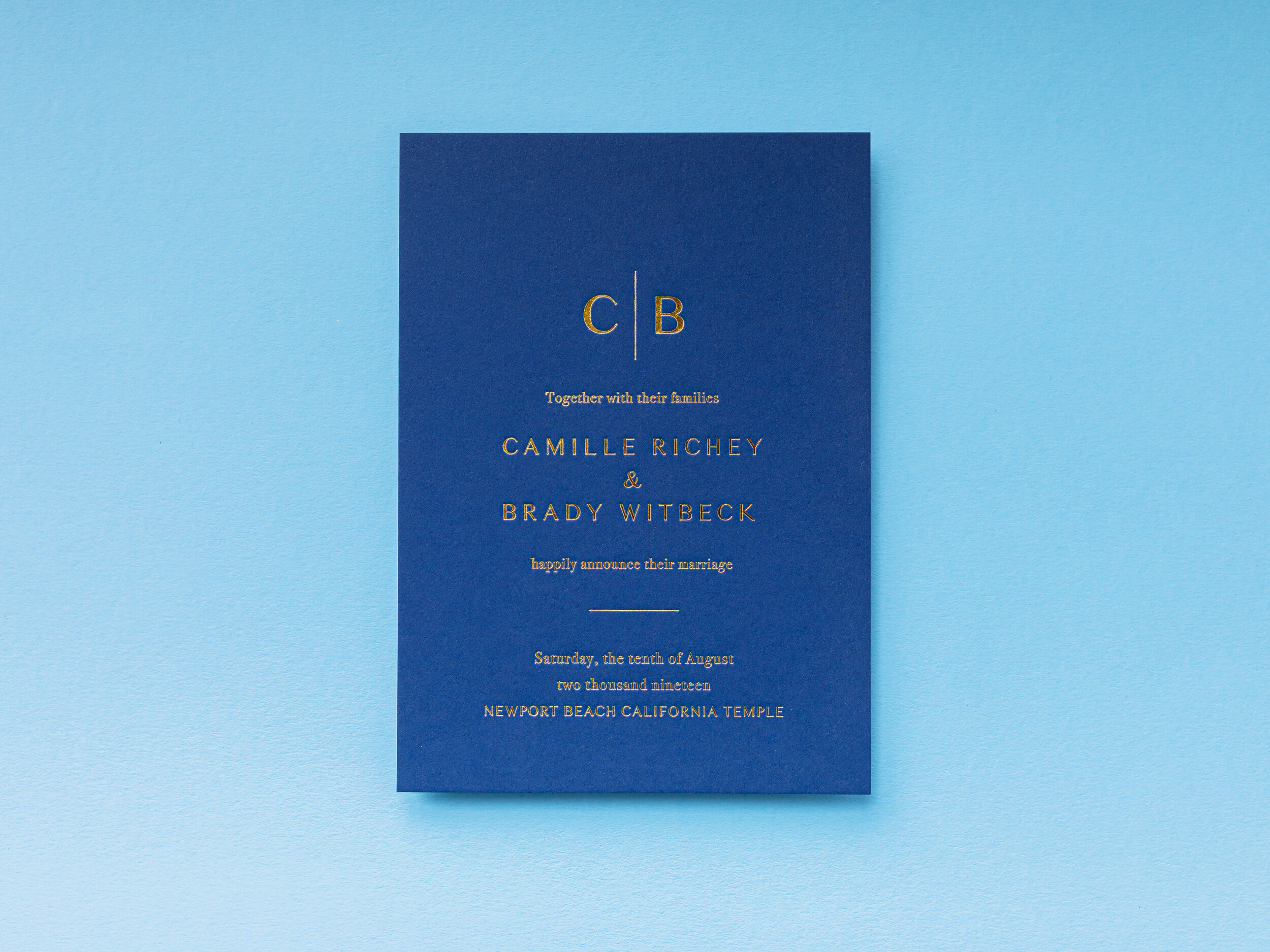
INVITATION Gold Shine foil on 540g Colorplan Cobalt
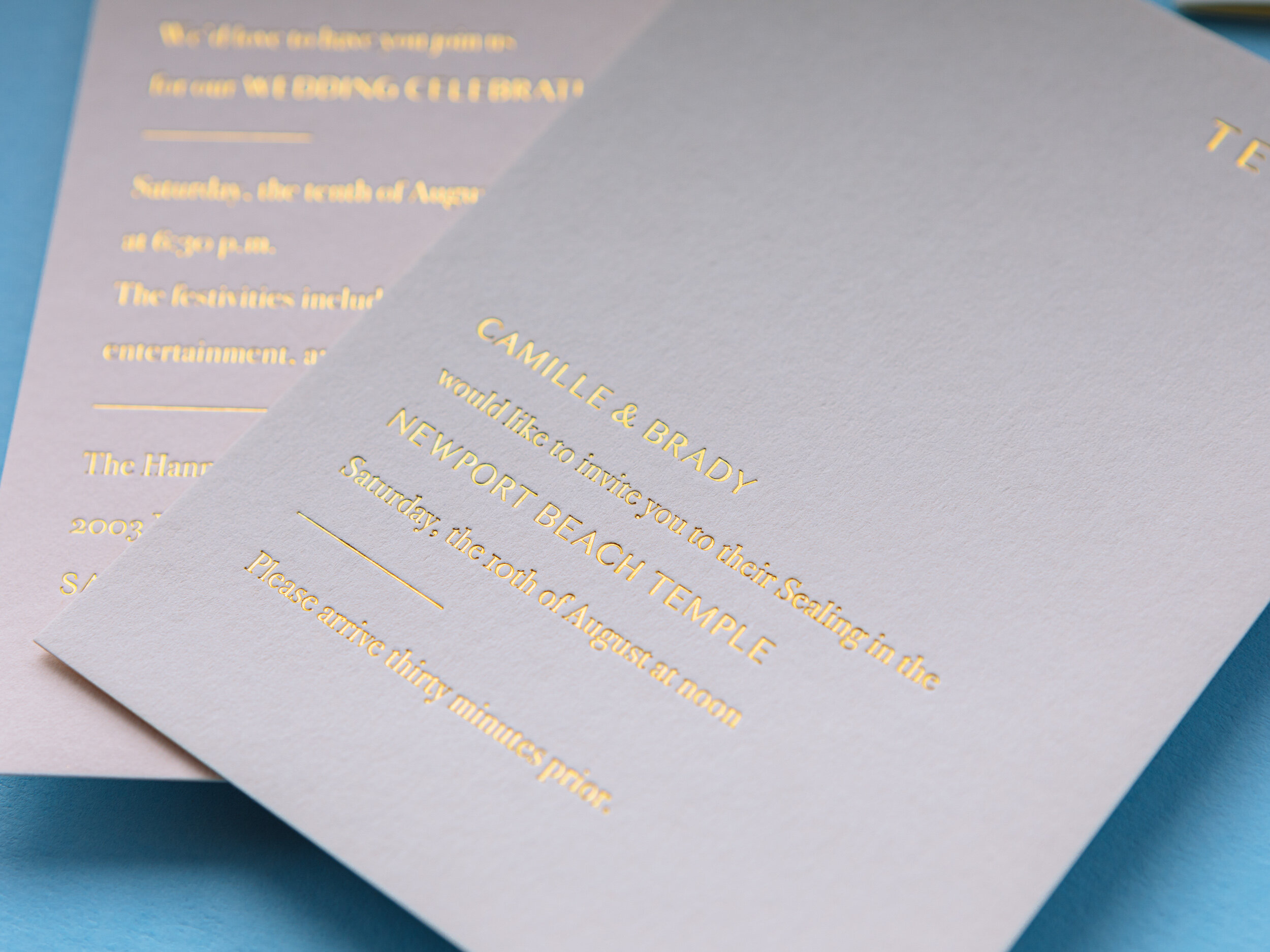
DETAILS CARD Gold Shine foil on 350g Colorplan Vellum
TEMPLE CARD Gold Shine foil on 350g Colorplan Mist
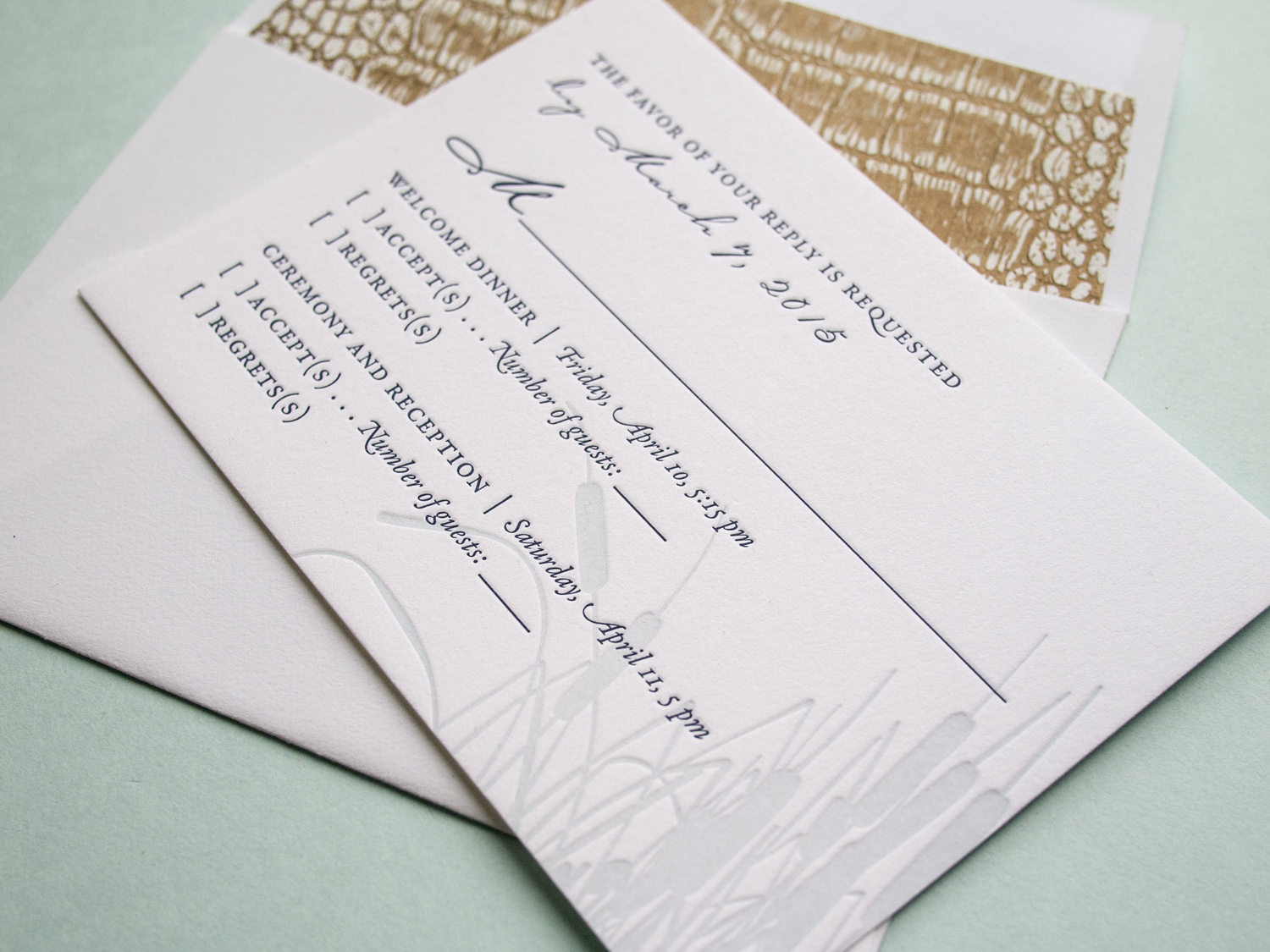
RSVP CARD Gold Shine foil and digital printing on 270g Colorplan Natural

Photos by Gritchelle
Tigers & Lemons

These oversized square invitations feature our Tungsten letterpress ink along with a digitally printed "tigers & lemons" wedding seal provided by the couple.

As they put it, β€œTiger” is the bride’s term of endearment for the groom as he is the fourth Shoemaker to hold β€œTigert” as his middle name. β€œLemons” is the groom’s term of endearment for the bride as she is β€œthe lemon to his lime.”

The invitation is printed on our thick 600g Pearl White paper with bright gold edge paint, and it's paired with a metallic gold liner. The typeface combo is great: All caps Bodoni with sans serif Neutra Book.

We also printed mini directions booklets using the same ink combo, but on our lighter-weight 300g stock.

Golden Botanicals Wrapped & Sealed

If you thought the letterpress save the dates we printed for Randi & Ben this spring were cool, I think you're gonna like the follow-up.

This was truly a collaborative project. Randi designed the two-sided invitation and sleeve, and sent the specs off to us.

We printed the front of the invitation on 300g Pearl White paper with midnight ink and gold foil, and the back with gold foil on a separate sheet. Then we duplexed the two sheets by hand, let them dry, and trimmed off the edges. This allowed us to get a two-sided piece with heavy artwork and no impression show-through.

Randi designed the sleeve to double as a direction card. We printed those with midnight ink on a 4" x 15" sheet, then scored, folded, and glued them.

Randi finished off the set on her end with gold string and a custom wax seal. Photos of the completed invitation are below.

Foiled & Monogrammed

We love type-only designs. This one's got a simple monogram in Italic Garamond along with text in Neutra Light and Sloop Script.

We used a custom paper -- two sheets of Dark Gray 350g Colorplan duplexed to create a nice, thick 700g stock. The card was printed with silver foil, finished with silver edge paint, and paired with a pearl white cotton envelope.

Foil, Door Tags, and Alligators

It's great when we get to work with a wedding client from the very beginning – starting with the save the dates, moving on to the invitations, and then following through to the wedding day pieces. We did this for Elisa and Alexander, shifting the design vision slightly throughout the process while still maintaining a cohesive aesthetic.

For the save the date, we printed tinted white and Espresso inks on an oversized 600g Pearl White card, tucking the text in the corner and emphasizing the dandelion motif.

Photo by Sarah Arneson

Moving to the invitation set, we got a bit more elaborate and less minimalistic. The alligator-print-lined envelopes housed a gatefold card, guarded by a pair of blind-pressed gators. Inside was a 3-ink + gold foil invitation on thick Fluorescent White paper, a 2-ink + foil pre-party card, and a 2-ink reply card with a lined reply envelope.

We unfortunately don't have photos of the (awesome) programs, menus, and place cards, but we did snag a shot of these custom die-cut hanging door tags that the bride and groom gave to their guests staying at the venue.

Custom Monogram in Santa Fe

Ah, the blind-pressed monogram. Hard to go wrong when you use a lightly tinted white ink with a deep impression on thick cotton paper.

We carried the variations of the monogram through to each piece β€” an accommodations card with a tear-off reply card, a menu, table numbers with a blind chevron pattern and inkjet numbers, and programs with silver ink on navy cotton paper.

Most letterpress inks are transparent, so we can't print light ink on dark paper. But silver is an exception β€” it's about 75% opaque. Not quite as opaque as foil, but not as pricey either.

Photos by Sarah Arneson