After the overwhelming success of Elisa's invitation set last spring, she's back with party invitations for her parents' anniversary.
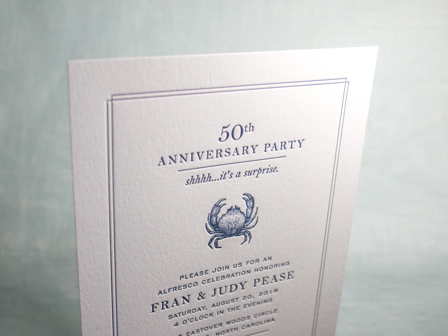
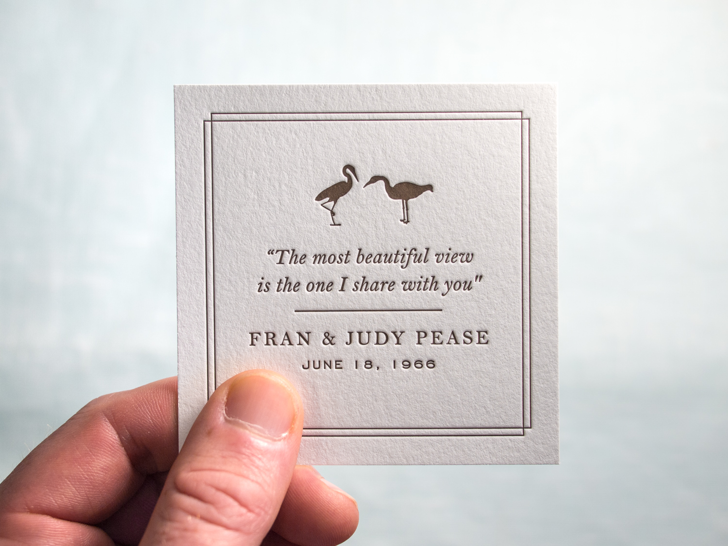
After the overwhelming success of Elisa's invitation set last spring, she's back with party invitations for her parents' anniversary.
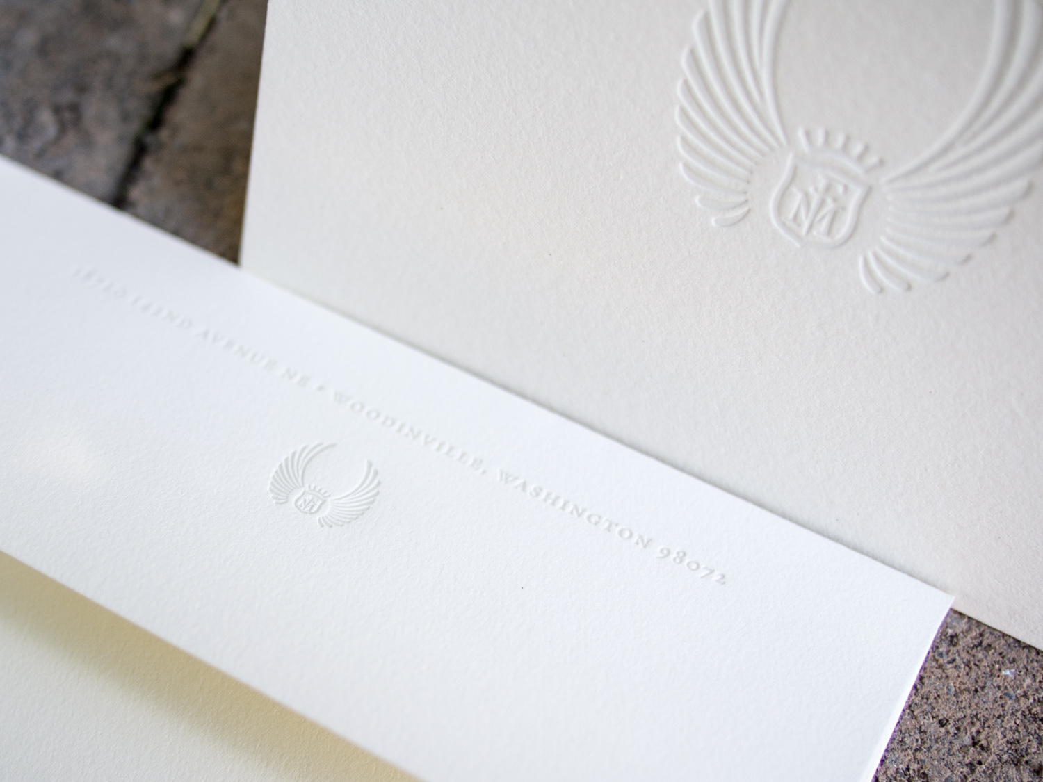
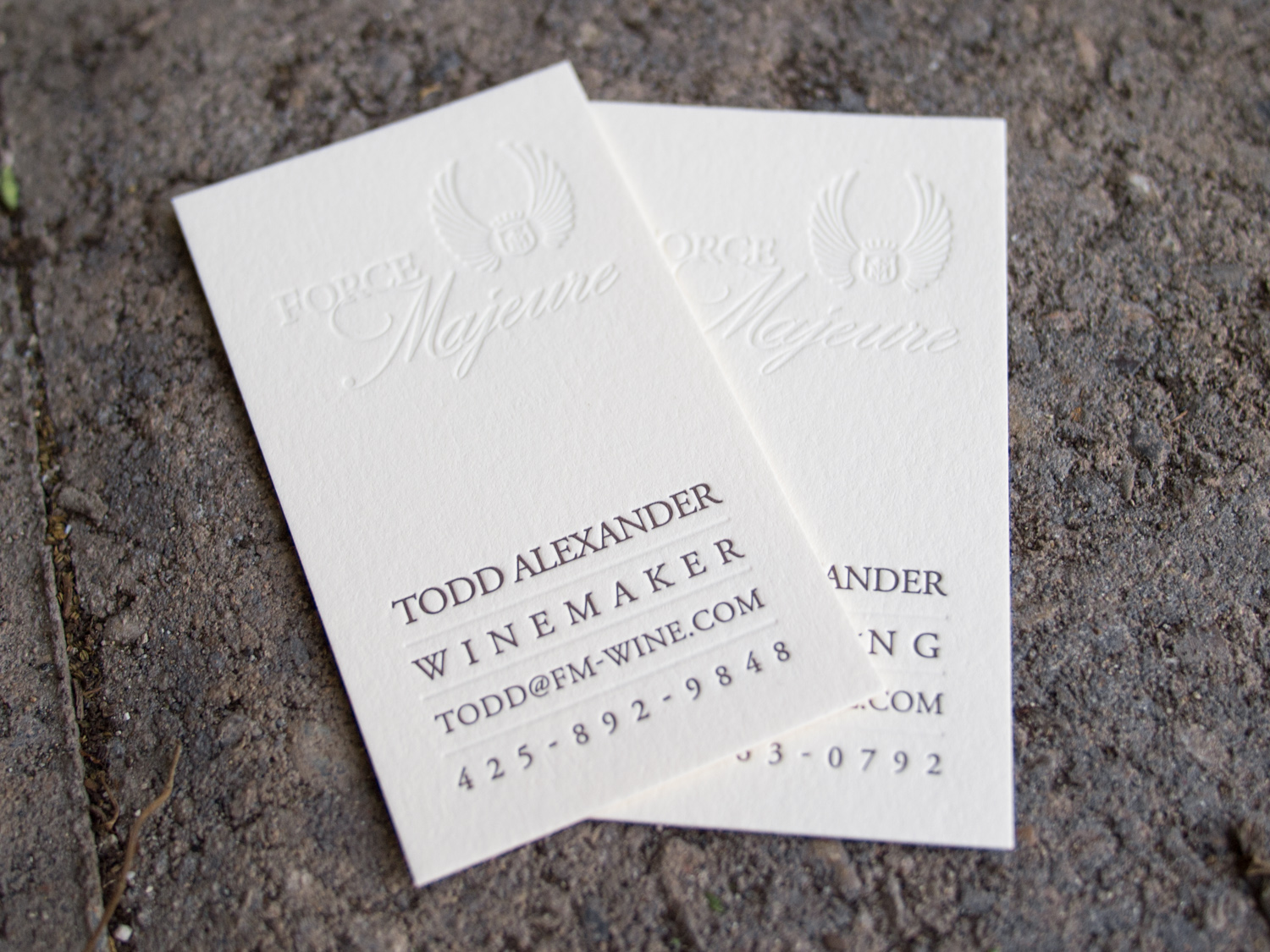
Washington's Force Majeure Vineyard makes lovely Bordeaux and Rhone-inspired wines. We've been lucky enough to sample from their limited production and we think their wines pair beautifully with our custom letterpress stationery.
We printed business cards, folded notes, and envelopes for Carrie and Todd using espresso and silver-tinted opaque white ink on Ecru Lettra paper.
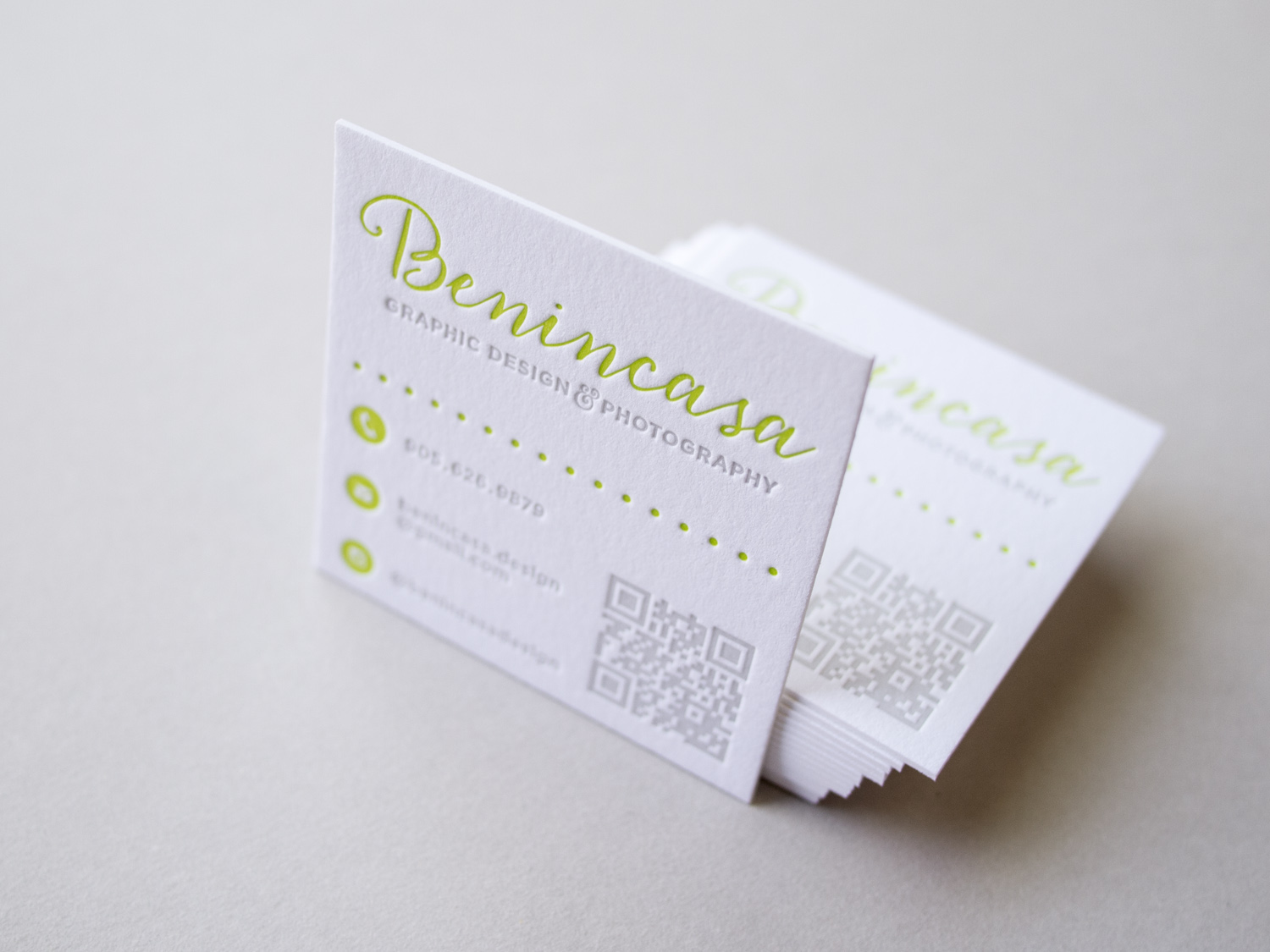
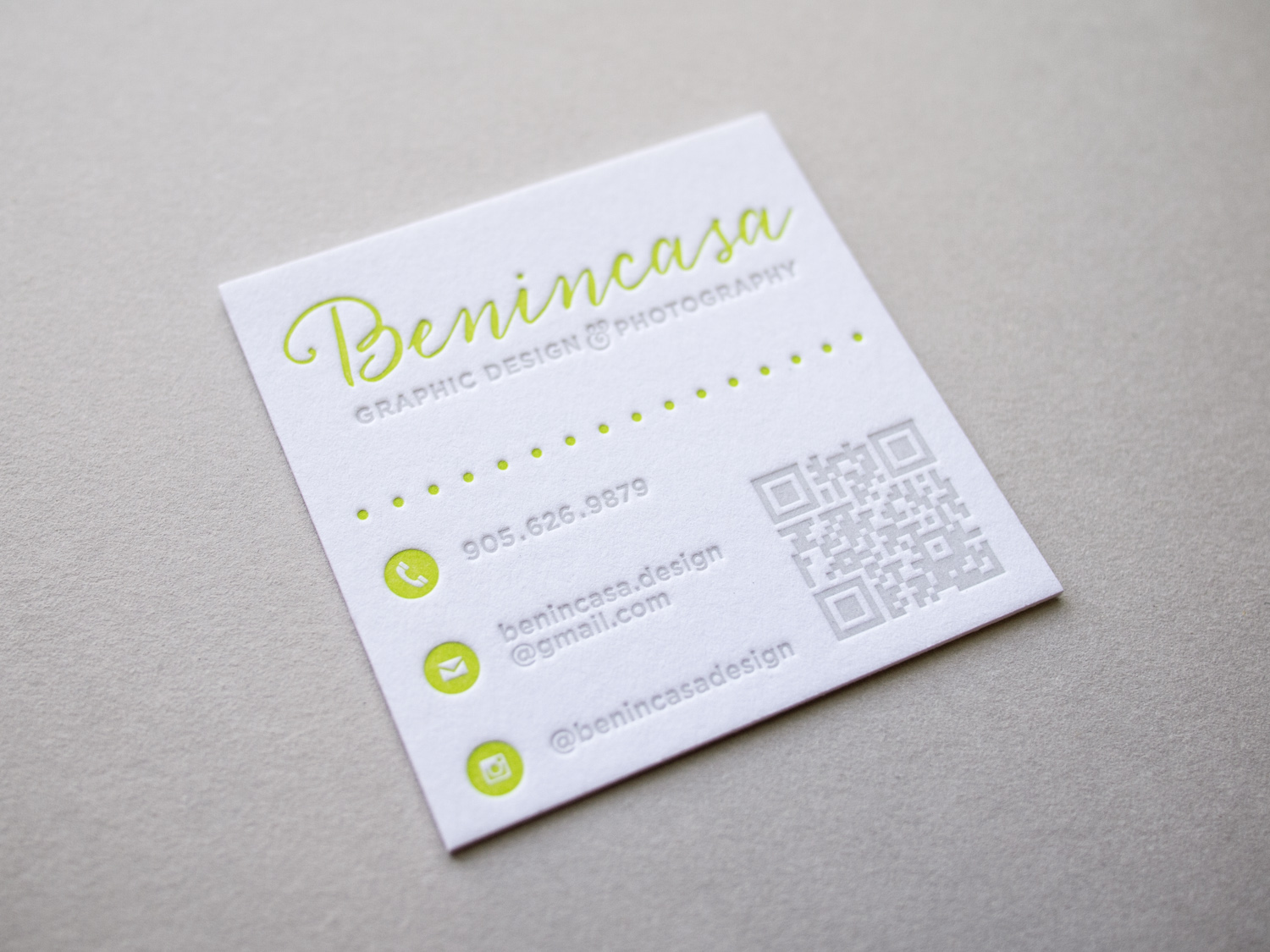
Canadian designer and photographer Amanda Benincasa (benincasadesign.com) designed these cards, complete with a letterpress QR code. We printed them with custom green and gray inks on thick 600g Fluorescent White Lettra.
Like pretty much everyone (Parklife included), Gritchelle recently relocated to Portland. We printed these cards for our new neighbor on 300g Fluorescent White Lettra.
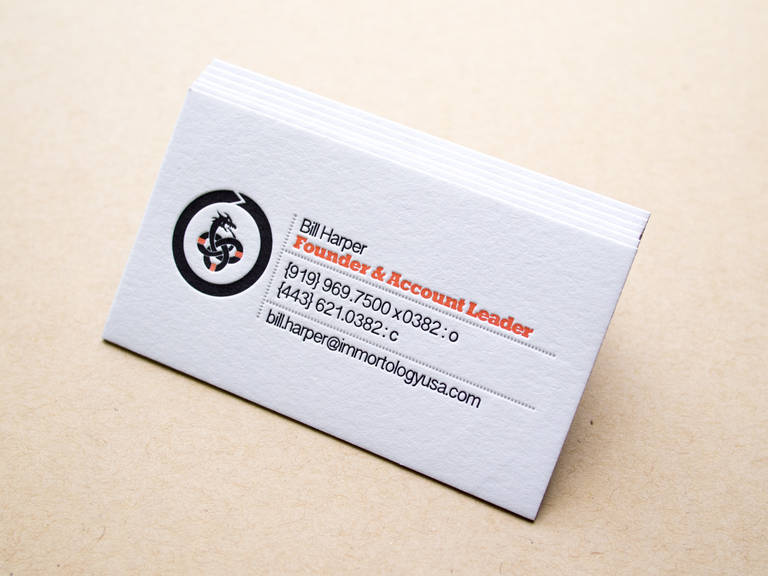
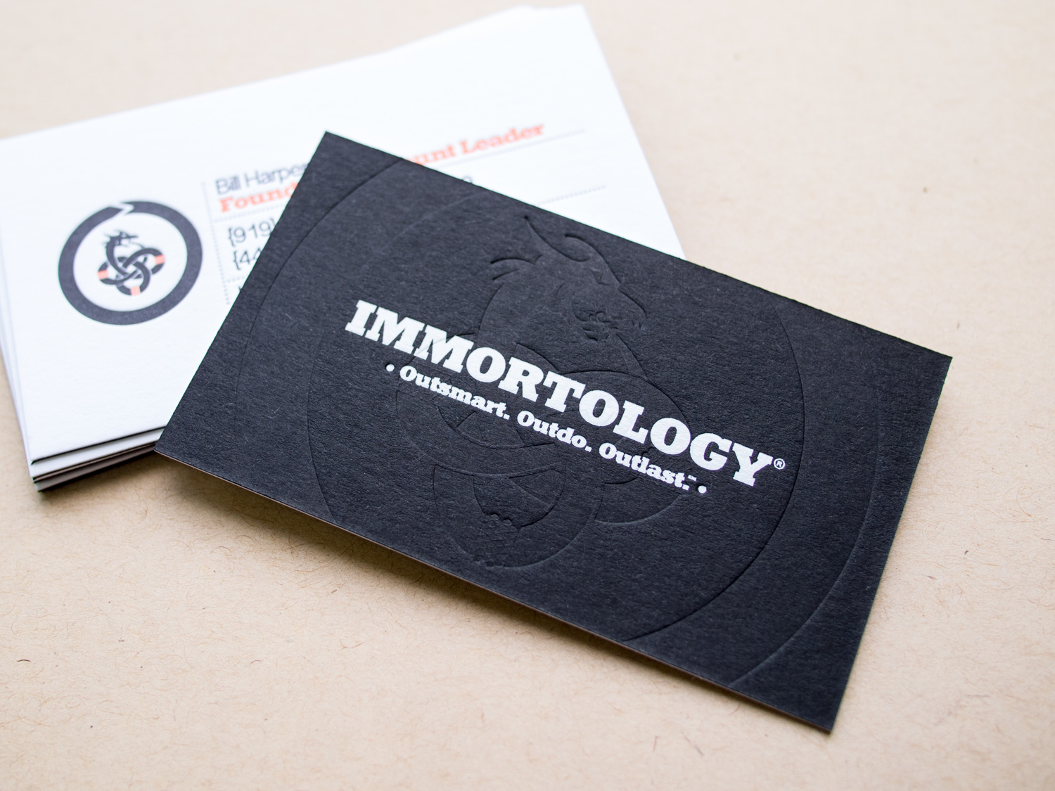
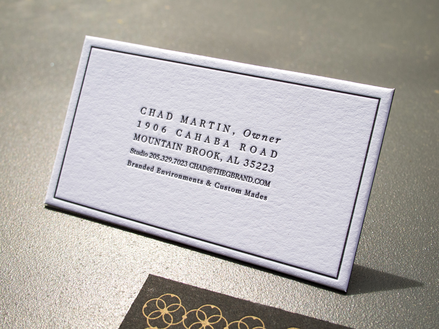
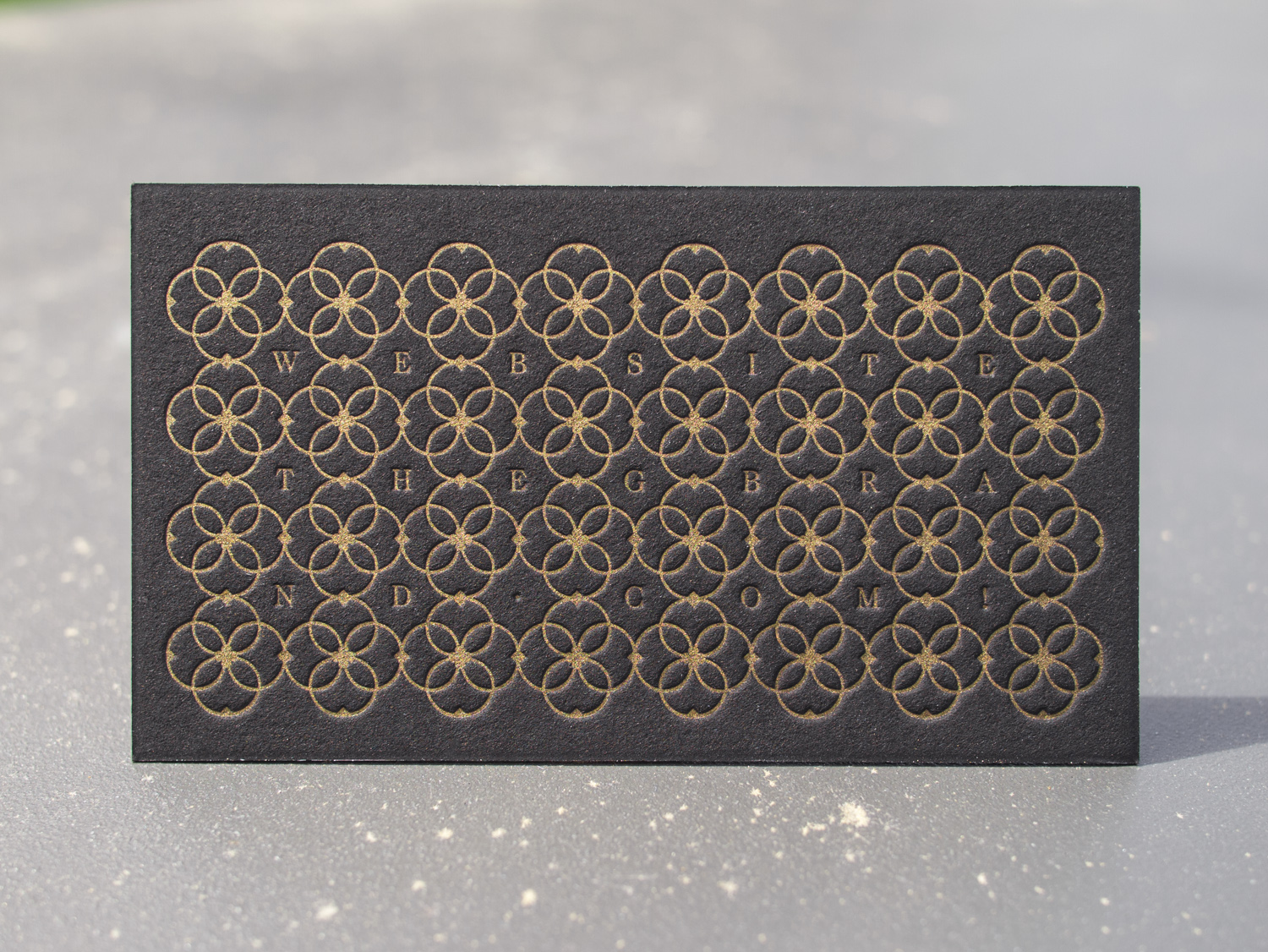
Some super-deluxe cards for Chapel Hill brand gurus, Immortology: Three inks on 300g Lettra for the front and white foil + a blind deboss on 350g Ebony Colorplan for the back.
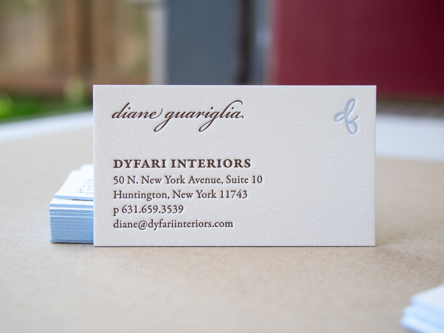
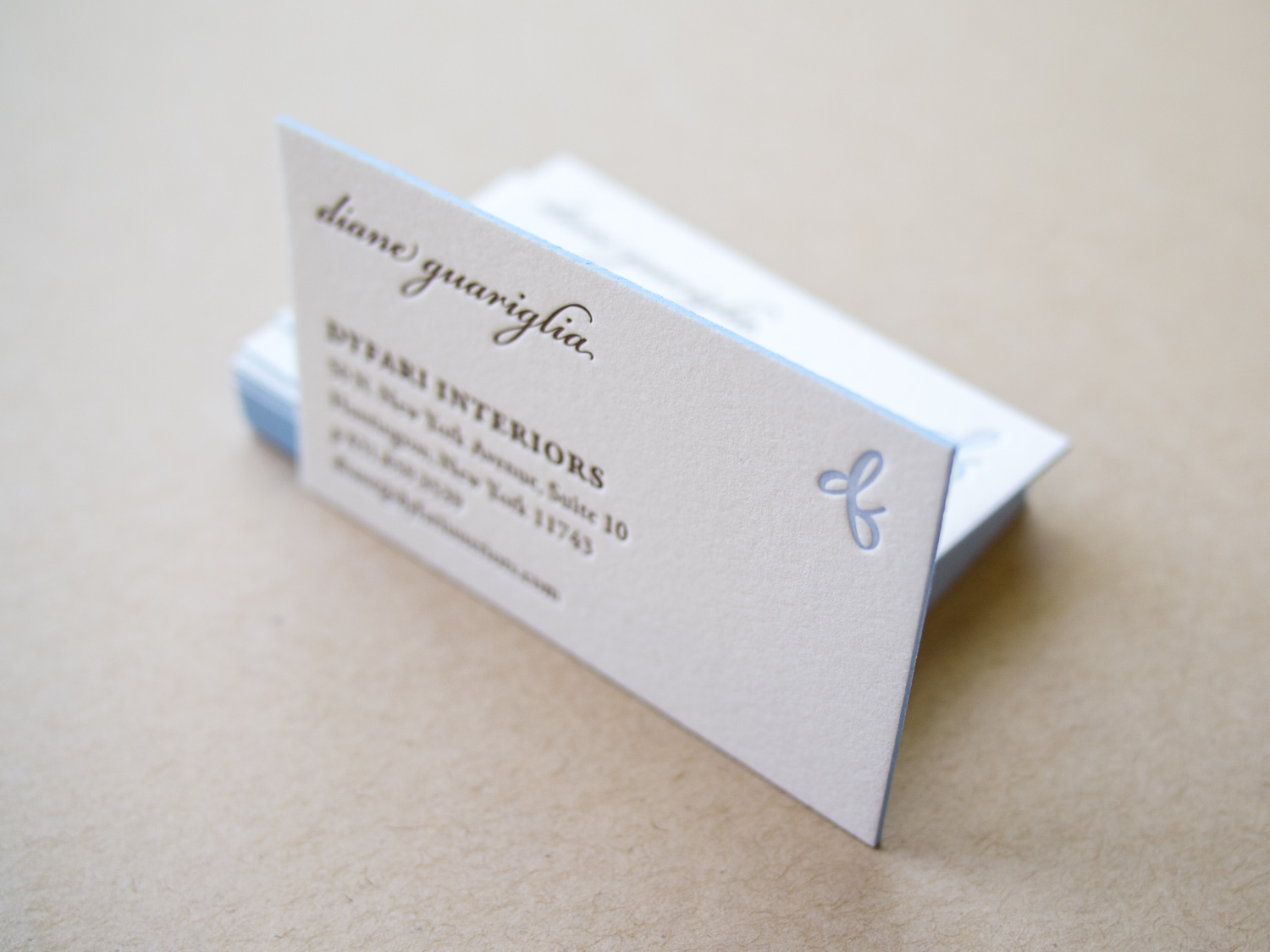
Finally, a business card reboot for Dyfari Interiors featuring Espresso and Periwinkle inks with Periwinkle edge paint on 600g Pearl White Lettra. This is the third iteration in a series of cards we've printed for Diane, starting with this version in 2010.
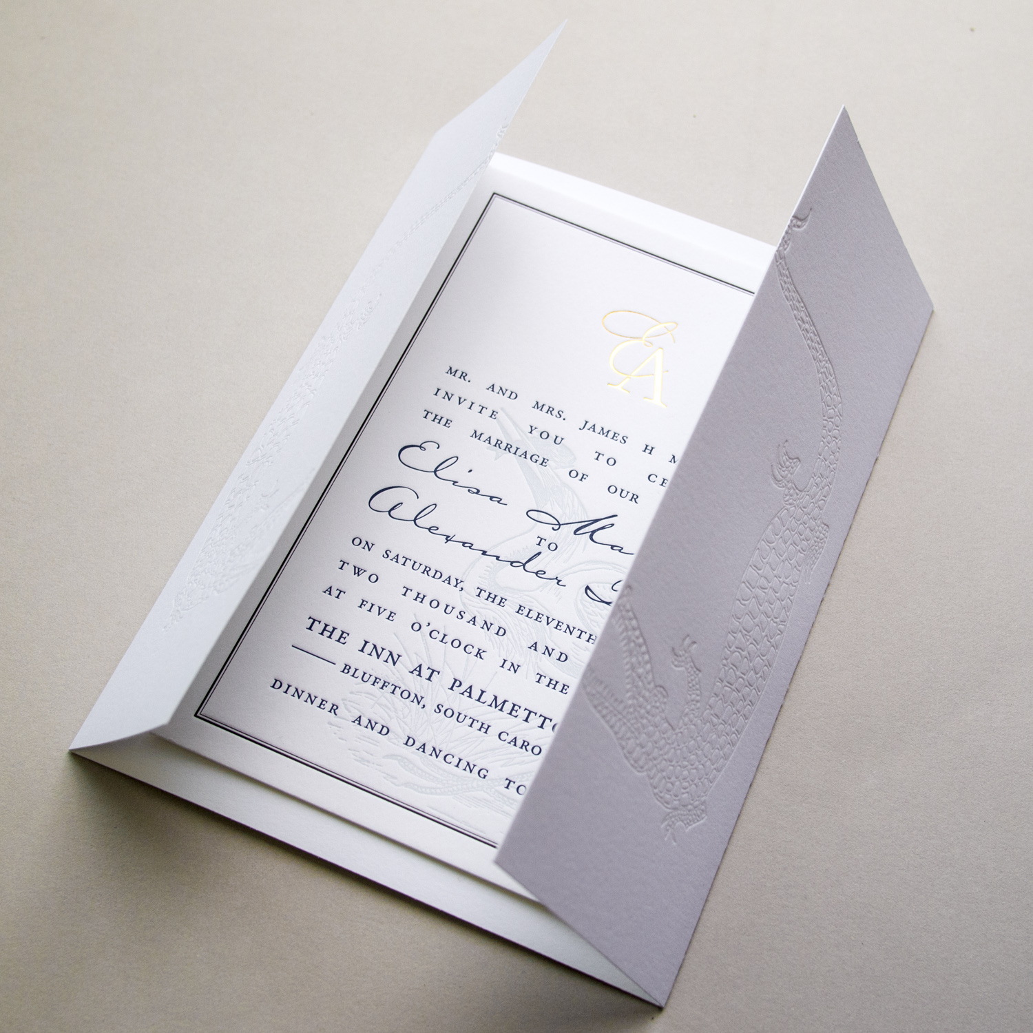
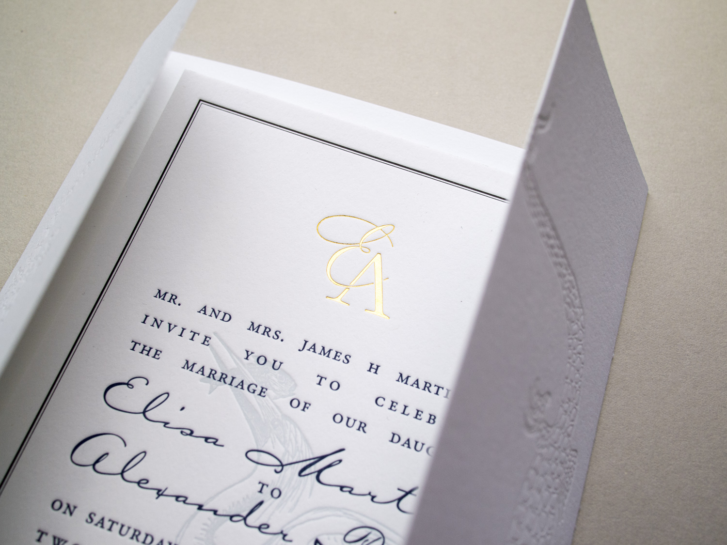
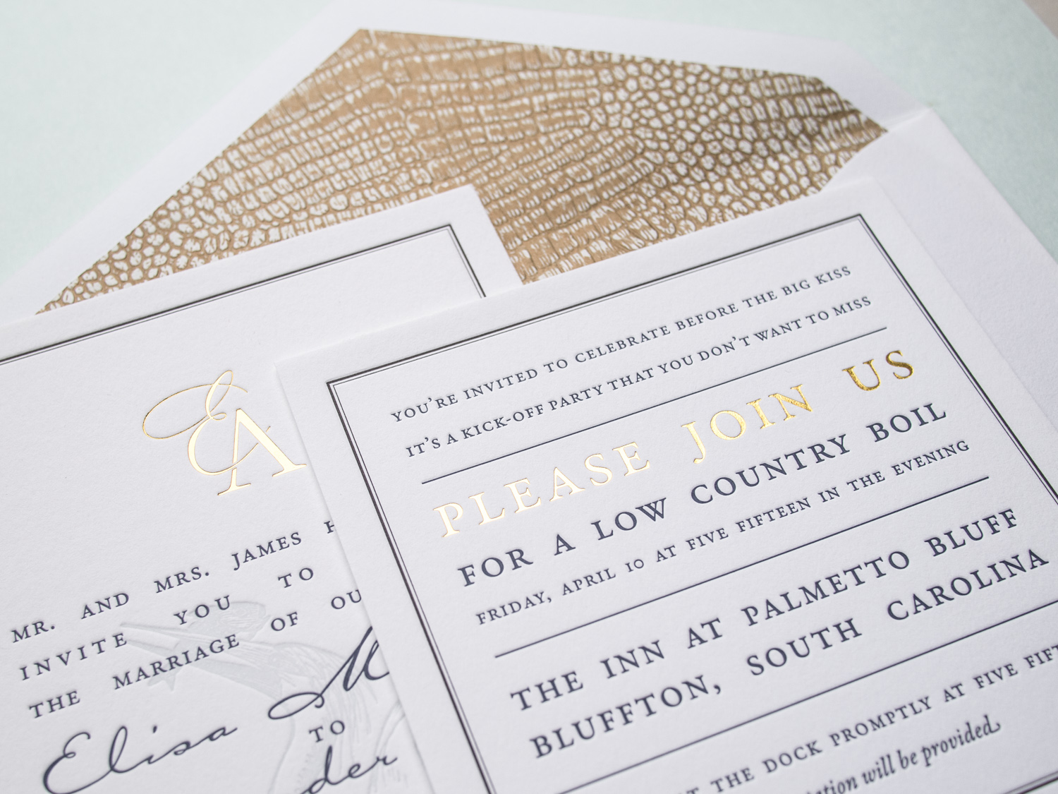
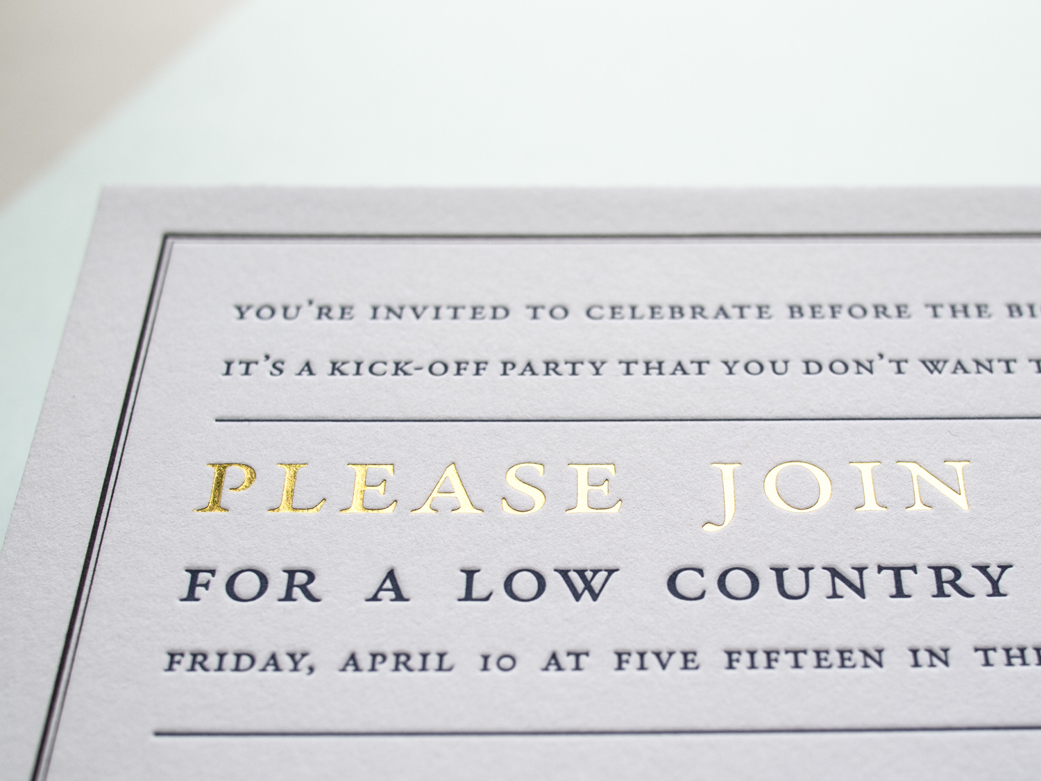
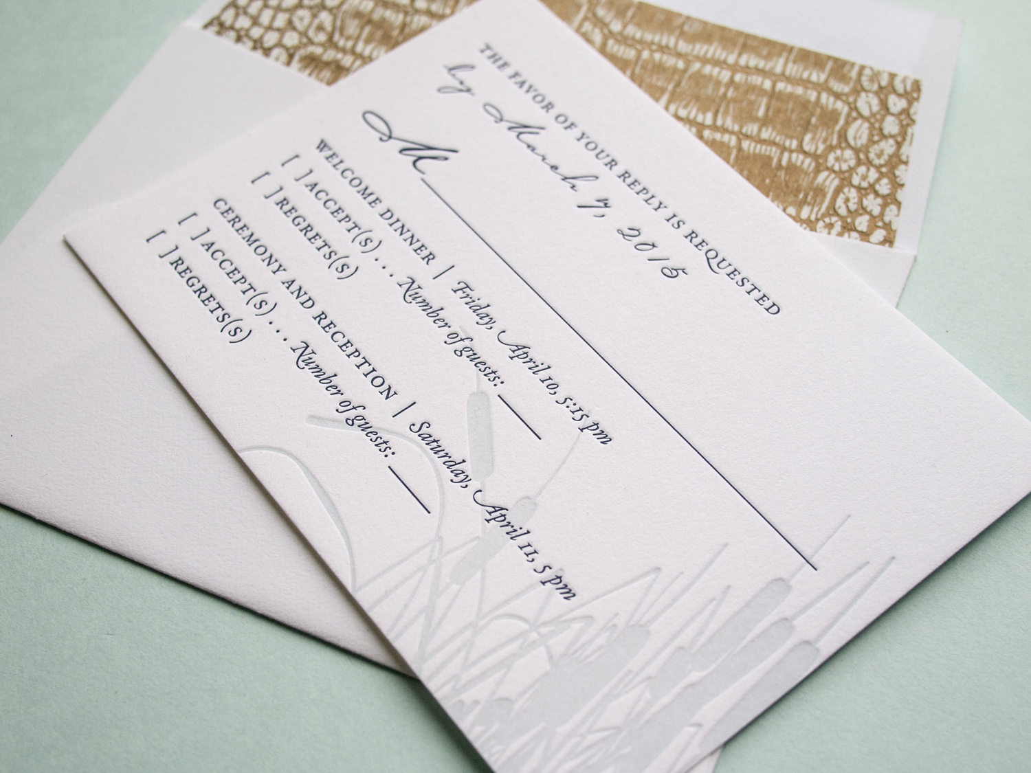
It's great when we get to work with a wedding client from the very beginning – starting with the save the dates, moving on to the invitations, and then following through to the wedding day pieces. We did this for Elisa and Alexander, shifting the design vision slightly throughout the process while still maintaining a cohesive aesthetic.

For the save the date, we printed tinted white and Espresso inks on an oversized 600g Pearl White card, tucking the text in the corner and emphasizing the dandelion motif.
Photo by Sarah Arneson
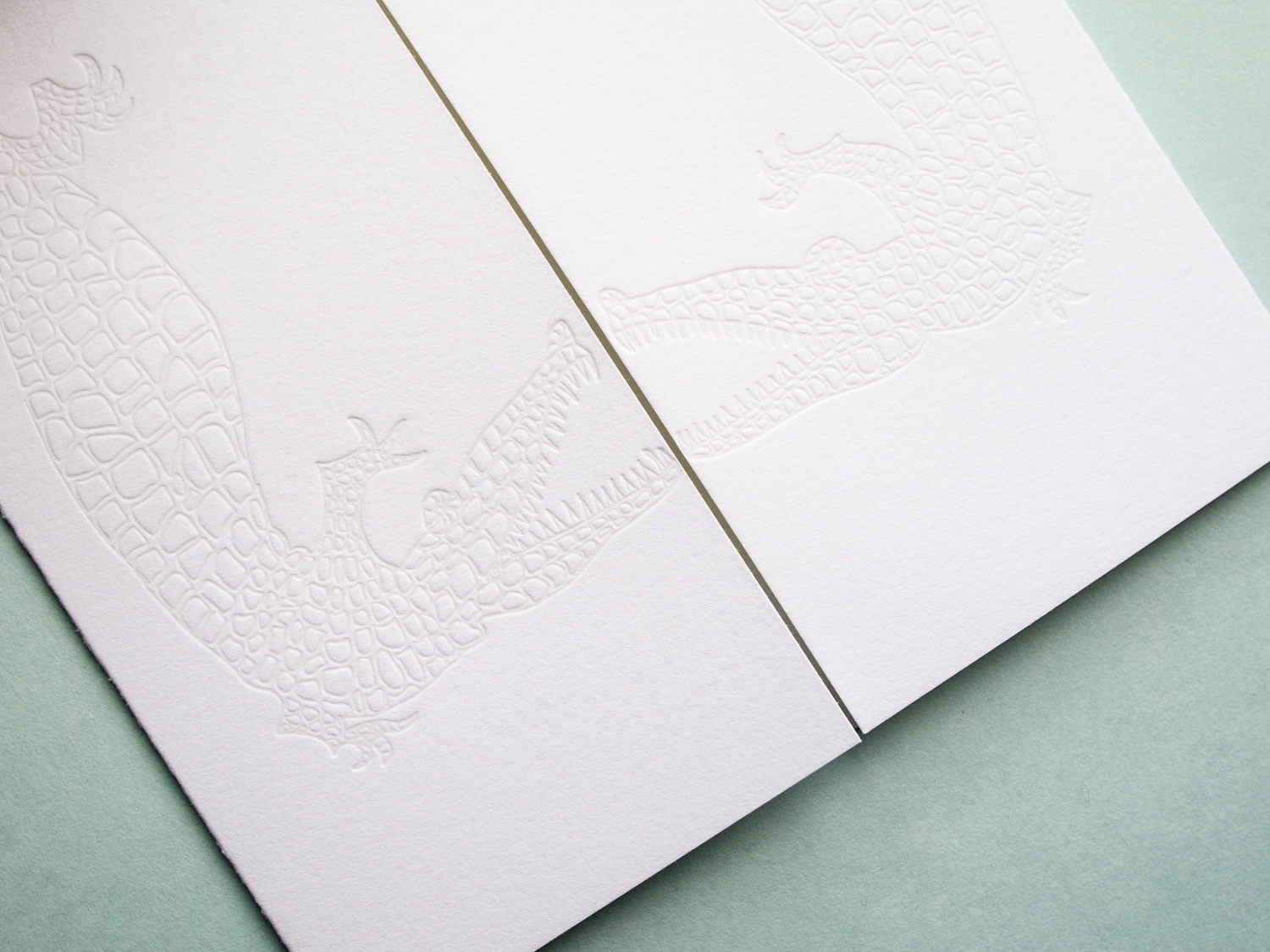
Moving to the invitation set, we got a bit more elaborate and less minimalistic. The alligator-print-lined envelopes housed a gatefold card, guarded by a pair of blind-pressed gators. Inside was a 3-ink + gold foil invitation on thick Fluorescent White paper, a 2-ink + foil pre-party card, and a 2-ink reply card with a lined reply envelope.
We unfortunately don't have photos of the (awesome) programs, menus, and place cards, but we did snag a shot of these custom die-cut hanging door tags that the bride and groom gave to their guests staying at the venue.
Alan and Keith were getting married on their farm in Virginia and wanted to balance the solemnity of the event with the rustic quality of the setting. The grooms-to-be had created an online video save-the-date for their guests, but for the invitations, they decided that letterpress would help underscore the formality of the occasion.
The invitation, according to Alan, had to convey several things at once to set the tone: a sense of formality (despite the fact that the reception was to be held in a barn, it was not going to be a casual event); the fact that the ceremony itself was going to be quite traditional; and the occasion's overall blend of elegance and rusticity. In his words, "we needed an invitation that tempered the formal and traditional with some sort of country element."
They felt the Californian design was almost there, but wanted to use a different oak tree image. The oak was their chosen motif, partly for symbolic reasons — the mighty, strong, sheltering, beautiful oak is an apt metaphor for a lifelong commitment — but it held literal meaning, as well. The couple planted a pair of young oaks on their farm, and are planning to watch them grow old together. As Alan said, "we hope we can look back on them one day and say, 'those were planted the year we got married.' "
Laura and Graham love skiing and love the mountains. Both their families were very connected to Jackson Hole — a beautiful spot in Wyoming nestled in the valley of the Teton Range — and so they knew they wanted to have their wedding there. They also wanted to incorporate the famous landscape in their invitations. They loved the tea-length card because it's unusual and distinctive, and also because they knew the proportion would highlight the mountain range illustration.
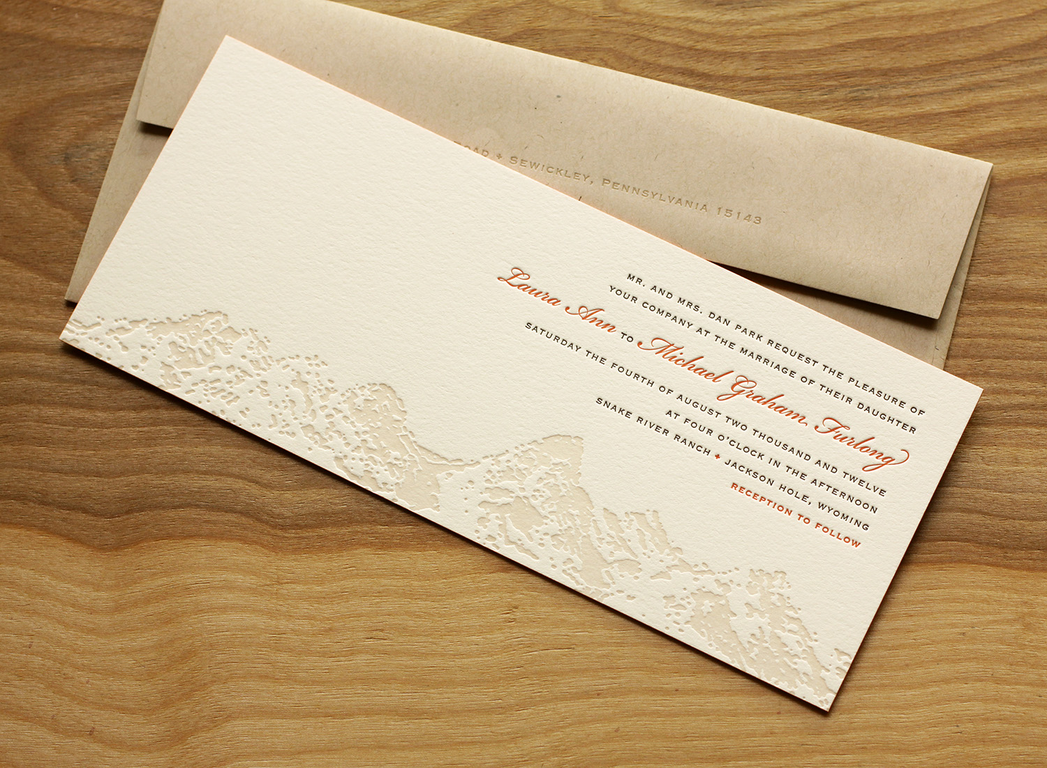
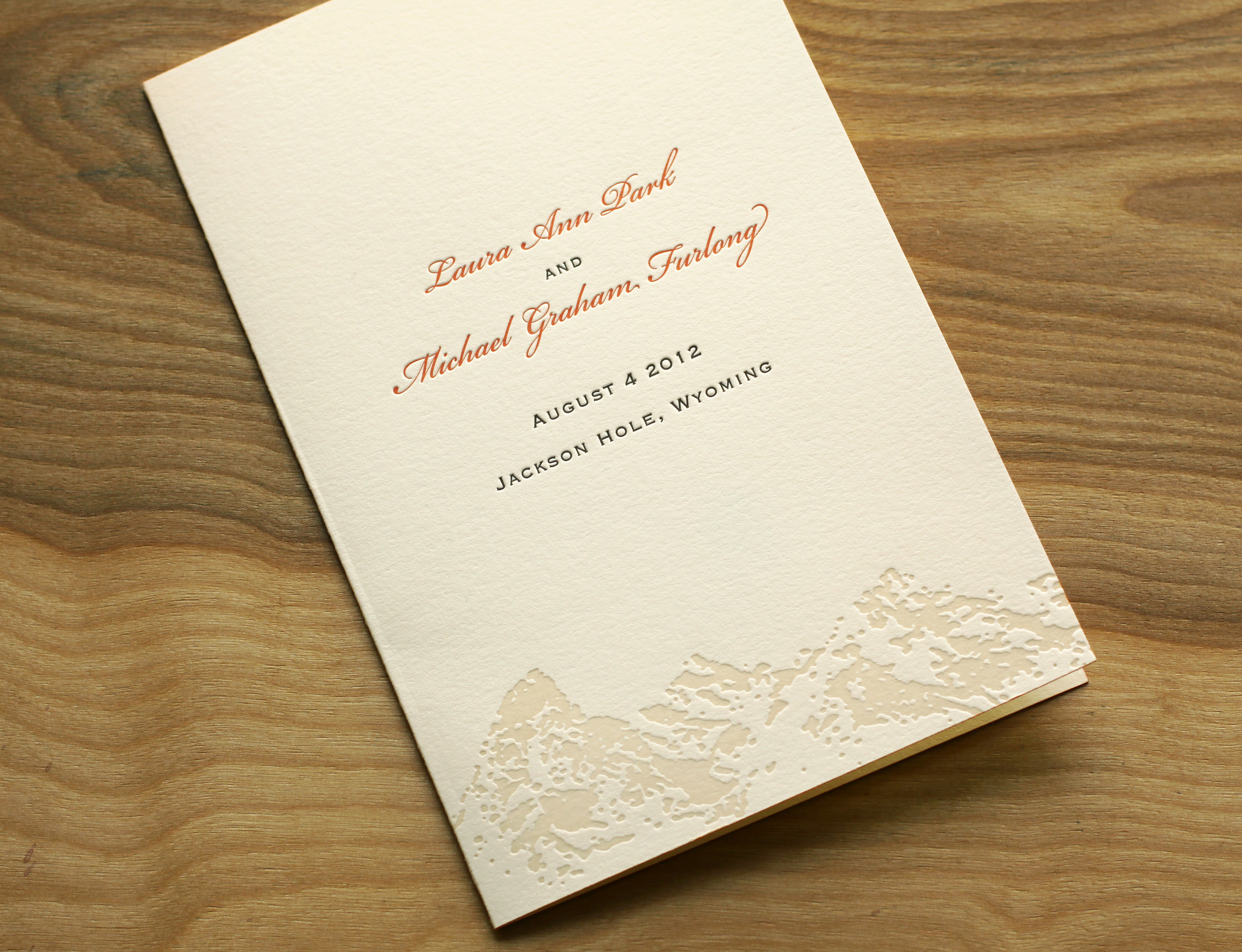
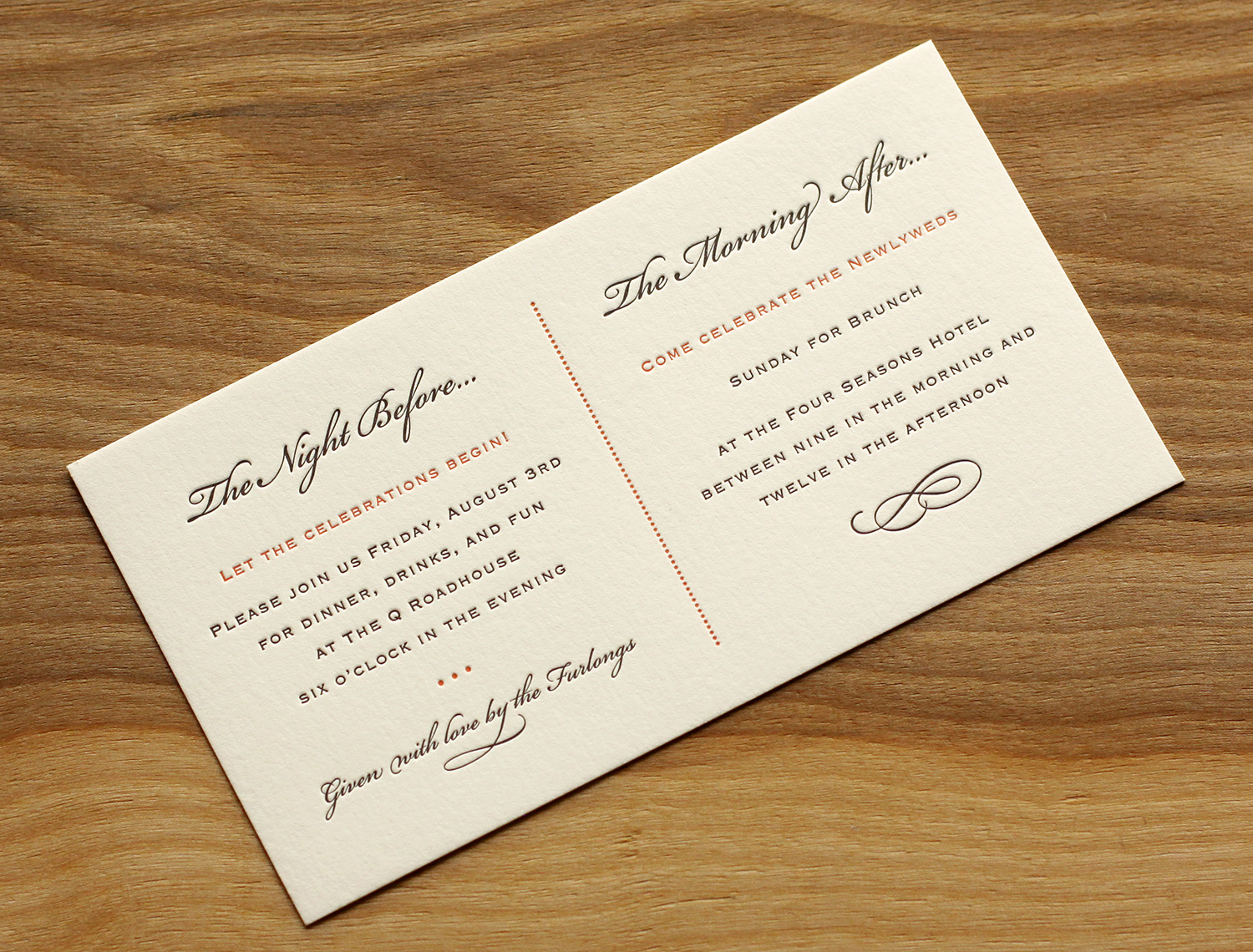
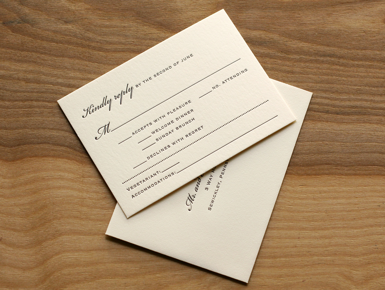
Travis worked with Laura to create the custom Teton art, and it was used on the invitation and on the program cover. Espresso and sherbet inks worked beautifully with the extra thick ecru paper, and corresponded with the wedding colors (brown was a featured color in the wedding, and the floral centerpieces had a pop of orange). The edges of the invitation card and the program cover were painted to tie together the sherbet accent ink used throughout.
The set included a card inviting guests to the other events (a Friday night dinner and a Sunday brunch), and the RSVP card covered replies to these events as well as the wedding itself. It also had space to request a vegetarian menu and note lodging plans.
Laura became familiar with Travis' studio while she was at business school in nearby Chapel Hill. She was amazed by his work, and said that "selecting who to do my invitations was the easiest part of planning." "Everyone loved the invitations," she said. "I got many compliments."