Posts in wedding invitations
Get With The Program

Ah, the wedding program. Do you really need one? Isn't it just one more thing to do, on what seems like an interminable list of pre- "I do" to-dos? Won't people get the general idea, and understand that they are gathered together, that day, to join together two people in matrimony? Well ... yes, it is one more thing to check off a list. And sure, sans program, guests would likely still be able to follow the action. But. BUT.

They're really nice to have.

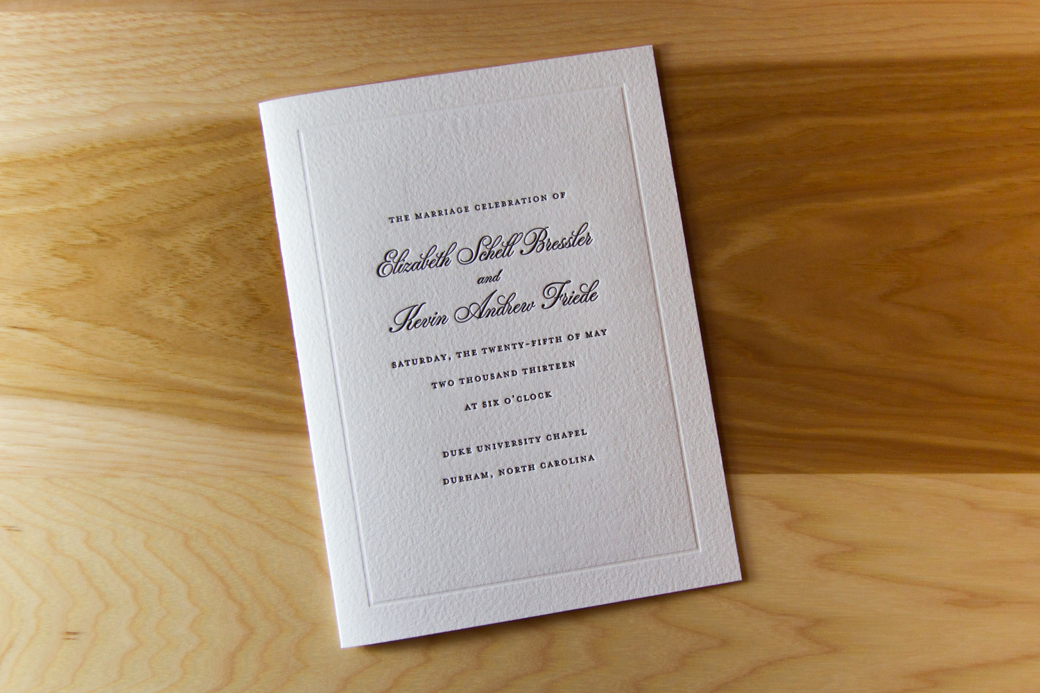
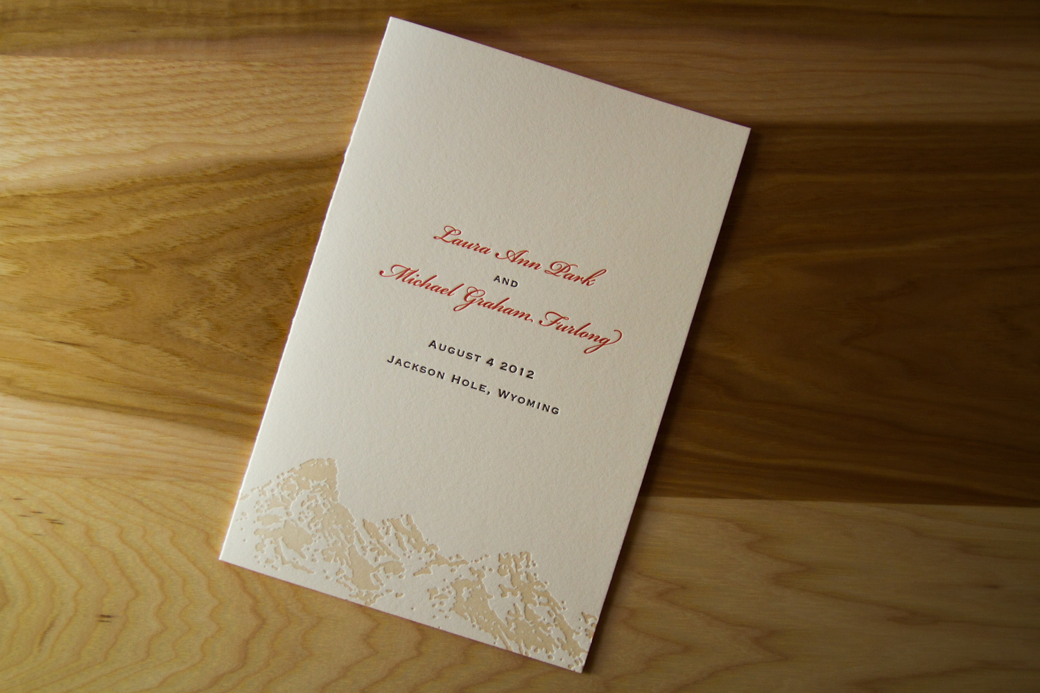
There are a couple of basic program formats: folded 4-panel and flat. Pricing for each depends on paper stock, number of ink runs front and back, etc. (More information on pricing is here, with the programs listed under "Additional Pieces.")

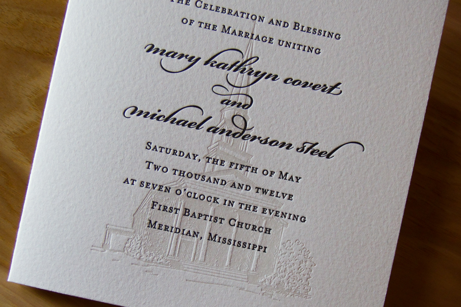
Sometimes you've got everything settled, and the big day is choreographed down to the last Corinthians. Then you're in luck; you can order programs which list every last detail. Parklife Press handles complete programs, providing design services if needed. Programs are usually printed and delivered closer to the wedding date, to give the couple time to craft the ceremony and confirm all the participants — all you need to do is remember to bring them to the venue.

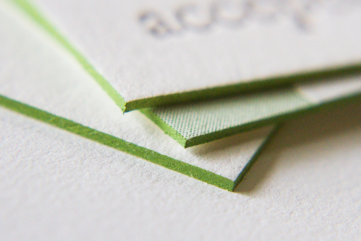
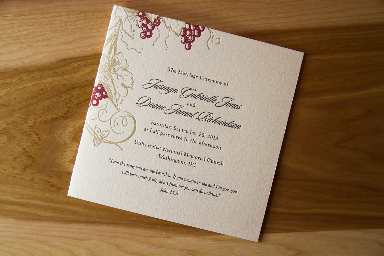
But sometimes, those details are still being worked out. You're putting the final touches on it, it's this close to being finalized, but you and your betrothed need a bit more time to decide about whether the recessional song will be "Beautiful Day" or "Til There Was You." This brings us to the third, unofficial format: a semi-DIY option. Below are two letterpress program covers by Parklife. They show the basic info on the front and are designed to match the look of the invitations. But they're blank inside — they're designed to accommodate an insert, to be printed and then attached via ribbon or glue.

But wait, you say. That's all layout stuff. Parklife can help you figure out how best to arrange and present the information, depending on how much text you provide, and that's all very helpful. So ... how much text do you provide? What information goes into a program? What details need to be gathered?

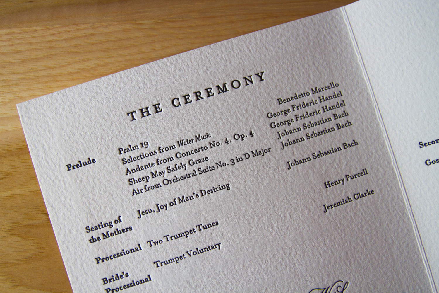
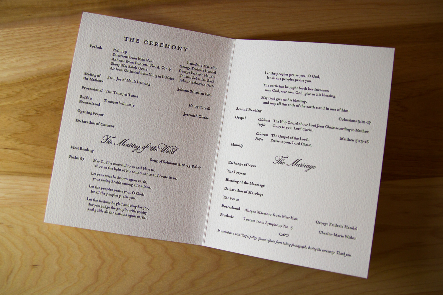
To begin with, most simply, a program is a schedule of events. It gives guests a blueprint of what's happening, and a rough timeline of the service. Let's face it, there can be some waiting around on the guests' part. Many will want to get there early to get a good seat, and once they're seated, well, let's hope they haven't pulled out their phones. (No judgement, phone slaves!) But ideally, all they'll have in their hands to read is what was put there when they walked in … the story of your wedding.

A program for a wedding is just like a Playbill — it imparts information to the guests/audience, providing details of what they're about to see. How many acts will there be? What are the musical numbers? Who's in the supporting cast, and are there any important cameos to watch out for? Are there any messages from the directors?

When writing your program, think of the audience. For most weddings, the guest list is comprised of a wide range of acquaintances, running the gamut from "oldest dearest friend" to "the cousin/childhood playmate whom you haven't seen in years" to "husband of a woman who works with your dad." You write the program so that it addresses everyone, so each guest can follow along regardless of how well they know the couple.

Are there any religious or cultural traditions included in the ceremony? What music is used? Are the readings from the Bible, or are they from poems and song lyrics? Apache Wedding Prayer or a passage from The Velveteen Rabbit?

And who are all those guys standing up there with the bride and groom? Siblings? Soccer teammates? Sorority sisters and frat brothers? Co-workers? All of the above? Listing the wedding party in the program is not only a way to honor and thank those participants, but it's also thoughtful information to provide to the guests.

Tip: in listing the wedding party, you only really need each person's name. But if you have the space and inclination, it's extra nice to include some context, like "sister of the groom," or "godchild of the bride," or "friend of couple." It goes a long way to helping your guests understand the emotional connections between all the key players. ("Oh, look! Isn't that nice? The 'best woman' is the groom's sister, and the 'man of honor' is the bride's brother!" and "Oh, look, the bride will be accompanied down the aisle by both her parents!")

In the interest of making your little wedding-world a smaller, friendlier, more connected place, it also provides more information for guests to chat and interact during the reception or after-party. ("Oh, you're the best man. Nice to meet you. Did you go to Brown with Adam? I went there, too; class of 2010! What dorm were you in freshman year?") It's all about inclusion of your guests, and consideration of them as an audience. Except it's not just an audience — it's a collection of the people closest to you, to your spouse-to-be, and to your families — it's one big mash-up of "This Is Your Life."

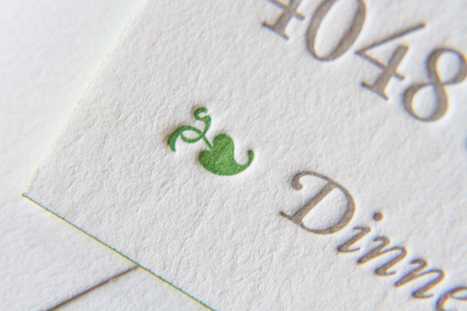
Some other elements that can be included: a passage or quote which is meaningful to the couple can really set the tone of the ceremony (above, a line of scripture is paired with a sprig of lavender, carrying through the colors and motif of the wedding). Another extra: if the couple has a new address, the program can be a great place to share it officially with their guests — either on the back, or as a note at the end.

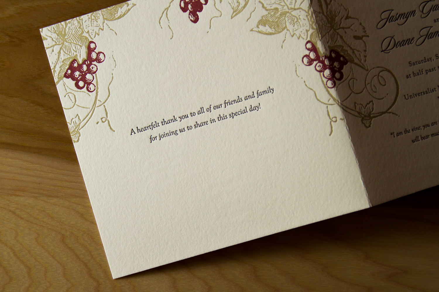
And finally, the wedding program is the perfect vehicle to share a little note of thanks to family and friends. Whether brief or long, formal or chatty, a heartfelt message from the couple is the perfect conclusion to a program, and it is always a gracious sentiment to include.

Photos by Sarah McCarty Arneson
Mapping Napa

Nick and Hadley were drawn to the ever-popular Bookplate, and chose a color palette of fresh green paired with a soft gray (apple and dust inks). Their set included a map, custom-designed by Parklife Press, to guide their guests around the Napa Valley wedding events.

The set is comprised of three pieces printed on extra thick, 600g paper: an invitation, an RSVP card with a printed return envelope, and a map to the wedding site. The map shows both an overview of the area in Napa — with all-points directions and major roads — and a detail section of the Inn and resort grounds, noting entrance and parking areas and the specific reception hall.

Bookplate has always been a popular style for Parklife Press; its clean, simple design — with plenty of white space — really highlights the beauty of the typography, and the color pop on the couple's names really draws the eye. And perhaps because the design is so elegant and uncluttered, the tiny flourishes pack a (visual) punch. Below, the edge painting on each the piece (the invitation, RSVP card, and map) shows off the extra-thick paper stock and unifies the color theme; the tiny green dingbat preceeding "Dinner to follow" draws attention to the reception note while adding visual interest; the typeface's blink-or-you'll-miss-them ligatures lend an old-world charm to a very modern design; and the extra-thin double rules on the map divide the sections in a beautifully understated way.

Bonus points for any fellow print nerds who noticed that our map design delivered two shades of green for the price of one, with the water — the Pacific Ocean, San Pablo Bay, and San Francisco Bay — shown in what appears to be a lighter tint. How did they do that, you ask? What alchemy have these mad geniuses wrested from their printing press? Short answer: a halftone screen. Longer answer here.

Photos by Sarah McCarty Arneson
Shades of Blush

David and Allyson's invitation set was based on Petal, which features an original illustration by Parklife Press. The text, set in all-caps Gill Sans, is set off by the lightly-flourished script of their names. The asymmetry of the single, flowering branch — printed in tungsten and blush inks — provides a fresh and cheerful balance to the clean and modern design.

The branch design from the invitation was carried through on the RSVP card.

Letterpress is typically created with solid areas of ink impressions using individual, premixed colors. But here, by using halftone screens (read our post about letterpress and the halftone process here), three shades of pink were achieved using only one ink. This branch of blooming buds would still be pretty with solid, 100%-strength blush ink, but the design would lack depth; it wouldn't be as delicate, or as interesting.

Pastoral Elegance

Alan and Keith were getting married on their farm in Virginia and wanted to balance the solemnity of the event with the rustic quality of the setting. The grooms-to-be had created an online video save-the-date for their guests, but for the invitations, they decided that letterpress would help underscore the formality of the occasion.

The invitation, according to Alan, had to convey several things at once to set the tone: a sense of formality (despite the fact that the reception was to be held in a barn, it was not going to be a casual event); the fact that the ceremony itself was going to be quite traditional; and the occasion's overall blend of elegance and rusticity. In his words, "we needed an invitation that tempered the formal and traditional with some sort of country element."

They felt the Californian design was almost  there, but wanted to use a different oak tree image. The oak was their chosen motif, partly for symbolic reasons — the mighty, strong, sheltering, beautiful oak is an apt metaphor for a lifelong commitment — but it held literal meaning, as well. The couple planted a pair of young oaks on their farm, and are planning to watch them grow old together. As Alan said, "we hope we can look back on them one day and say, 'those were planted the year we got married.' "

Photos by Sarah McCarty Arneson
Formal, with Flourishes

Alexandra and Michael were planning a black-tie, traditional Catholic wedding, and wanted their invitation to reflect that style. Alex was drawn to the Fountain design — seeing how the layout's simplicity put the elaborate font on display, she was, as she put it, "hooked."

Deceptively simple in design, the typeface features intricate and playful ligatures and flourishes. The extra thick invitation cards were edged in gold, and that subtle sparkle was echoed by the envelopes' antique gold liners.

Alex found Parklife Press on the Martha Stewart Weddings website. As with any wedding, there were many decisions to be made — but when it came to the invitations, whether to use letterpress was never really a question. "My Mom is a calligrapher and has instilled a reverence to paper products in me that I was sure to embrace in our wedding planning process." The effect was everything she and Michael were looking for: formal and traditional, with impact.

Photos by Sarah McCarty Arneson
Drawing Inspiration: Art, Cultural Traditions, Local Pride

From a creative professional's perspective, Sneha and Dylan were dream clients. The did research, they "shopped local," and they visited the studio — both to talk with Travis, and to see (and feel) letterpress samples in person. Most importantly, they had a solid design vision and provided concrete inspiration and references.

Parklife Press did custom designs for both the save the date card and the invitation set. For the former, Sneha and Dylan said they wanted "whimsical ... like the opening scenes of a Wes Anderson film." (For a graphic designer and film buff to hear this? He knows it's the start of a fun job.)

The list of inspirations for the invitation set was longer, but no less interesting to fit together. To start with, it was to be "a bit more formal" than the save the date cards.

For the couple, it was tiny details that made this set distinctive and personal. They wanted to incorporate "flower garlands from traditional Indian weddings." To do this, Travis used a blind deboss impression — thereby lending texture to the background and creating a subtle, striped effect which was in keeping with the design's formal tone. Sneha and Dylan chose the green and gold colors they "often see in the beautiful forests here," colors which they used in the wedding and reception. (The heavy-weight cards were edged in gold, setting off the deep green of the text.) And finally, they wanted to "give a nod to our new home in Durham by featuring a romanticized bull." That bull, extending a single rose, appears on both the save the date card and on the invitation's envelope flap return address.

Commissioning custom designs, especially when the turnaround time is short, can be nerve-wracking for clients. But it was a positive experience for Sneha, who said, "Travis was so easy to work with and incredibly quick to respond to our edits." And the resulting product really set the tone for their big day: "We have received more compliments on the invites than we could have ever imagined," she said. "He helped two very time-constrained and design-naive individuals make absolutely beautiful invitations we will treasure forever."

Photos by Sarah McCarty Arneson
Old World Charm in New York City

The beauty of a classic, calligraphic invitation puts the emphasis on the writing. Here, in a invitation based on Quill, with custom calligraphy by Monica Rachel Lima, the swirls and flourishes of the text sets the tone for an elegant and festive occasion. The black ink on thick, pearl white paper stock is set off by a metallic silver envelope liner.

The simplicity of the dingbat rule pairs well with dramatic flair of the calligraphic flourishes, and all the rounded corners of all the pieces ties the set together.

Accompanying reception and RSVP cards are done in a understated serif font with a vintage feel. The two styles coordinate to set the tone for a formal wedding in New York City.

Photos by Sarah McCarty Arneson