Four Inks on Black for Alex Jackson Studio

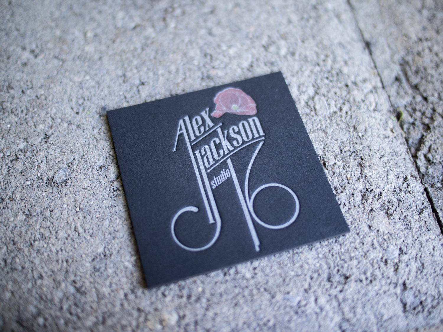
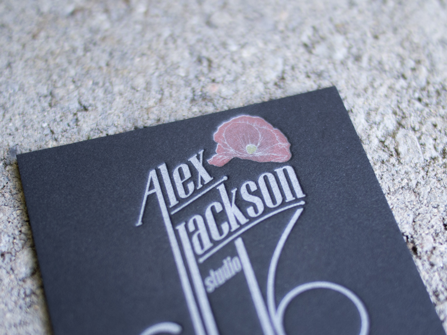
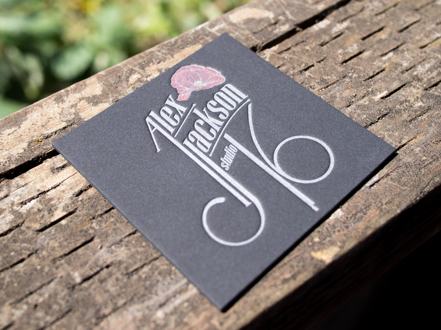
Letterpress printing on black paper can pose challenges. Most letterpress inks are transparent, so they're not going to show up on a black background. One exception is silver. Silver ink is mostly opaque (about 80%), so if you're sneaky, you can print a silver ink run on the black paper to create a lighter base, then print any color you'd like on top.

For Alex Jackson Studio we started with thick 4-ply black museum board and a silver ink run. Then we added the red rose artwork and a subtle yellow stamen, leaving a super-thin silver outline and tiny silver veins. On top of the red, we printed a gray halftone gradation to create shading (check out our halftone blog post if you're not sure what that is).

animation.gif

This technique requires really tight registration, but it allows for an effect you don't see often with letterpress. Our PDX sports fan coasters were done the same way. More photos of Alex's cards are below.

Letterpress Posters for Bowdoin College

Barry Mills served as president of Maine's Bowdoin College from 2001 until this past July. Upon his departure, the college asked us to print his manifesto as a 6" x 15" letterpress poster.

Since we use a Chandler & Price platen press, which isn't really designed for larger pieces like this, we actually printed this two-color piece in four separate runs. That way we could get a nice even and deep impression into the 600g Lettra paper.

Golden Botanicals Wrapped & Sealed

If you thought the letterpress save the dates we printed for Randi & Ben this spring were cool, I think you're gonna like the follow-up.

This was truly a collaborative project. Randi designed the two-sided invitation and sleeve, and sent the specs off to us.

We printed the front of the invitation on 300g Pearl White paper with midnight ink and gold foil, and the back with gold foil on a separate sheet. Then we duplexed the two sheets by hand, let them dry, and trimmed off the edges. This allowed us to get a two-sided piece with heavy artwork and no impression show-through.

Randi designed the sleeve to double as a direction card. We printed those with midnight ink on a 4" x 15" sheet, then scored, folded, and glued them.

Randi finished off the set on her end with gold string and a custom wax seal. Photos of the completed invitation are below.

A Wedding Between Two Ferns

Last month we featured Luke and Robyn's Mount Hood wedding invitation set. Sticking with the Oregon theme, this time we head south for Julia and Detlev's wedding on the Umpqua River.

Both the wedding ceremony invitation and the rehearsal dinner invite feature fern imagery – somewhat abstractly on the main invite and more realistically and delicately for the rehearsal.

Blind, Edged, & Converted

We've been printing fancy letterpress business cards for Norfolk creatives Grow for a while now (check it out). Recently they asked us to print simple blind-pressed, edge painted notes along with custom printed and converted envelopes.

To get the pattern on the inside of the envelope (called a "tint") we first offset printed flat sheets with a light cool gray, then folded and glued the envelopes. Finally, we added the letterpress return address and logo.

A Mount Hood Wedding

Perhaps you saw our 2013 blog post detailing the underused letterpress technique of halftone screens. In short, we can use tiny dots and on-paper ink mixing to create the illusion of gradations and multiple ink colors.

For Robyn and Luke's Timberline Lodge wedding, we used just two inks (a very light gray and a dark blueish-gray) to create a photo-realistic image of Oregon's Mount Hood.

To accompany the invitation, we printed an info card with a tear-off reply postcard (this one with a halftone bird because, hey, put a bird on it), a small rehearsal dinner invite, and a custom woodgrain-lined envelope.