Letterpress Invites in the Santa Cruz Mountains

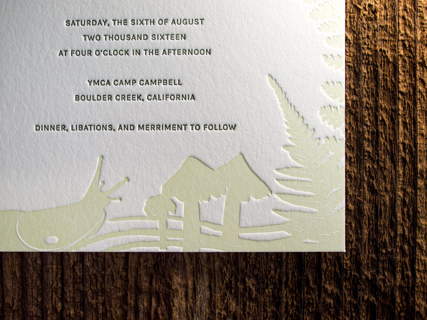
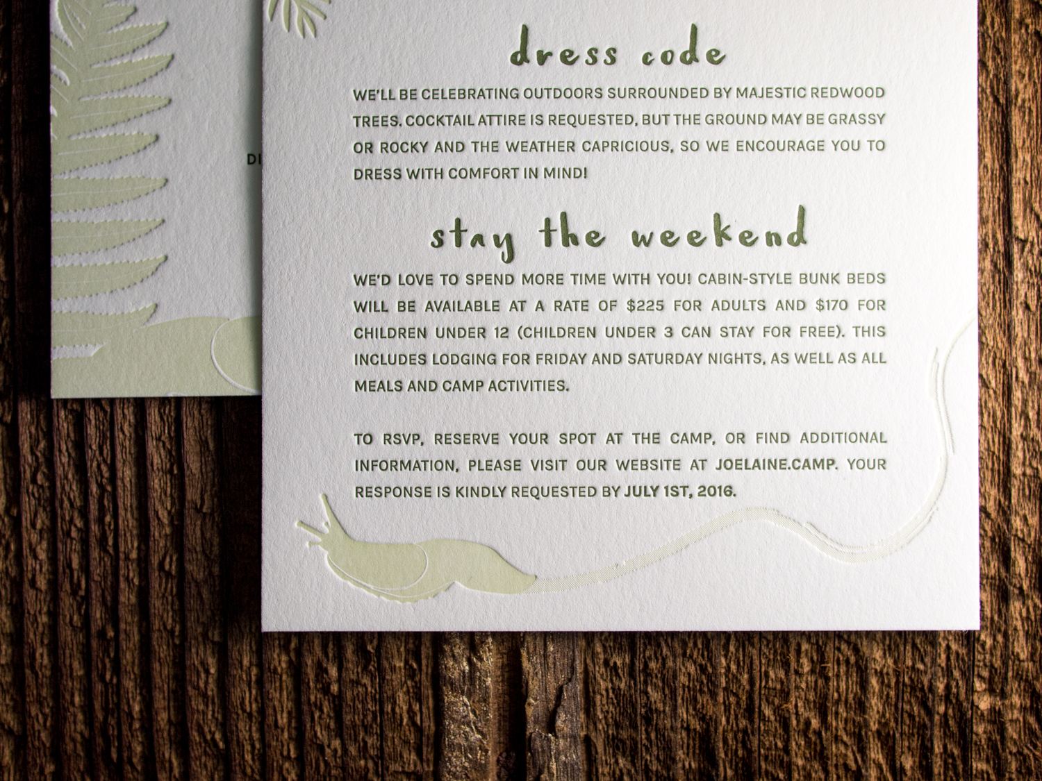
This is one of our favorite client-designed wedding sets of the summer. Elaine and Joseph's invites mimic the lush forest that surrounded their venue in the Santa Cruz Mountains, complete with ferns, pinecones, and slugs.

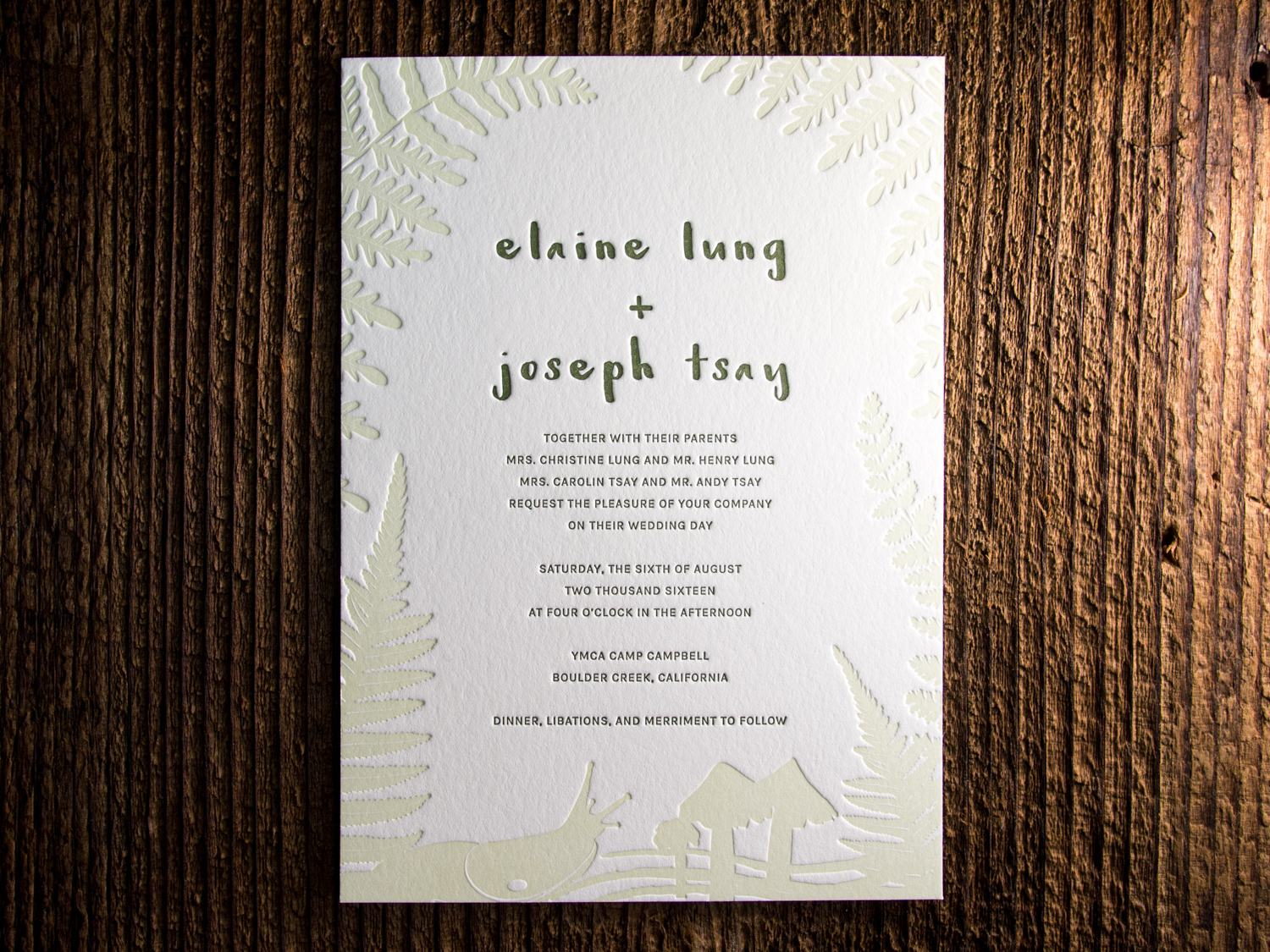
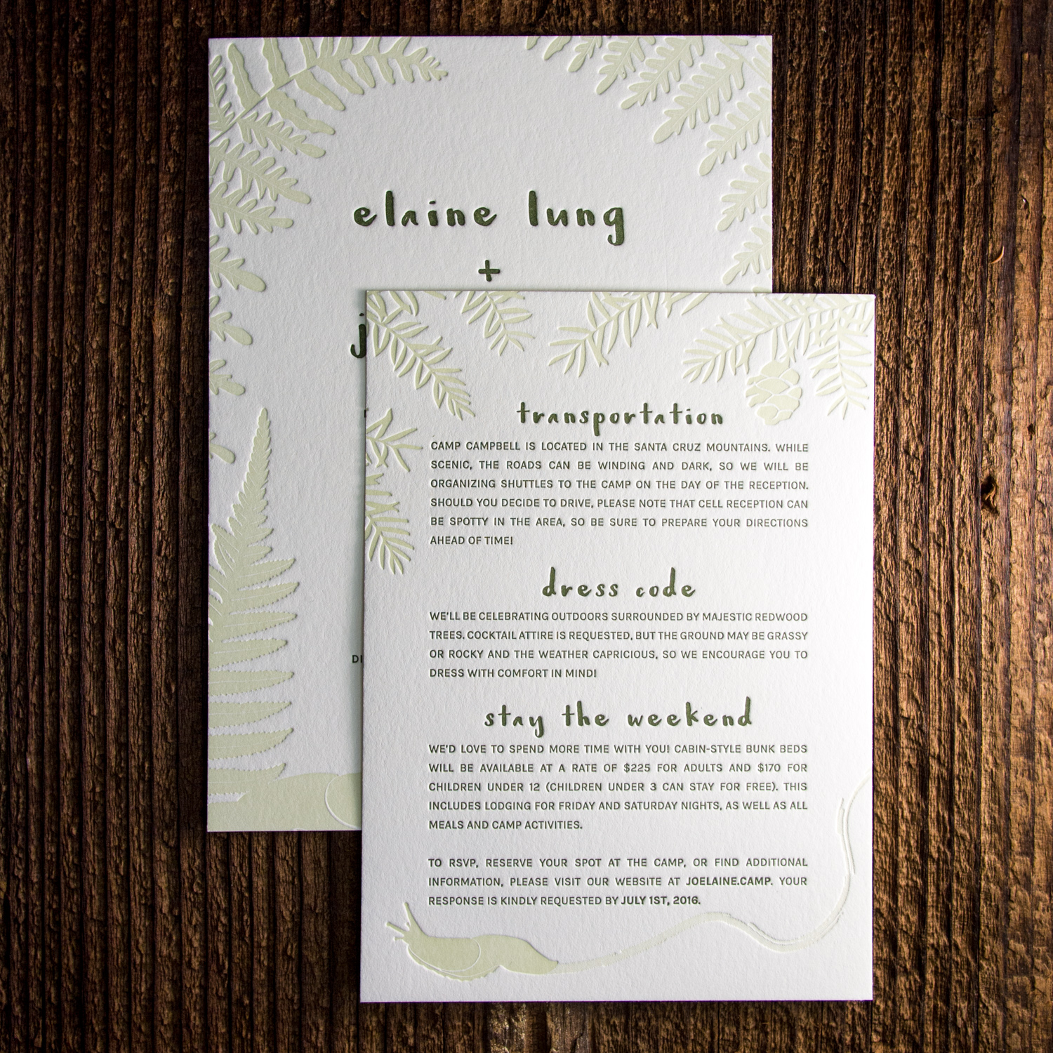
We mixed a custom dilution of our Light Celadon ink to let the deep impression of the artwork really stand out.

Biz Cards by Floc5

Here we've got a couple of sweet business cards designed by Sarah at Kansas City's Floc5. Connect with them on twitter (@floc5) or at their website.

The first is for Floc5 Homes — printed in rich black ink on thick, bright 600g Fluorescent White cotton stock.

Next we've got skinny cards for Amy Slattery of the architecture firm Odimo. We printed these with custom gray and flame red inks on 500g cotton Savoy and finished them with edge paint to match the ink.

Belvedere in Lavender

Our Belvedere invitation is traditionally rather formal — printed with a graphite ink and a blind impression for a bold but stark feel. But Maura and Matthew wanted something a little more playful and a touch more Downton Abbey. So we swapped out the Mrs Eaves text and Burgues Script for the more lighthearted combo of Carlton and Parfumerie, punched up the color with two shades of lavender, and opted for a prim and proper flourish motif.

Golden Black Squares for MA Allen Interiors

Another awesome duplexed card. This one's for interior design firm, MA Allen Interiors. We actually printed wedding invitations for the firm's founder back in 2010, and she came back to us for business cards after opening her Raleigh firm.

On the front we've got gold foil on 30pt black museum board — and on the back, the same gold foil on our pearl white 300g (21pt) house cotton paper.