Posts in wedding invitations
Foiled & Monogrammed

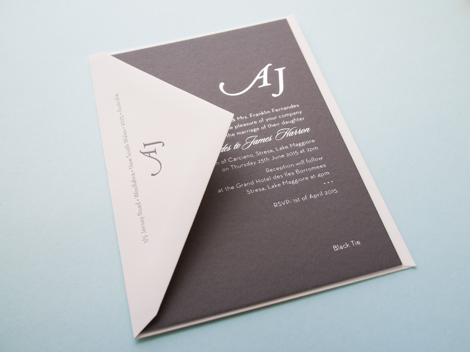
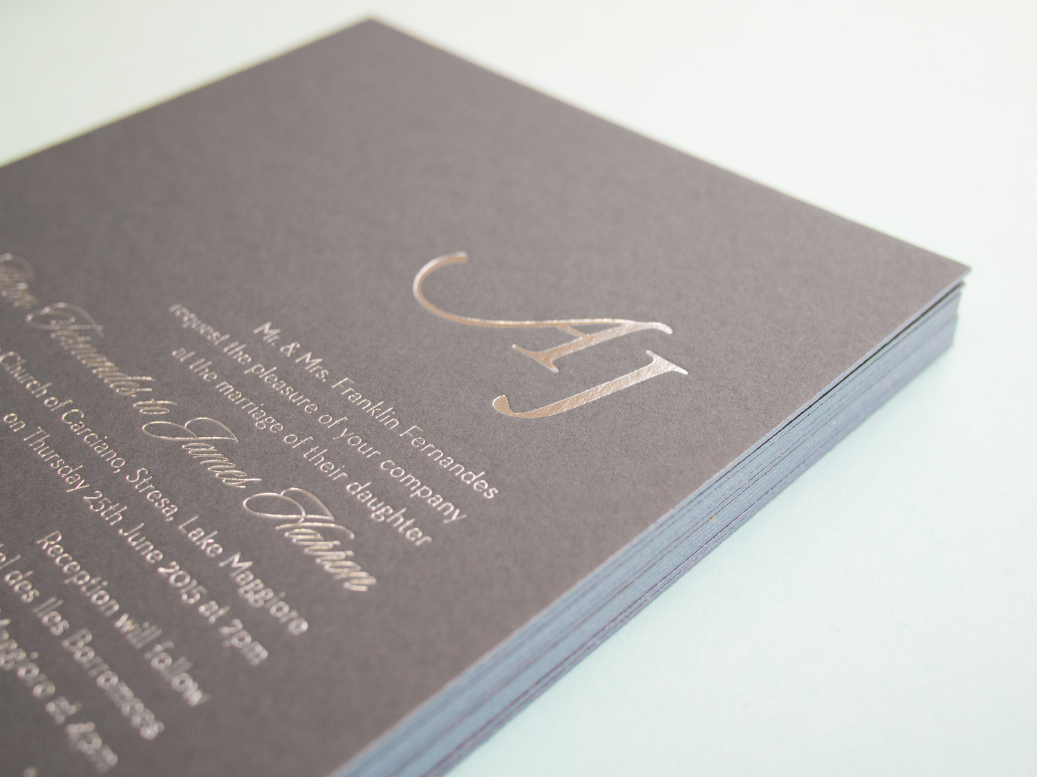
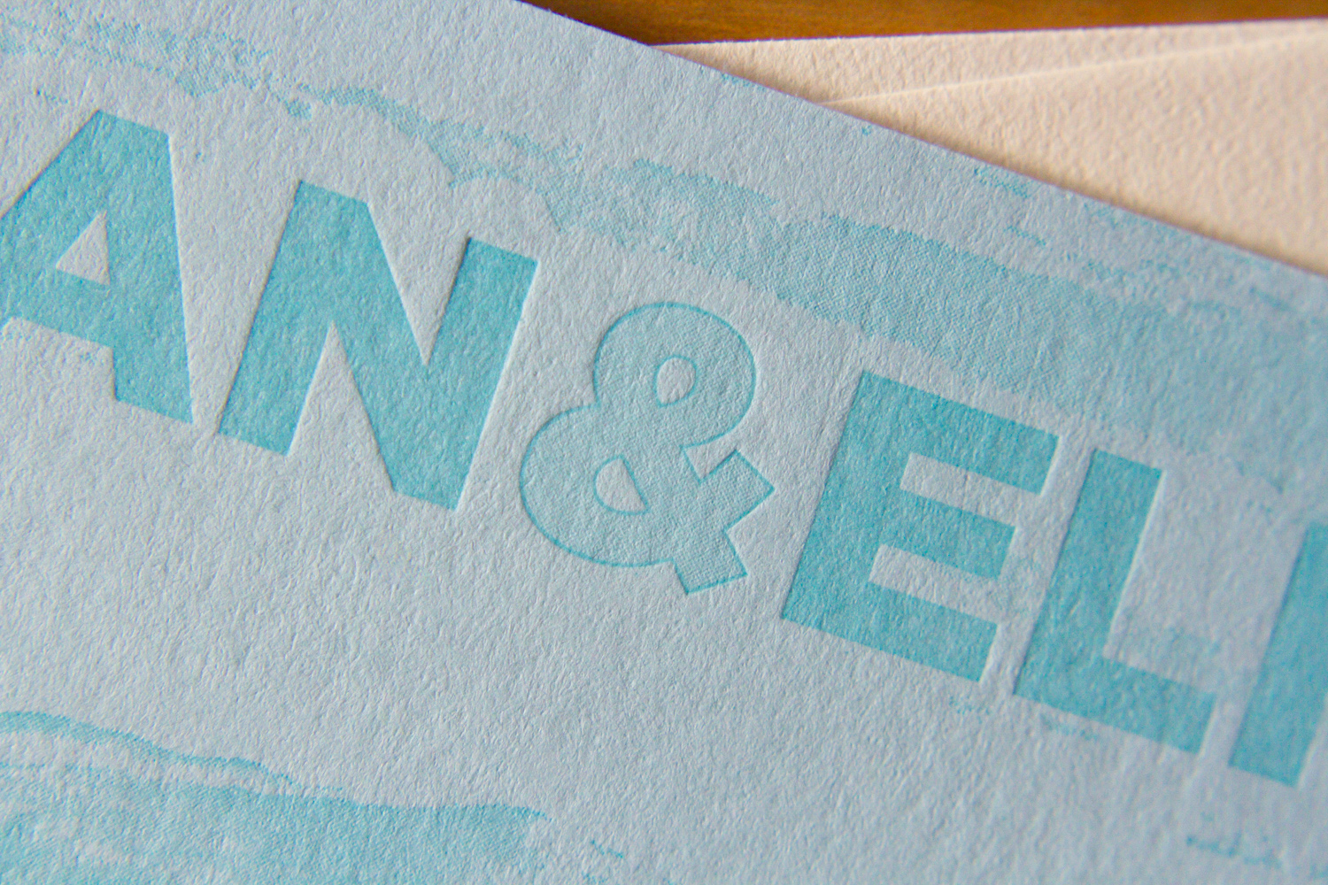
We love type-only designs. This one's got a simple monogram in Italic Garamond along with text in Neutra Light and Sloop Script.

We used a custom paper -- two sheets of Dark Gray 350g Colorplan duplexed to create a nice, thick 700g stock. The card was printed with silver foil, finished with silver edge paint, and paired with a pearl white cotton envelope.

Foil, Door Tags, and Alligators

It's great when we get to work with a wedding client from the very beginning – starting with the save the dates, moving on to the invitations, and then following through to the wedding day pieces. We did this for Elisa and Alexander, shifting the design vision slightly throughout the process while still maintaining a cohesive aesthetic.

For the save the date, we printed tinted white and Espresso inks on an oversized 600g Pearl White card, tucking the text in the corner and emphasizing the dandelion motif.

Photo by Sarah Arneson

Moving to the invitation set, we got a bit more elaborate and less minimalistic. The alligator-print-lined envelopes housed a gatefold card, guarded by a pair of blind-pressed gators. Inside was a 3-ink + gold foil invitation on thick Fluorescent White paper, a 2-ink + foil pre-party card, and a 2-ink reply card with a lined reply envelope.

We unfortunately don't have photos of the (awesome) programs, menus, and place cards, but we did snag a shot of these custom die-cut hanging door tags that the bride and groom gave to their guests staying at the venue.

Mid-Century Modern Floral

This lively set was based on a 60's style botanical motif printed in two shades of green. Designed by the bride (between her cake-baking sessions), the set was printed with two custom inks on 600g fluorescent white stock.

PLP_20141201setV2-0394.jpg

First, a square save the date card — emphasis on the date. The playful greens grow inwards from all sides. The "save the date" is in a handwritten-style script, and the date is in large bold text.

Next, the invitation itself. The flowers and vines border the top and bottom, giving an appearance of open white space on the sides. On closer inspection, an edge of stippled dots accents the two sides, and the spaces between the flowers, creating a casual but grounded border to the artwork frame.

Finally, an information card, to answer crucial questions about accommodations, dress code, and gift registries. This piece uses only a couple of the floral elements, at top and bottom. Together, these three pieces are great example of how use of color and motif can tie together distinct pieces — each has a different layout, and all are reinforced by the common design elements.

The floral elements of the set's design bring to mind Scandinavian mid-century modern influences. And the lemongrass and avocado colors are similarly evocative of the mid 20th century. All the designs were provided to us by the client, and there are so many parts to love. So here's a collection of detail shots.

One last note, as a brief digression from the design … remember when putting your invitation together that you can say whatever you want to say. This goes especially for information cards. In addition to basic events/travel/lodging details, it's a great place to convey anything you need to the guests. If there are some conditions (a ceremony on a grass lawn, possibility of unpredictable weather, etc.) feel free to say it! Be conversational, be you. We love the way this couple addressed their invitees, and the dress code below is just one example. The warm and chatty tone made it very personal, and goes perfectly with the whimsical graphic style of the artwork.

Photos by Sarah Arneson
Custom Monogram in Santa Fe

Ah, the blind-pressed monogram. Hard to go wrong when you use a lightly tinted white ink with a deep impression on thick cotton paper.

We carried the variations of the monogram through to each piece — an accommodations card with a tear-off reply card, a menu, table numbers with a blind chevron pattern and inkjet numbers, and programs with silver ink on navy cotton paper.

Most letterpress inks are transparent, so we can't print light ink on dark paper. But silver is an exception — it's about 75% opaque. Not quite as opaque as foil, but not as pricey either.

Photos by Sarah Arneson
Botanical Postcards

This two-sided client-designed save the date postcard combines light warm gray letterpress ink for the front with flat inkjet printing on the back.

The botanical image has wonderful ornate detail while the R+B monogram on the back is simple and clean. The two styles work beautifully together.

When printing two-sided, we can use letterpress for both, but it's sometimes nice to flat print one of the sides like we've done here. That way the impression from one side doesn't interfere with the impression from the other.

Lavender & Mint in Scappoose

Here's a lovely wedding set for Parklife's favorite brother and his favorite new wife. For the save the date we used two custom inks on thick 600g ecru paper.

For the invitations, we carried through the same inks, paper, along with a few variations on the Gotham typeface.

On the back of the invitation we added a hand-duplexed backing that's letterpress printed with a tonal ink and a fine halftone screen. The image is adapted from an early nineteenth century drawing of Portland.

Photos by Sarah Arneson
Leaves in Motion

This cheerful set was based on Parklife's Antiquity. It's one of our most popular designs. As we describe on the site, "The overlapping light and dark motifs give this invitation a sense of motion that's unlike anything else in our collection." This version has been modified a bit: the couple chose pearl white paper and a vertical orientation. By the way: we love it when people ask for modifications; our designs are a jumping-off point, but we want our clients to have exactly what they want.

This set had a fun combination of a traditional-looking calligraphic script paired with a modern, expressionistic contour drawing of leaves and garlands.

The thin parts of the script's stroke mirror the line art of the flora design. The two inks, midnight and peacock, compliment each other beautifully, and pop off the pearl white stock. The pieces are edge-painted in midnight.

Along with the invitation and RSVP card and printed return envelope, the set included these two additional pieces. An information card detailed directions and accommodations, and a separate card invited guests to a welcome dinner and a farewell brunch.

The dancing vines weren't the only graphic elements of this set. The RSVP card used playful icons — a cow, a fish, some carrots — for guests to select either the beef, seafood, or vegetarian dinner options. And, the "additional events" card featured custom illustrations done by Parklife Press. For the welcome dinner: a homey, old-school charcoal barbecue; and for the farewell brunch: a bloody mary, complete with celery stalk.

Photos by Sarah Arneson