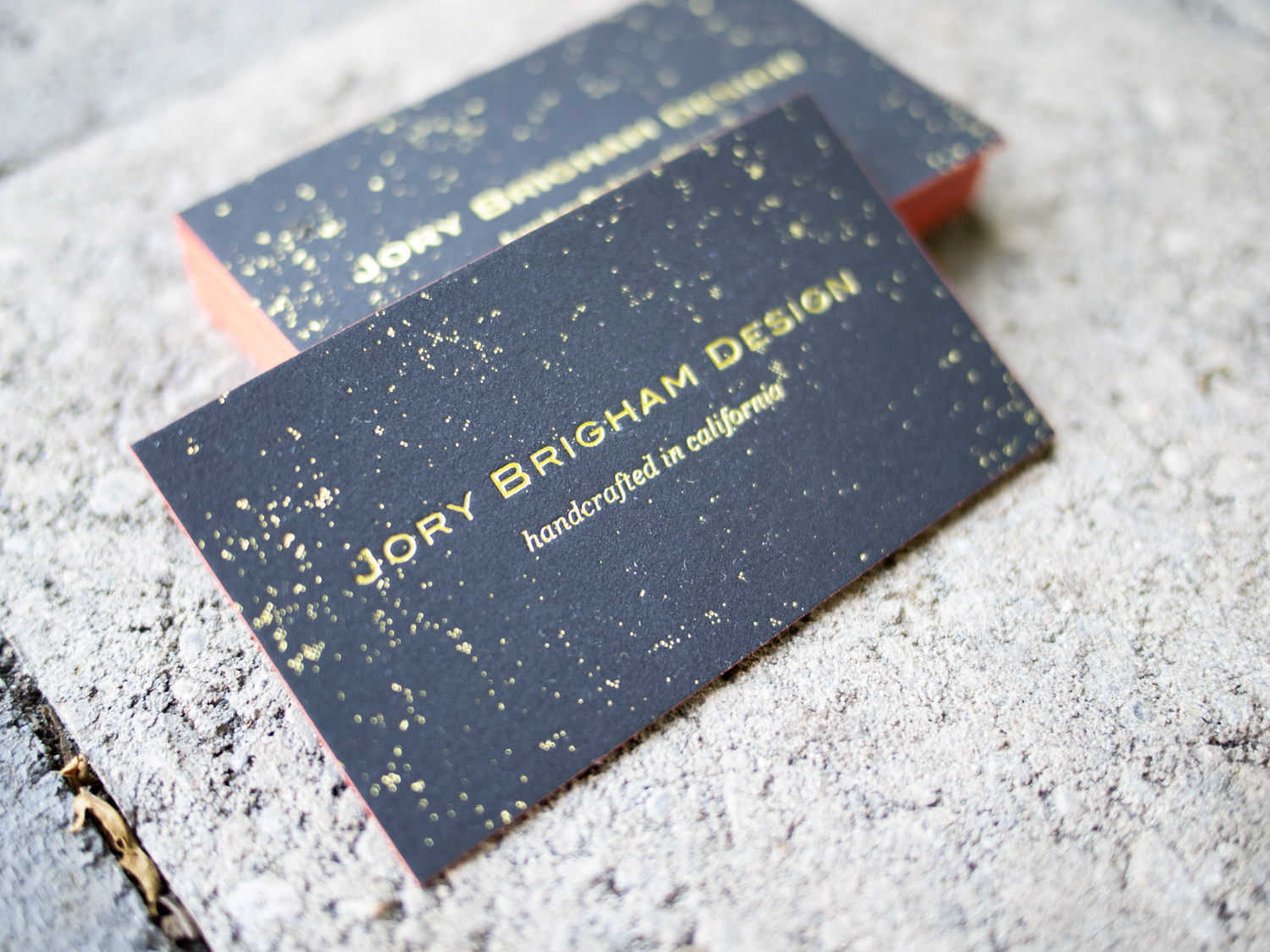
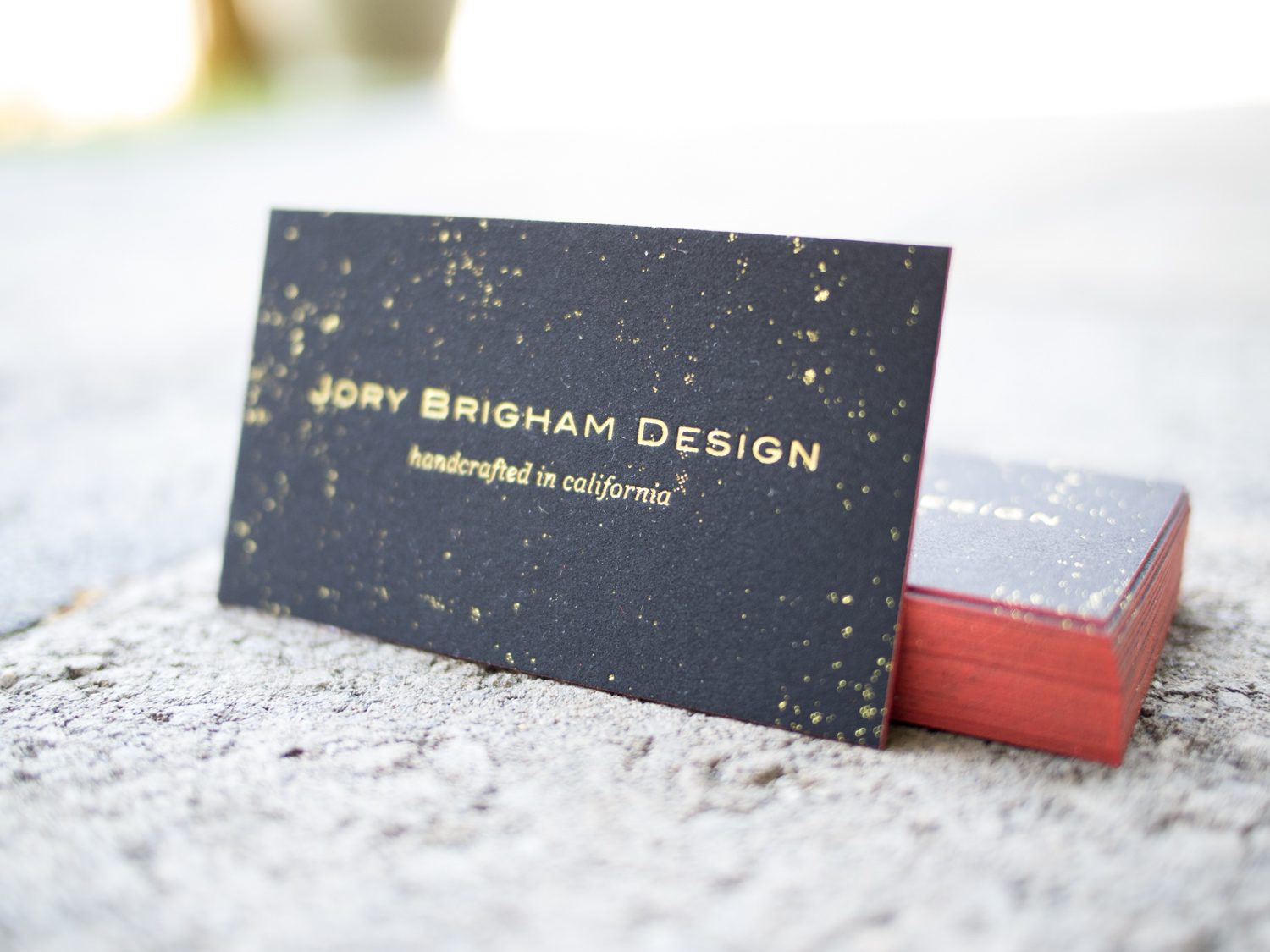
Business Cards for Jory Brigham Design

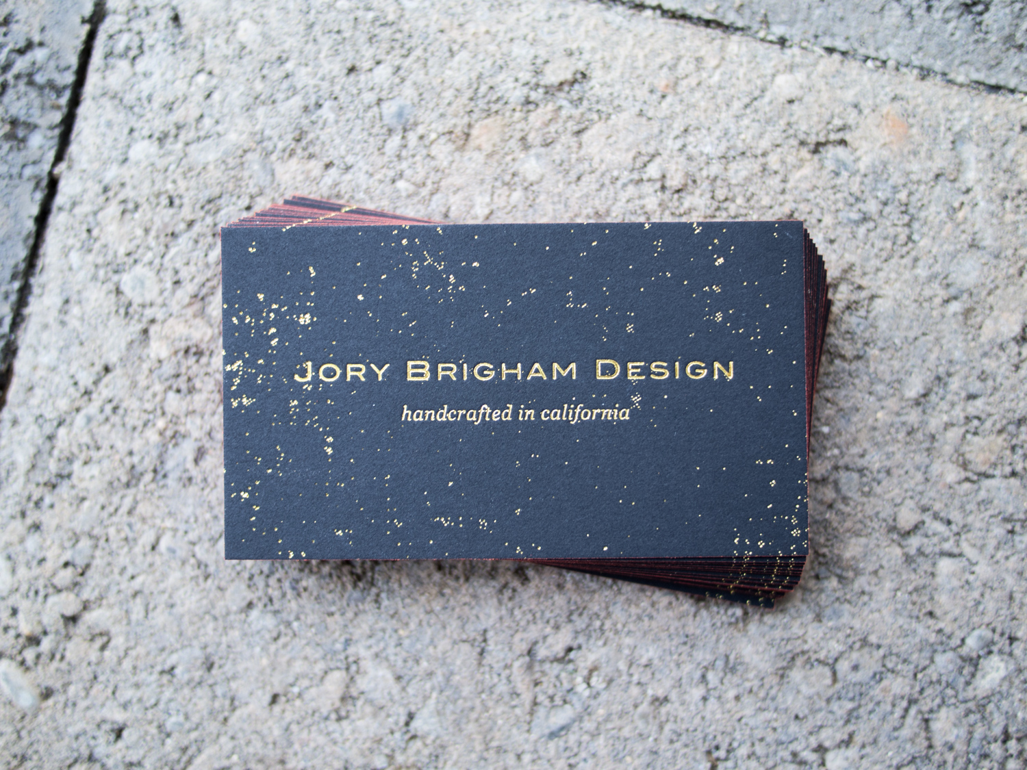
We first worked with Jory in January when he asked us to print a display sign for his award winning ping pong table. For that project we used gold ink on 4-ply museum board (about 60pt thick).

Love gold ink on black paper. This one's printed on super thick 60pt Rising Museum Board. #letterpress

A photo posted by Parklife Press (@parklifepress) on

A few months later, Jory game to us for business cards. We again went with a gold-on-black look, but this time with thinner 2-ply museum board and metallic gold foil. We finished the cards with a rich orange edge paint.
Just a Dream (About Letterpress)

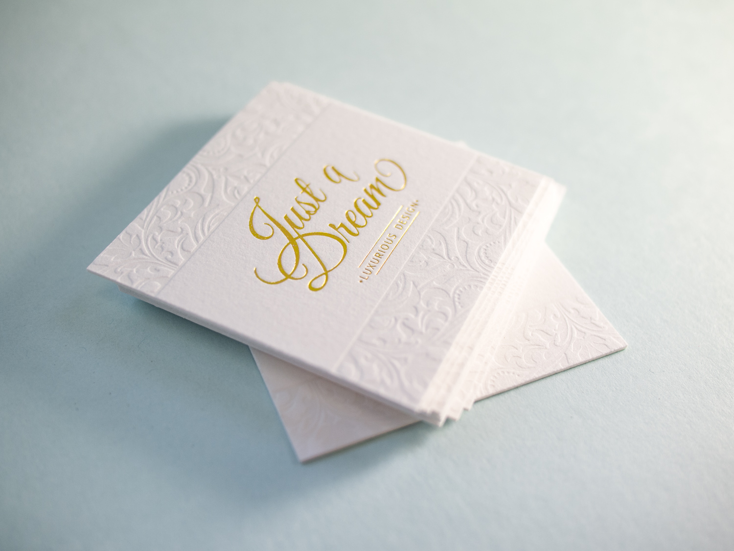
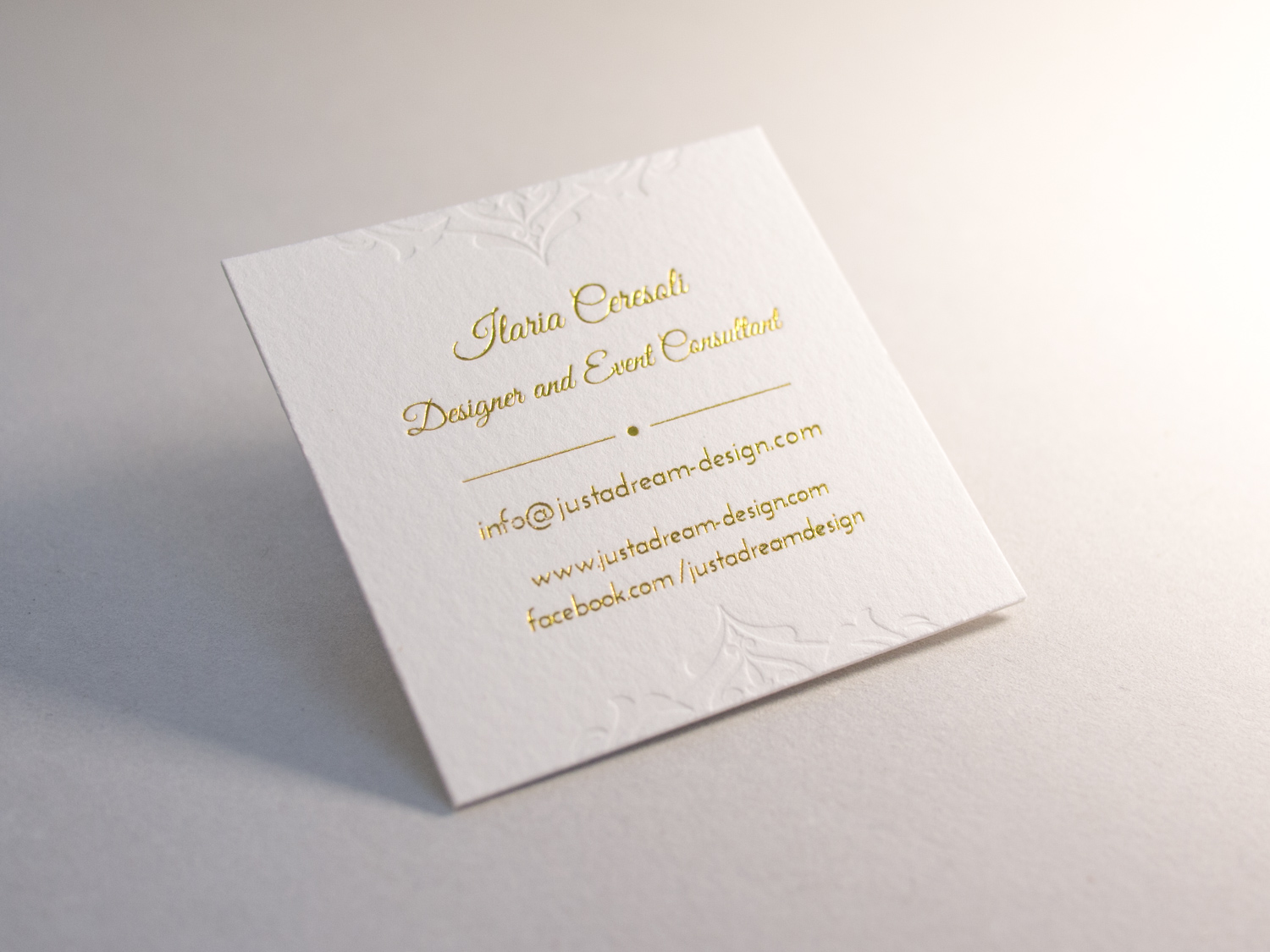
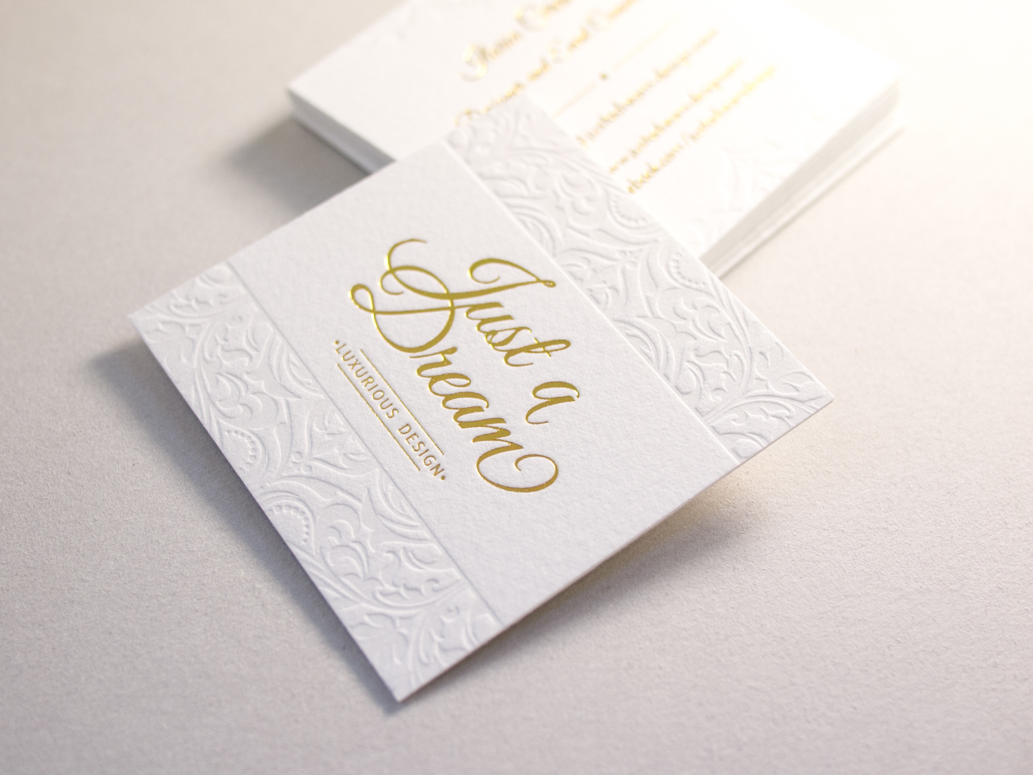
For designer and event consultant, Ilaria Ceresoli and her business Just a Dream, we printed these super-deluxe foil + letterpress business cards on 100% cotton Somerset paper.

Since Ilaria designed these with foil and a blind deboss on both sides, we printed the front and back on separate sheets of 330g Somerset paper, then duplexed them after printing so that the impressions didn't get flattened.

Our Letterpress Halloween Card = 15% Off Business Orders

Our 2015 Letterpress Halloween Card

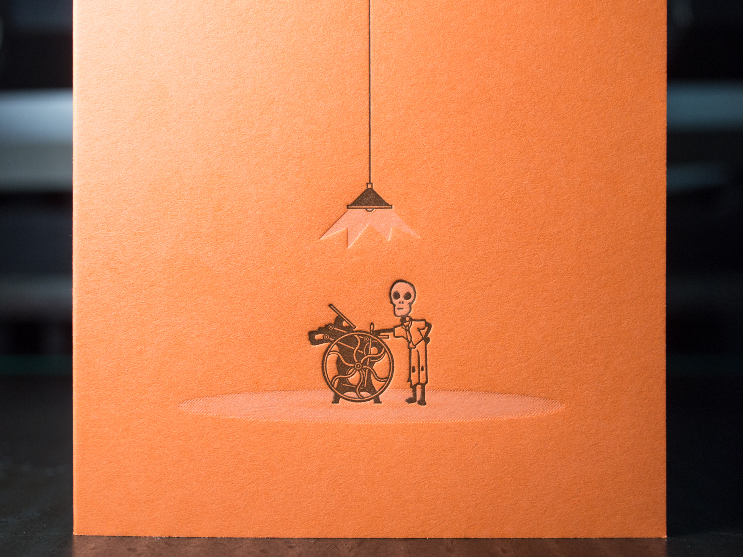
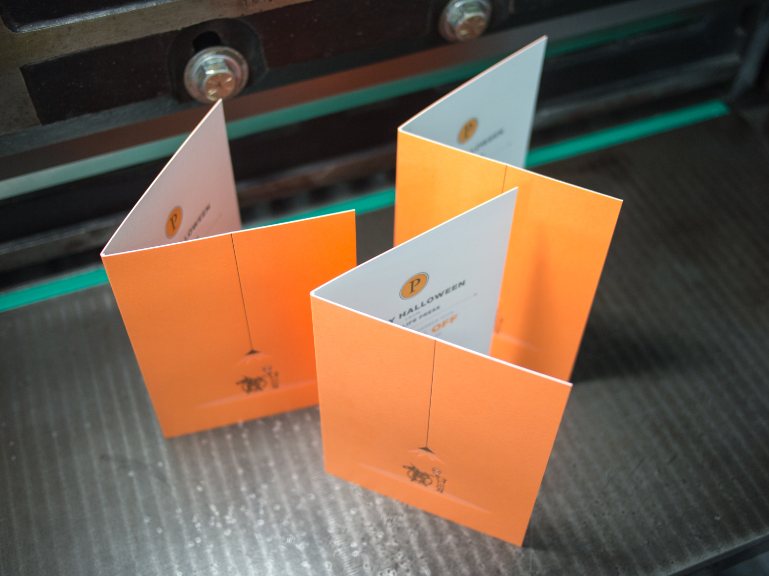
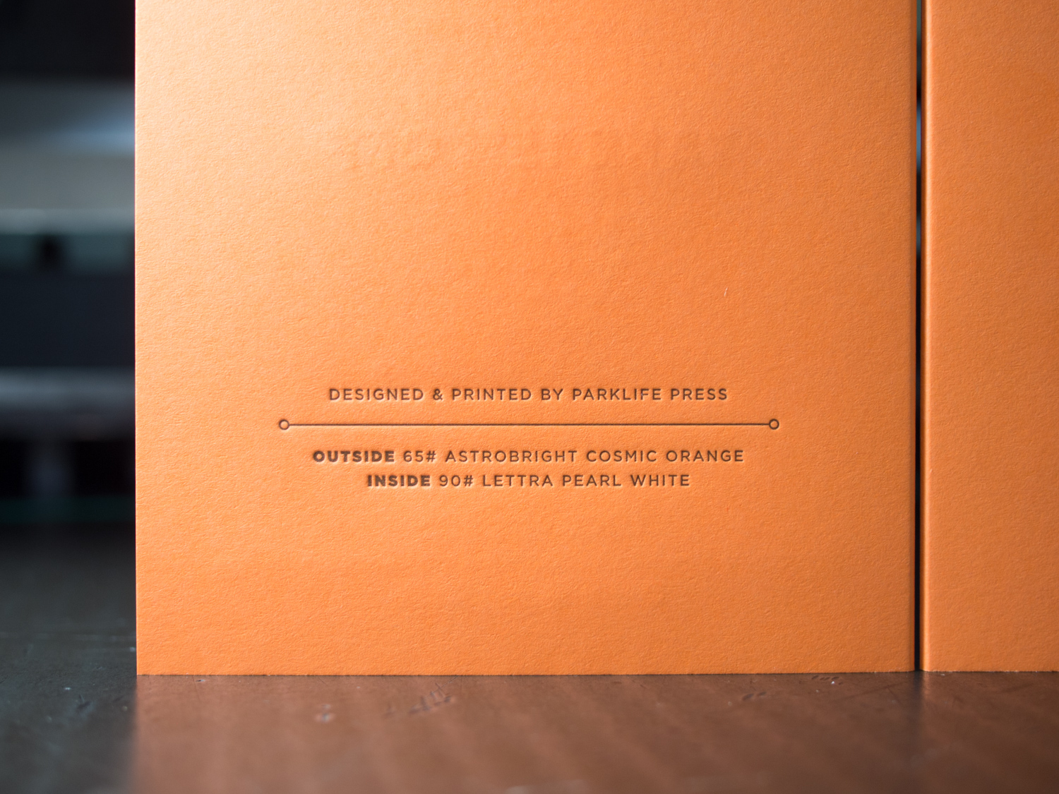
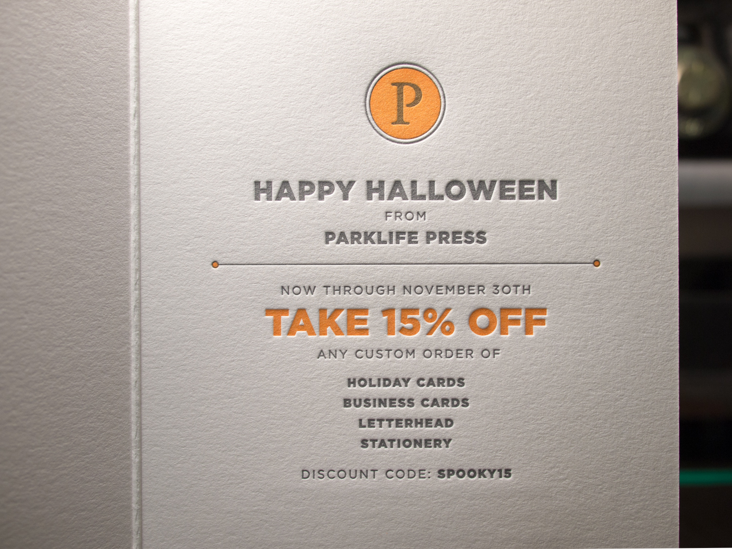
Whoa. Check out this hot-off-the-press Halloween card — designed and printed right here at our Portland studio. On the outside it features a medium gray ink and a 50/50 mix of transparent and opaque white on 65# Neenah Astrobrights Cosmic Orange. And on the inside it's the same gray ink plus a custom orange on 90# Pearl White Lettra. All hand duplexed of course.

Oh, and what exactly is going on inside? It's 15% off any business-related custom printing now through the end of November. That could mean business card, holiday cards, letterhead, or maybe some letterpress coasters for your company's New Year's Eve bash.

We mailed these out to a select bunch of loyal customers, but figured the whole world should be clued in too. The whole world reads this blog, right? Probably.

Ontario Blossoming

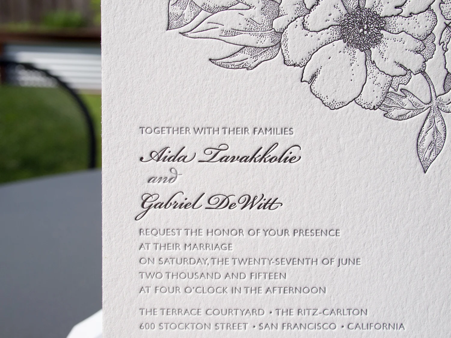
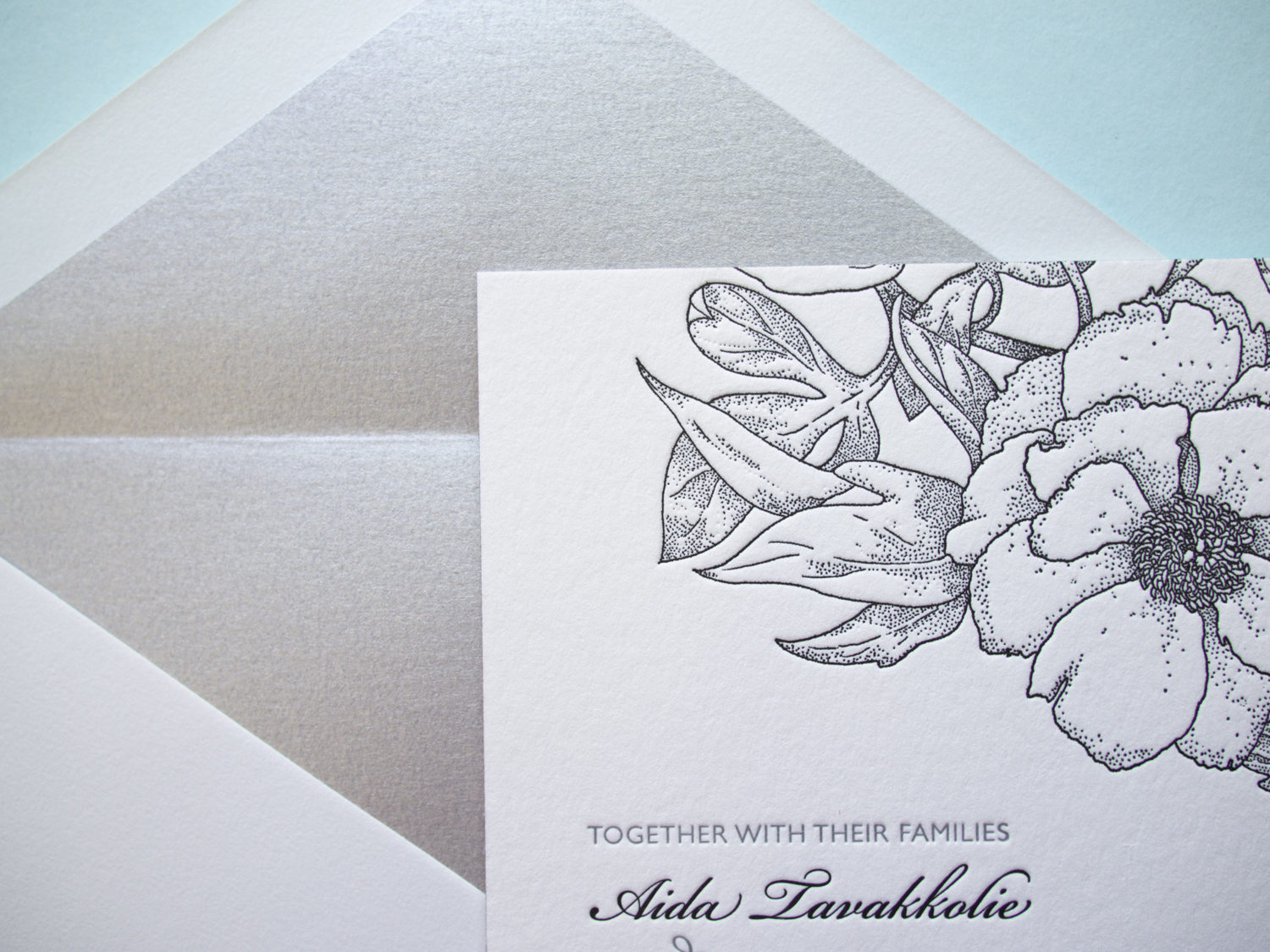
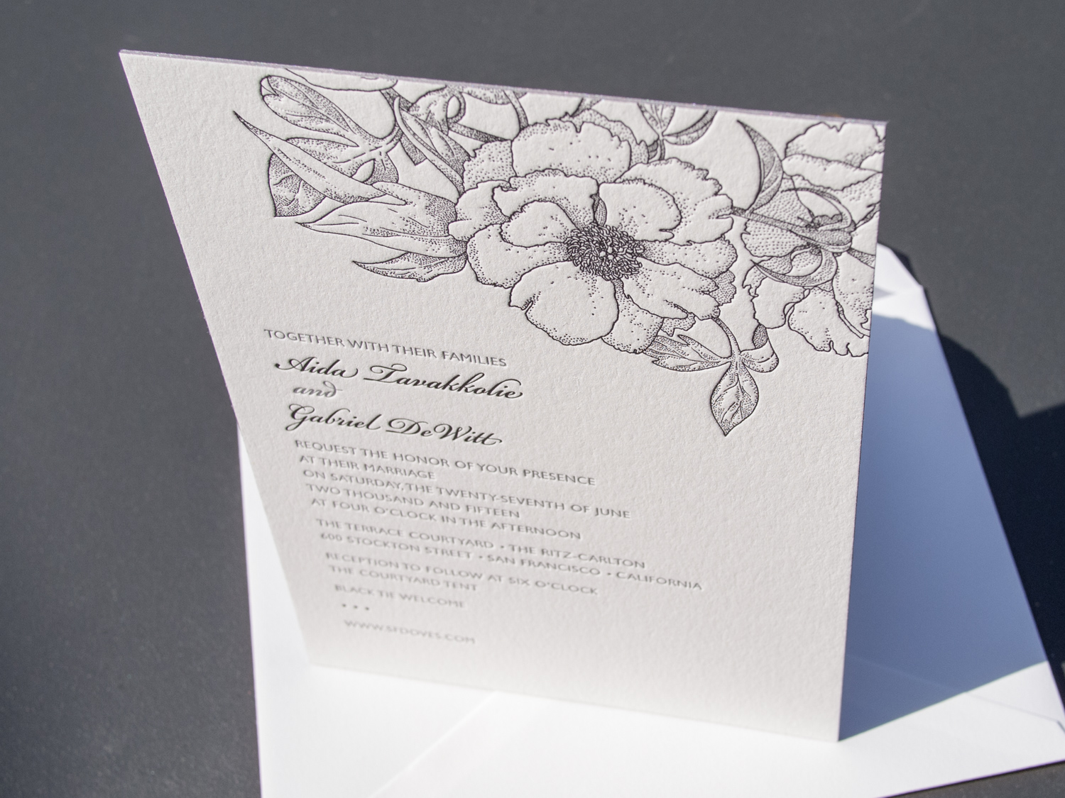
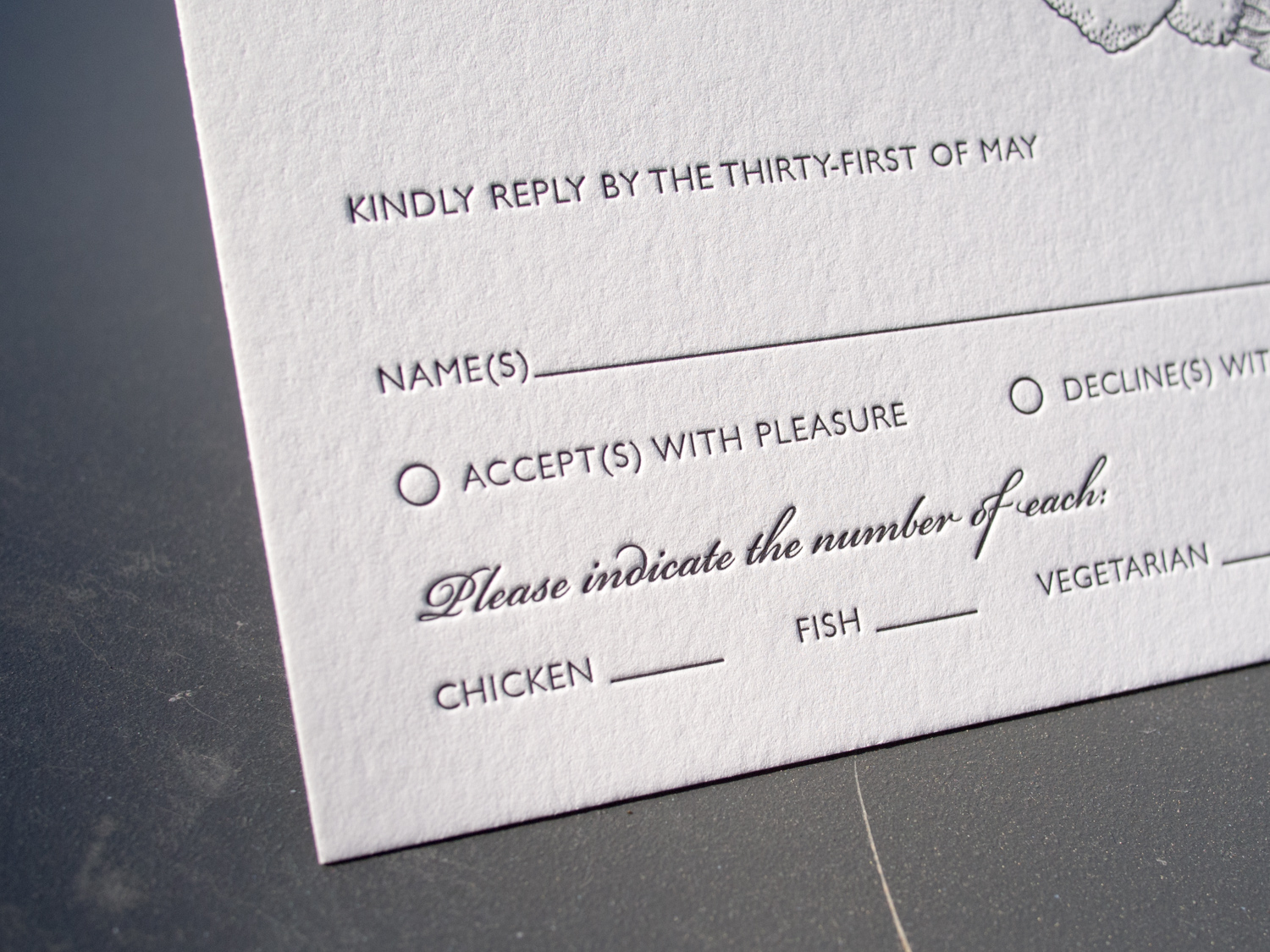
Gabriel & Aida saw two of our most popular wedding invitations, our Ontario and Blossom styles, and asked, "why choose?". Why not Ontariossom? Or Blosstario? 

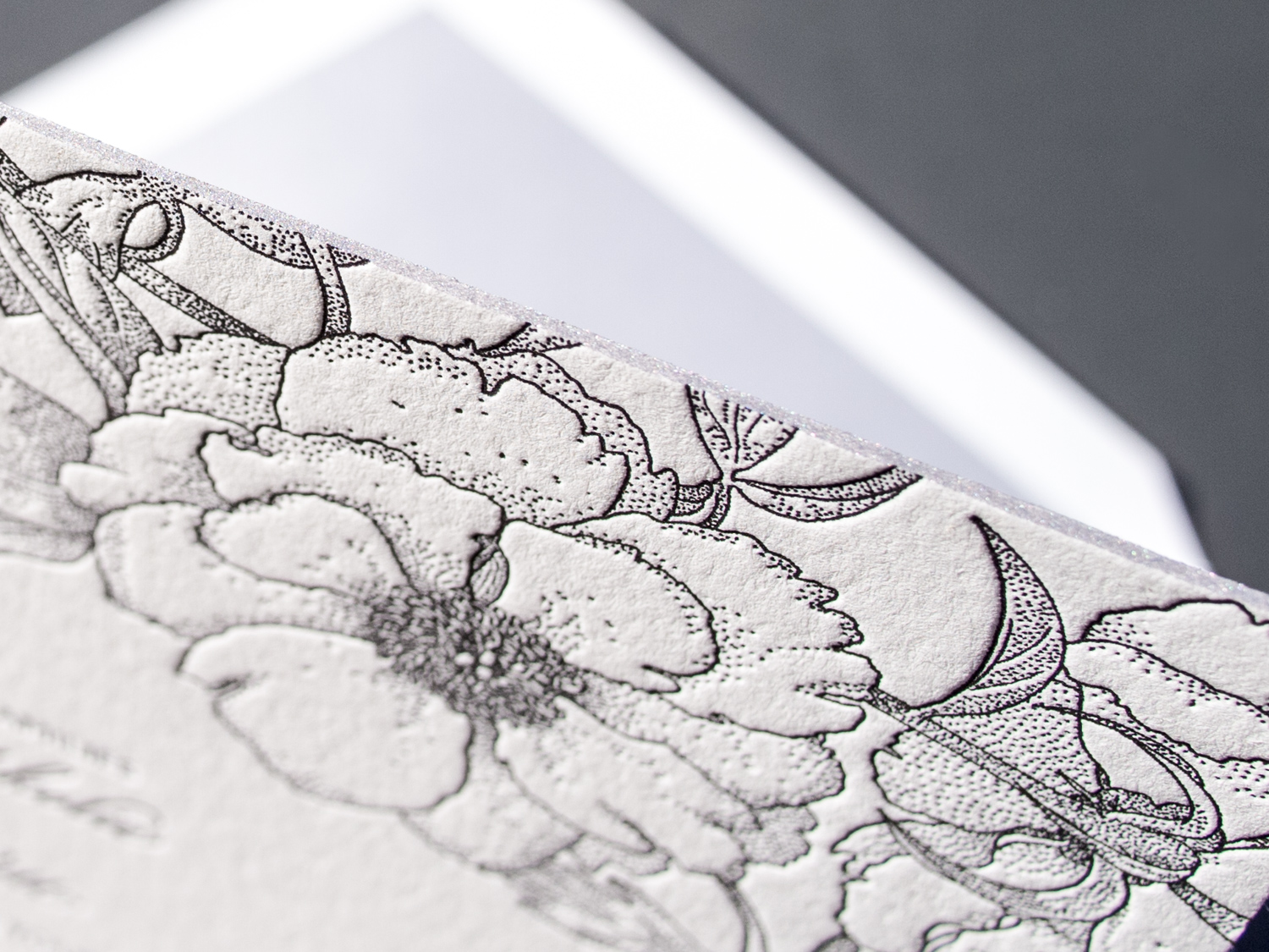
With our help, they combined the modern typefaces and sleek black / white / silver color scheme of our Ontario style with the classic floral motif from our Blossom design.

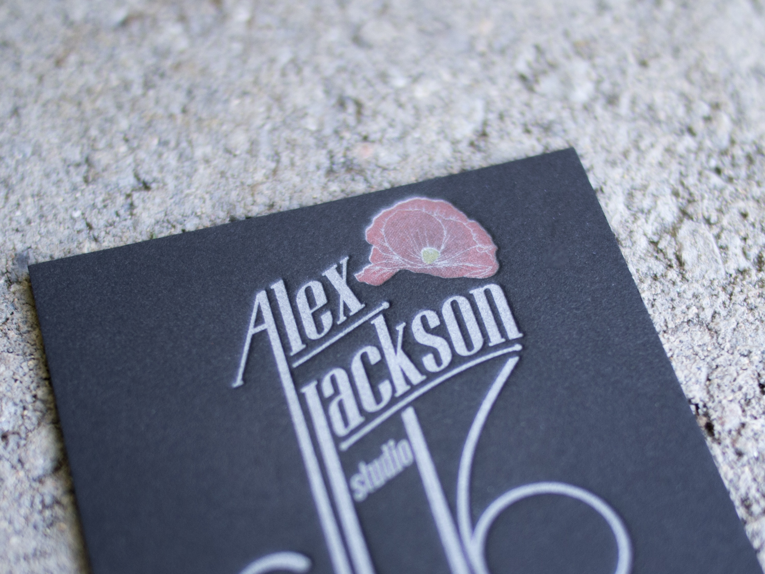
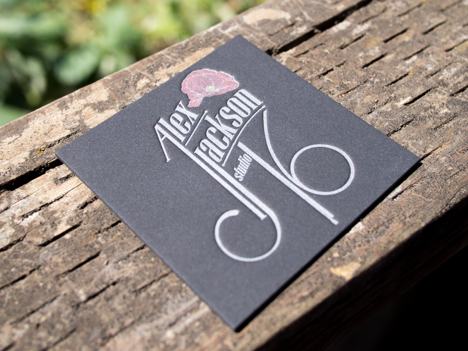
Four Inks on Black for Alex Jackson Studio

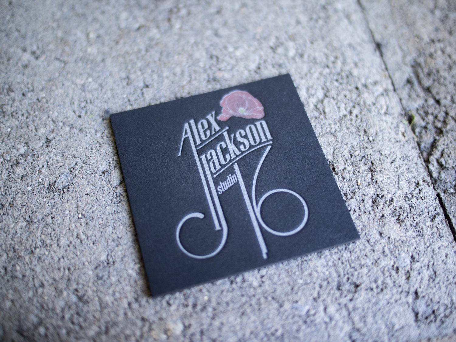
Letterpress printing on black paper can pose challenges. Most letterpress inks are transparent, so they're not going to show up on a black background. One exception is silver. Silver ink is mostly opaque (about 80%), so if you're sneaky, you can print a silver ink run on the black paper to create a lighter base, then print any color you'd like on top.

For Alex Jackson Studio we started with thick 4-ply black museum board and a silver ink run. Then we added the red rose artwork and a subtle yellow stamen, leaving a super-thin silver outline and tiny silver veins. On top of the red, we printed a gray halftone gradation to create shading (check out our halftone blog post if you're not sure what that is).

animation.gif

This technique requires really tight registration, but it allows for an effect you don't see often with letterpress. Our PDX sports fan coasters were done the same way. More photos of Alex's cards are below.

Letterpress Posters for Bowdoin College

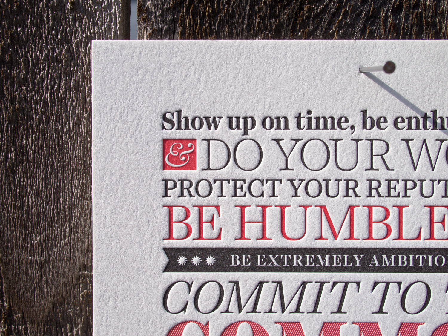
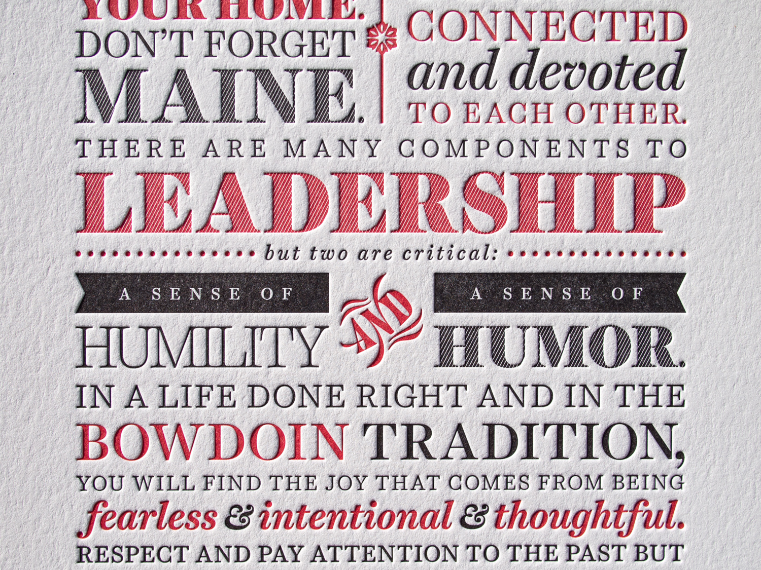
Barry Mills served as president of Maine's Bowdoin College from 2001 until this past July. Upon his departure, the college asked us to print his manifesto as a 6" x 15" letterpress poster.

Since we use a Chandler & Price platen press, which isn't really designed for larger pieces like this, we actually printed this two-color piece in four separate runs. That way we could get a nice even and deep impression into the 600g Lettra paper.