For us, 2015 has been the year of foil. Check out these awesome foil stamped employee recognition cards we printed for Canada's Ian Martin Group.
All six sets were printed with gold foil on 600g Ecru Lettra paper, then finished with gold edge paint.
For us, 2015 has been the year of foil. Check out these awesome foil stamped employee recognition cards we printed for Canada's Ian Martin Group.
All six sets were printed with gold foil on 600g Ecru Lettra paper, then finished with gold edge paint.
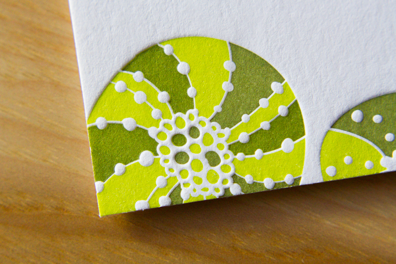
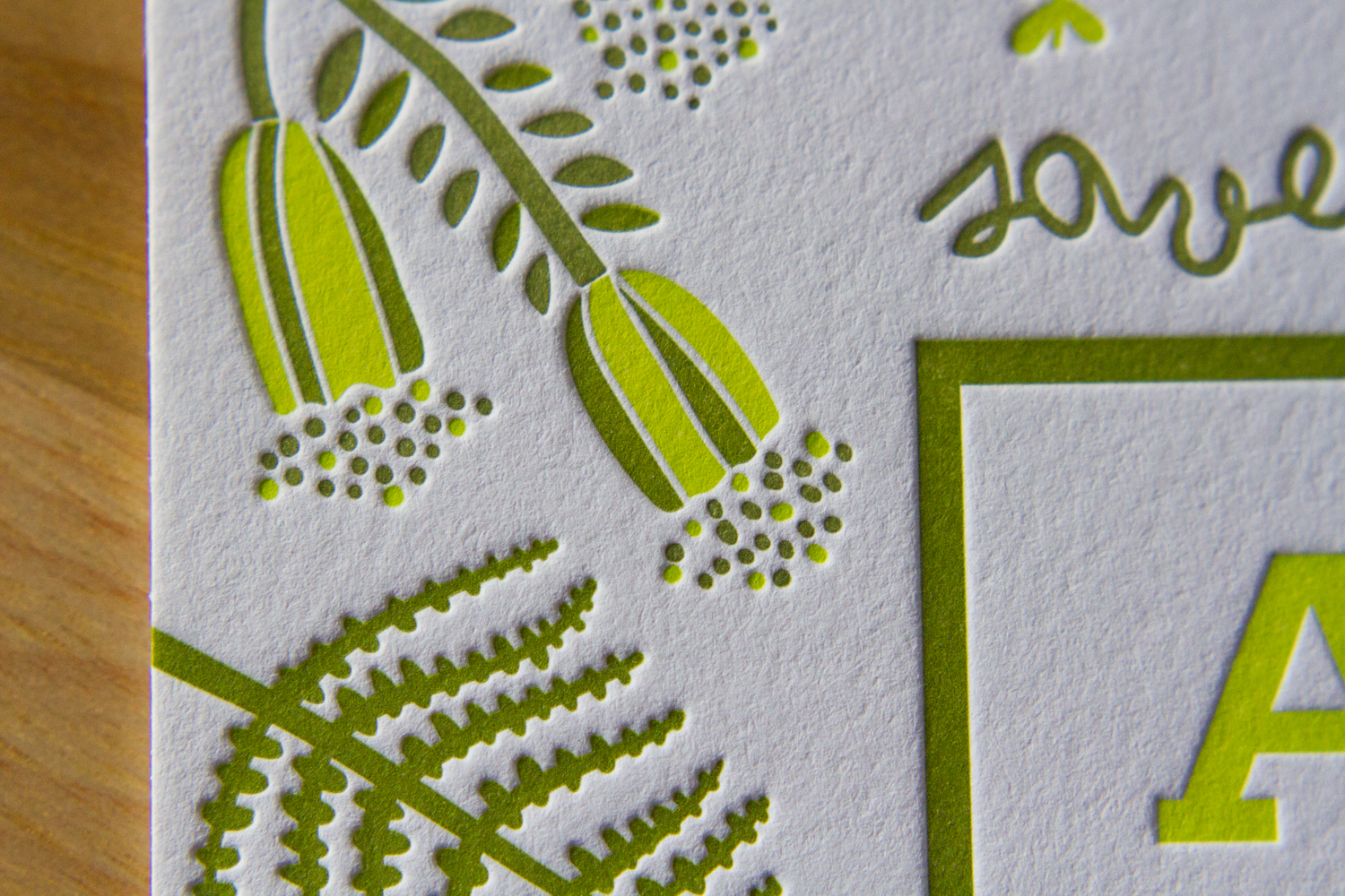
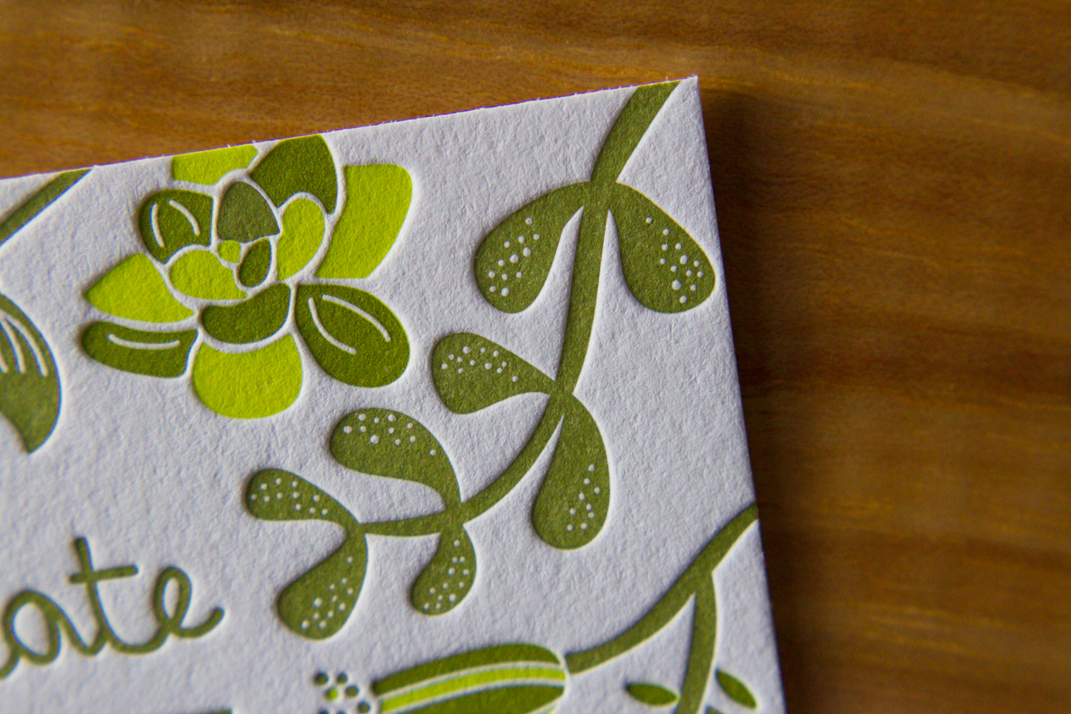
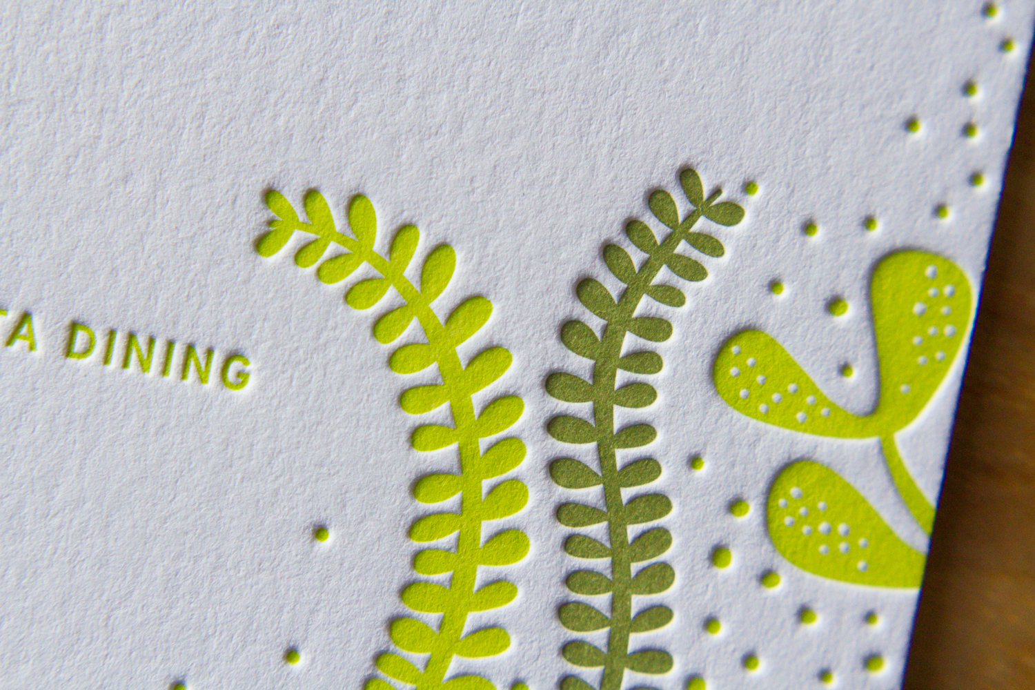
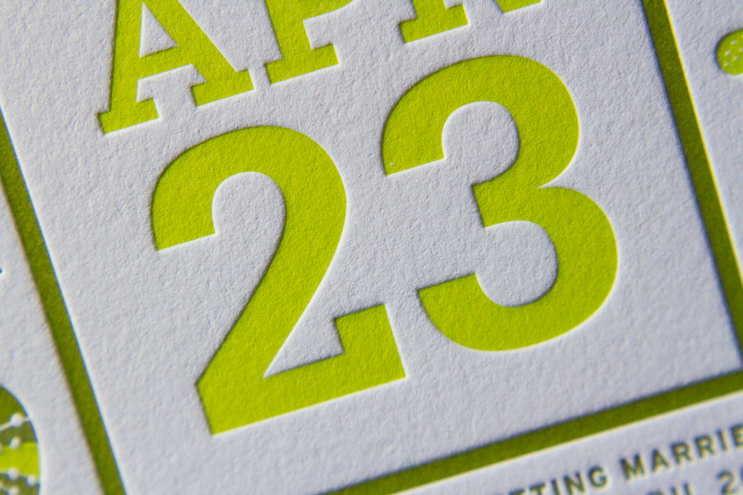
This lively set was based on a 60's style botanical motif printed in two shades of green. Designed by the bride (between her cake-baking sessions), the set was printed with two custom inks on 600g fluorescent white stock.

First, a square save the date card — emphasis on the date. The playful greens grow inwards from all sides. The "save the date" is in a handwritten-style script, and the date is in large bold text.

Next, the invitation itself. The flowers and vines border the top and bottom, giving an appearance of open white space on the sides. On closer inspection, an edge of stippled dots accents the two sides, and the spaces between the flowers, creating a casual but grounded border to the artwork frame.

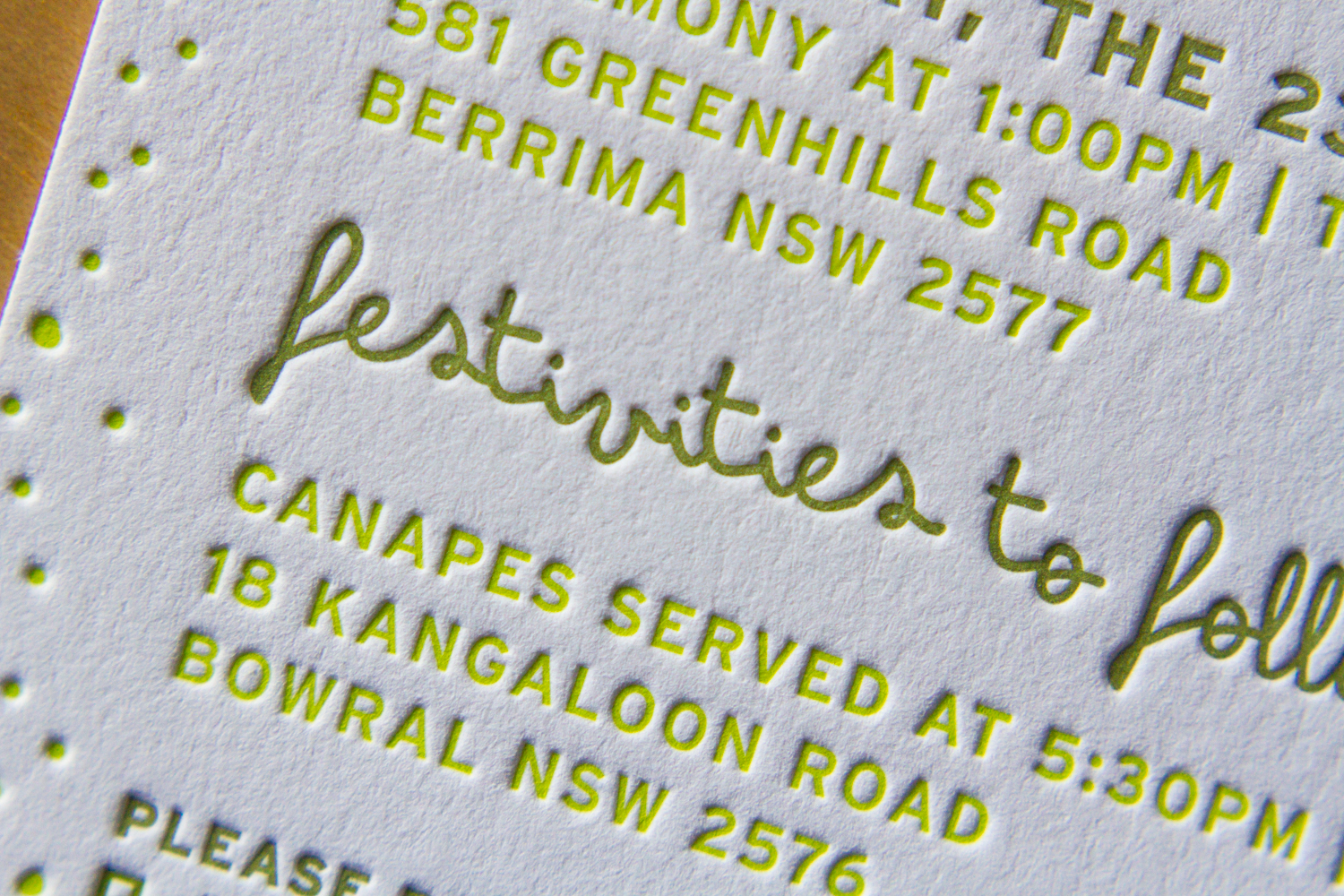
Finally, an information card, to answer crucial questions about accommodations, dress code, and gift registries. This piece uses only a couple of the floral elements, at top and bottom. Together, these three pieces are great example of how use of color and motif can tie together distinct pieces — each has a different layout, and all are reinforced by the common design elements.

The floral elements of the set's design bring to mind Scandinavian mid-century modern influences. And the lemongrass and avocado colors are similarly evocative of the mid 20th century. All the designs were provided to us by the client, and there are so many parts to love. So here's a collection of detail shots.
One last note, as a brief digression from the design … remember when putting your invitation together that you can say whatever you want to say. This goes especially for information cards. In addition to basic events/travel/lodging details, it's a great place to convey anything you need to the guests. If there are some conditions (a ceremony on a grass lawn, possibility of unpredictable weather, etc.) feel free to say it! Be conversational, be you. We love the way this couple addressed their invitees, and the dress code below is just one example. The warm and chatty tone made it very personal, and goes perfectly with the whimsical graphic style of the artwork.


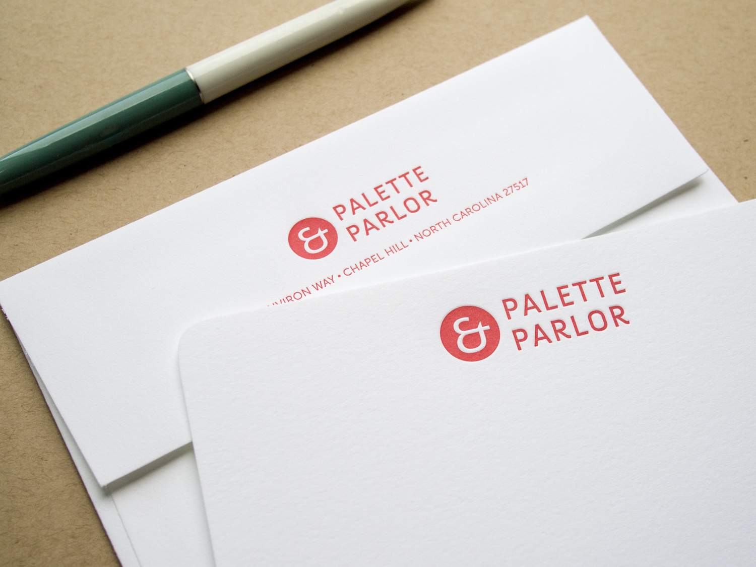
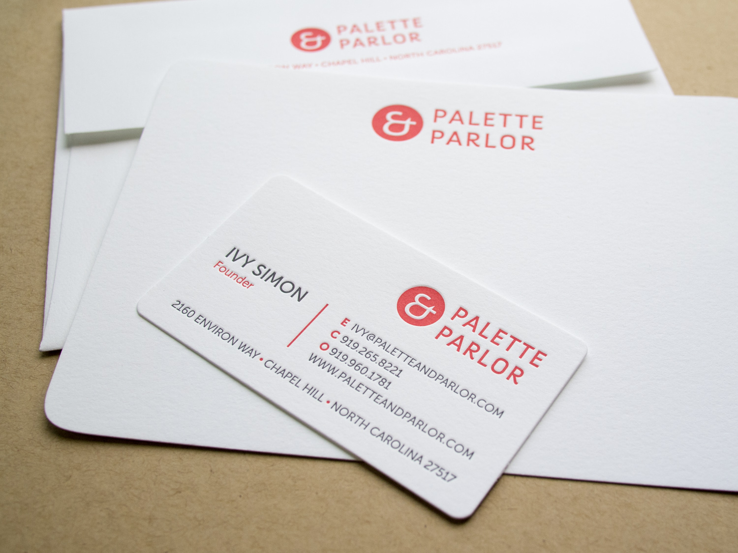
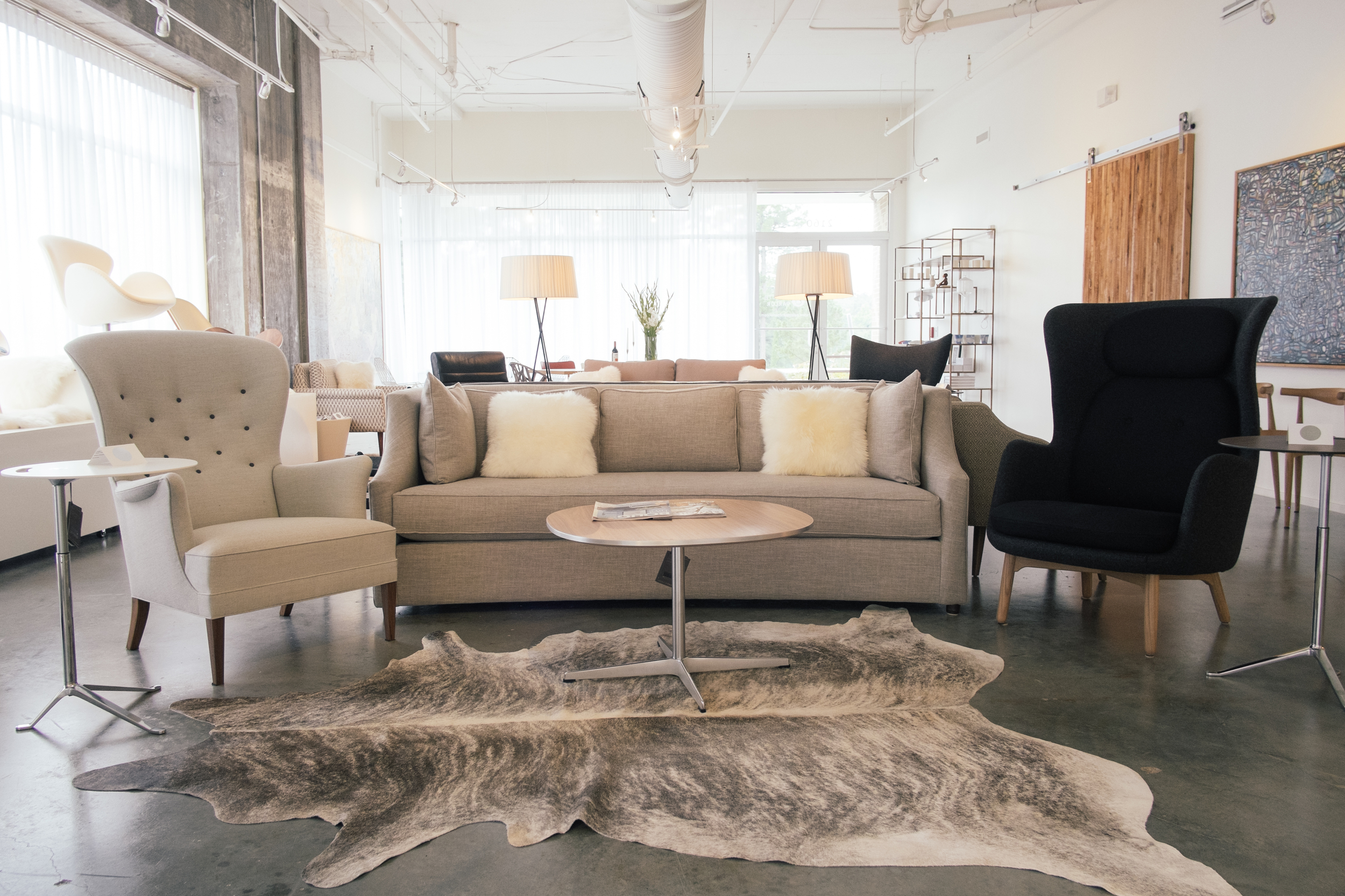
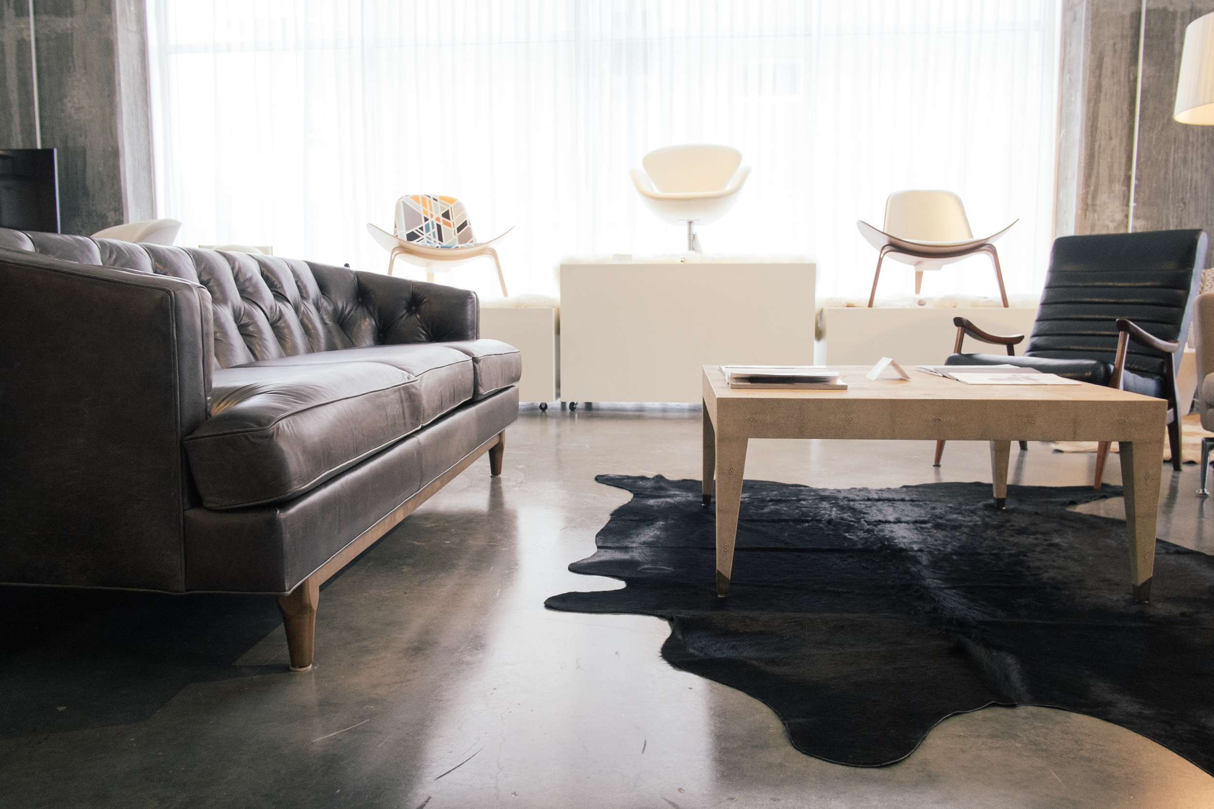
As we were moving Parklife Press from North Carolina out to Oregon last summer, Ivy and John were bringing their Chapel Hill furniture studio into full swing. We're no longer in the same town, but that doesn't mean we can't still work together.
We printed note cards and business cards with custom inks on 300g Fluorescent White Lettra paper with die cut corners and matching A6 envelopes. A nice complement to P&P's simple aesthetic.
Ah, the blind-pressed monogram. Hard to go wrong when you use a lightly tinted white ink with a deep impression on thick cotton paper.

We carried the variations of the monogram through to each piece — an accommodations card with a tear-off reply card, a menu, table numbers with a blind chevron pattern and inkjet numbers, and programs with silver ink on navy cotton paper.
Most letterpress inks are transparent, so we can't print light ink on dark paper. But silver is an exception — it's about 75% opaque. Not quite as opaque as foil, but not as pricey either.
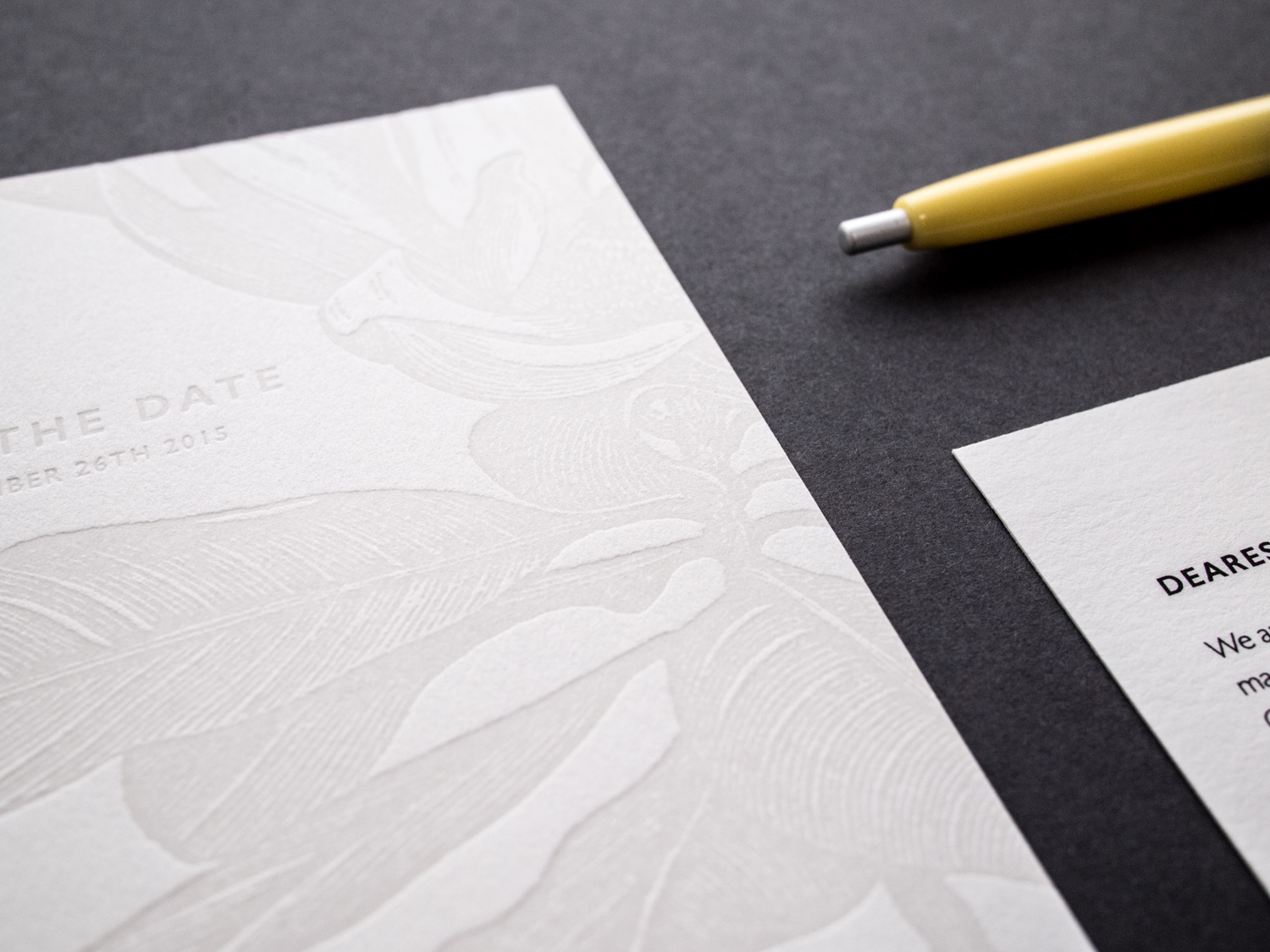
This two-sided client-designed save the date postcard combines light warm gray letterpress ink for the front with flat inkjet printing on the back.
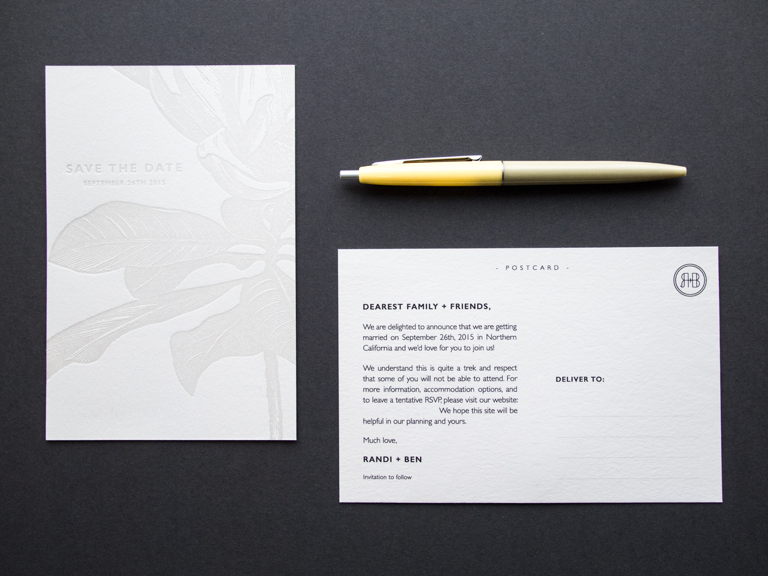
The botanical image has wonderful ornate detail while the R+B monogram on the back is simple and clean. The two styles work beautifully together.
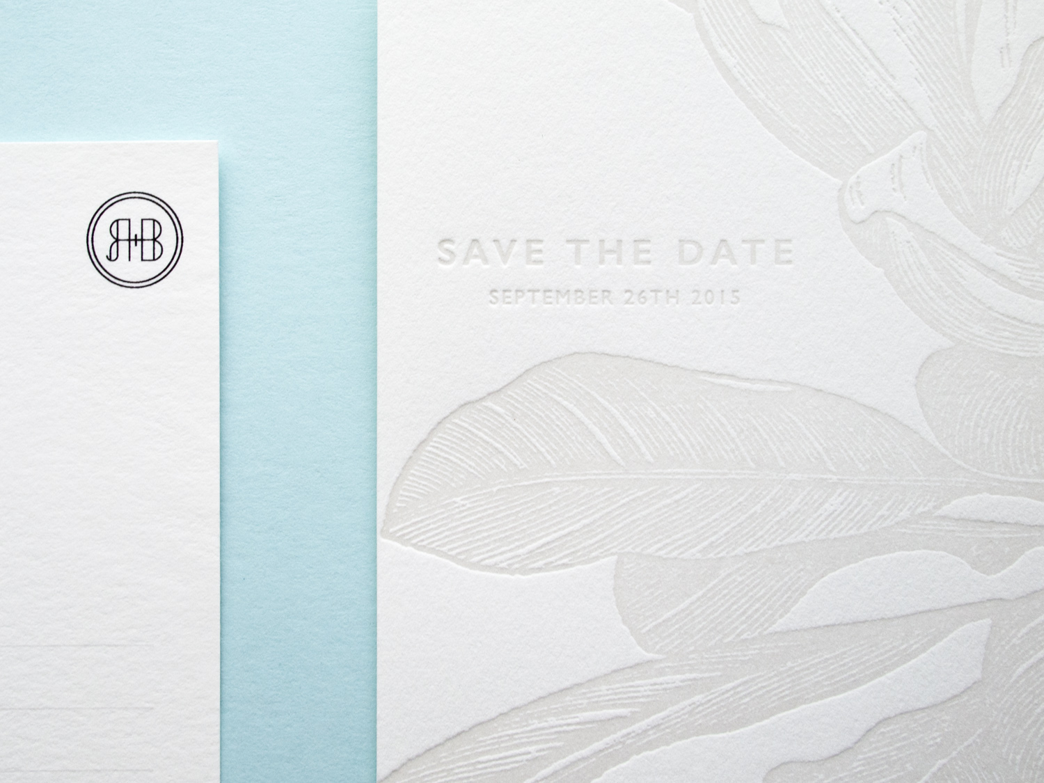
When printing two-sided, we can use letterpress for both, but it's sometimes nice to flat print one of the sides like we've done here. That way the impression from one side doesn't interfere with the impression from the other.
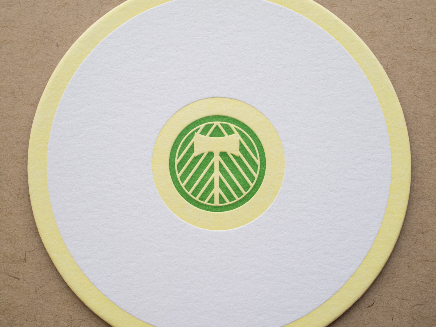
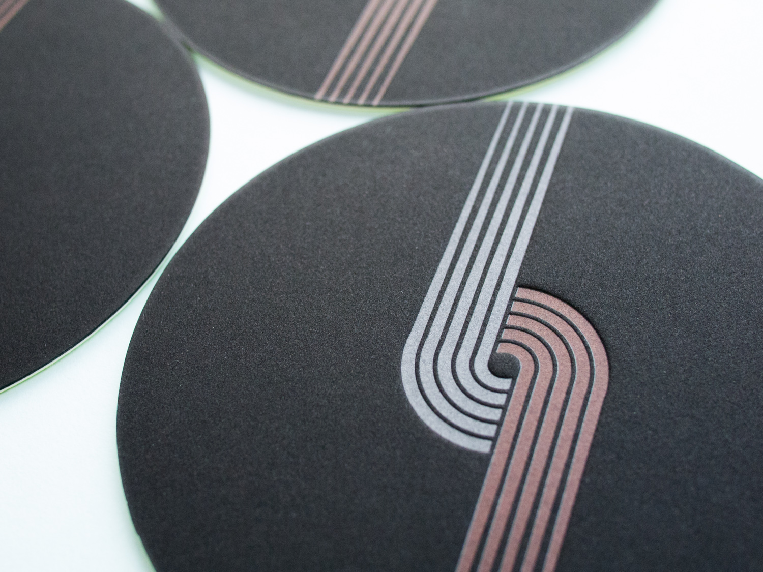
Looking for the perfect gift for your beverage-sipping Portland sports fan friend? Well shoot, these aren't for sale. But if they were, they'd be perfect... if not a little pricey.

We printed the Timbers side with two inks on 300g Fluorescent White Lettra. On the opposite side, we printed a modified Trail Blazers logo with silver and red inks on ridiculously thick 4-ply rich black museum board. Then we duplexed the two sheets by hand and die cut them to 4 inch 80pt thick circles.
Silver is one of the few letterpress inks that's opaque; most non-metallics are transparent. So we printed the full Blazer logo in silver to create a light-colored base, then printed red ink on top of the silver for half of the logo. If we'd just printed red on black, the color would be completely lost.
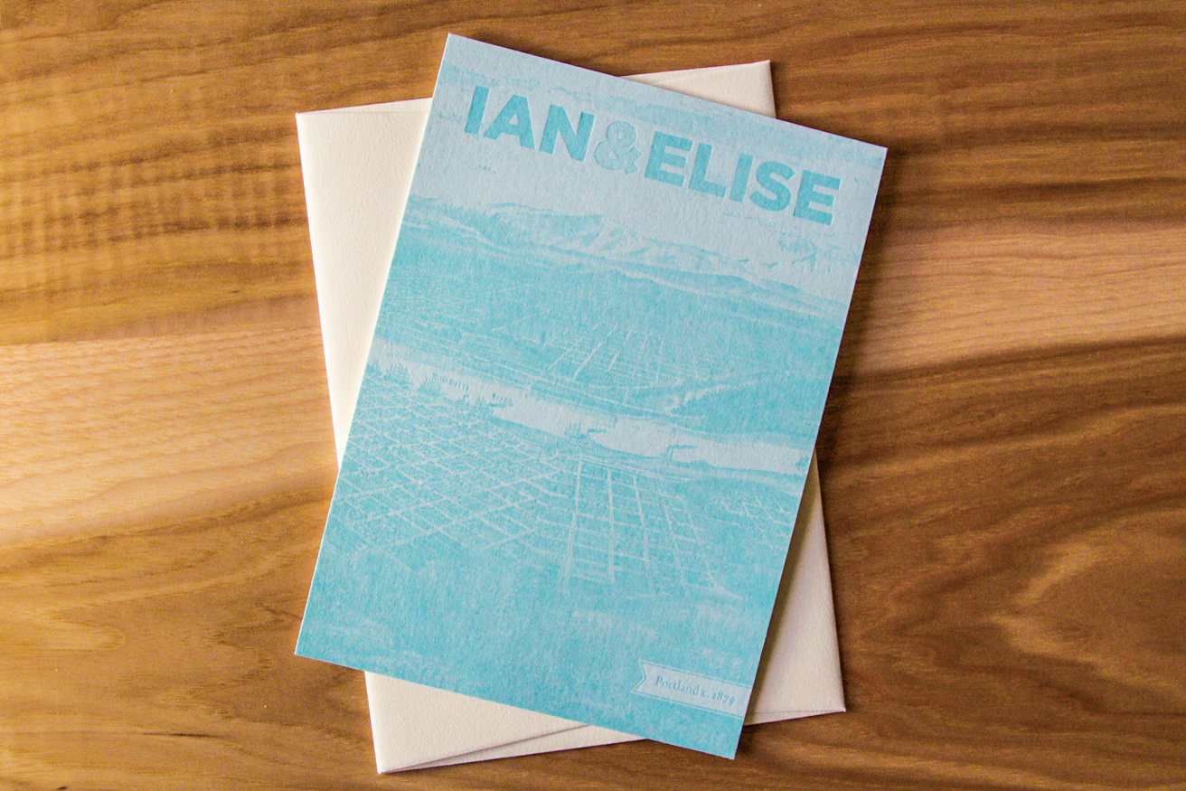
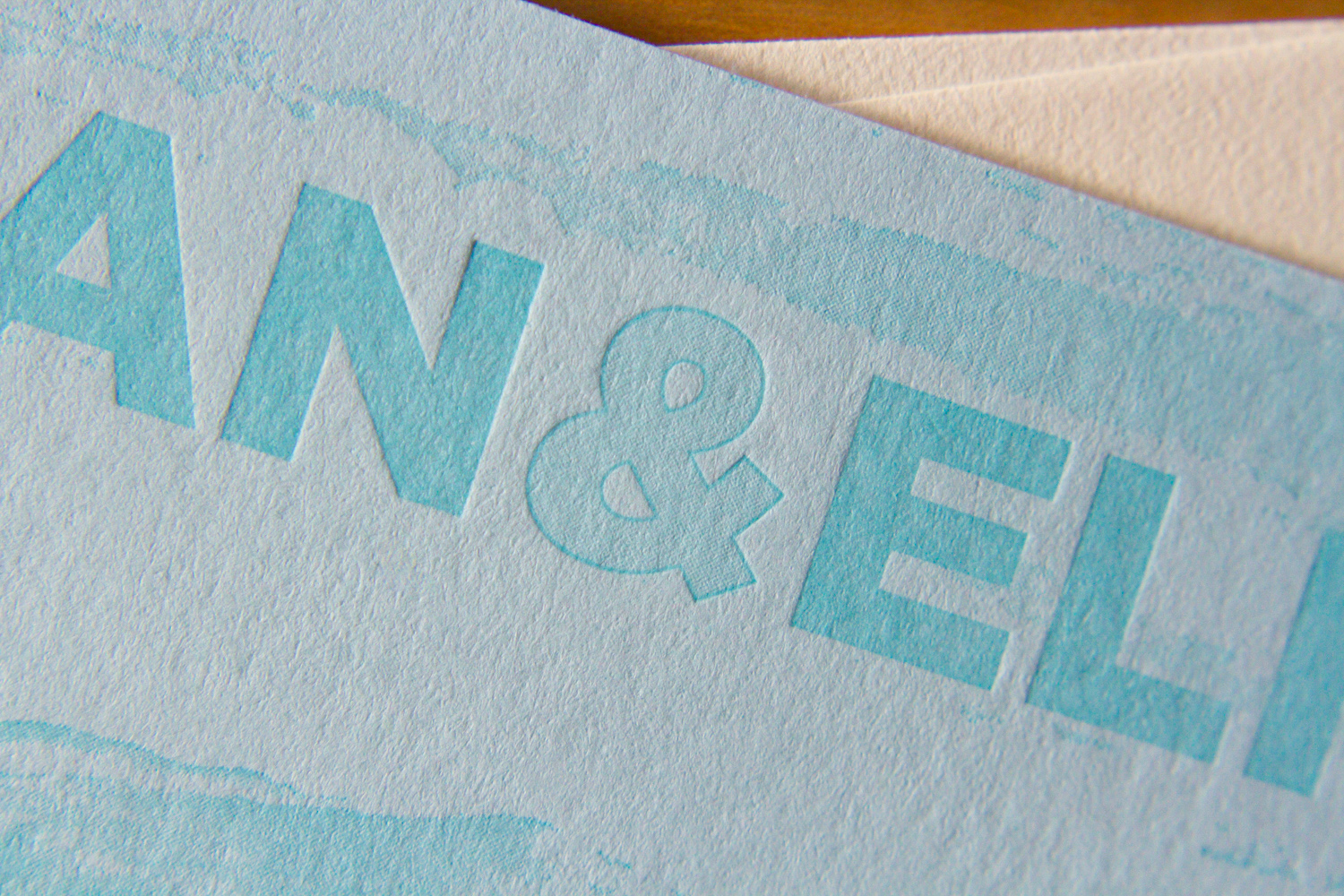
Here's a lovely wedding set for Parklife's favorite brother and his favorite new wife. For the save the date we used two custom inks on thick 600g ecru paper.

For the invitations, we carried through the same inks, paper, along with a few variations on the Gotham typeface.

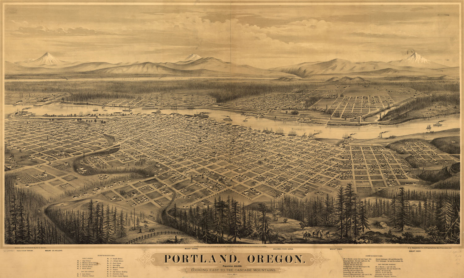
On the back of the invitation we added a hand-duplexed backing that's letterpress printed with a tonal ink and a fine halftone screen. The image is adapted from an early nineteenth century drawing of Portland.