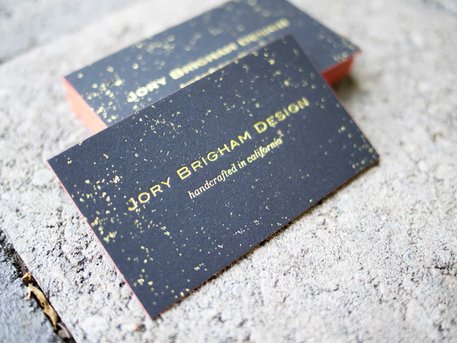
Freddy Oropeza creates incredibly rich and vibrant photographs. But for his business cards, he opted for a simple, clean, monochrome aesthetic.
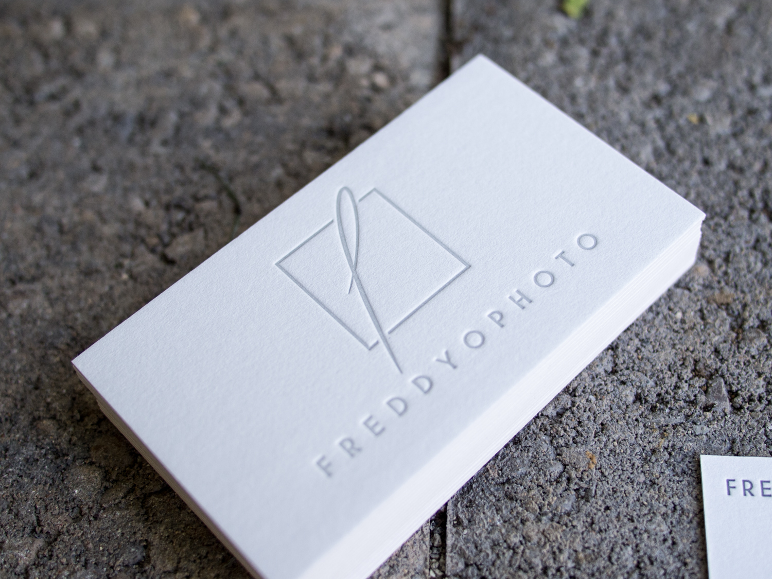
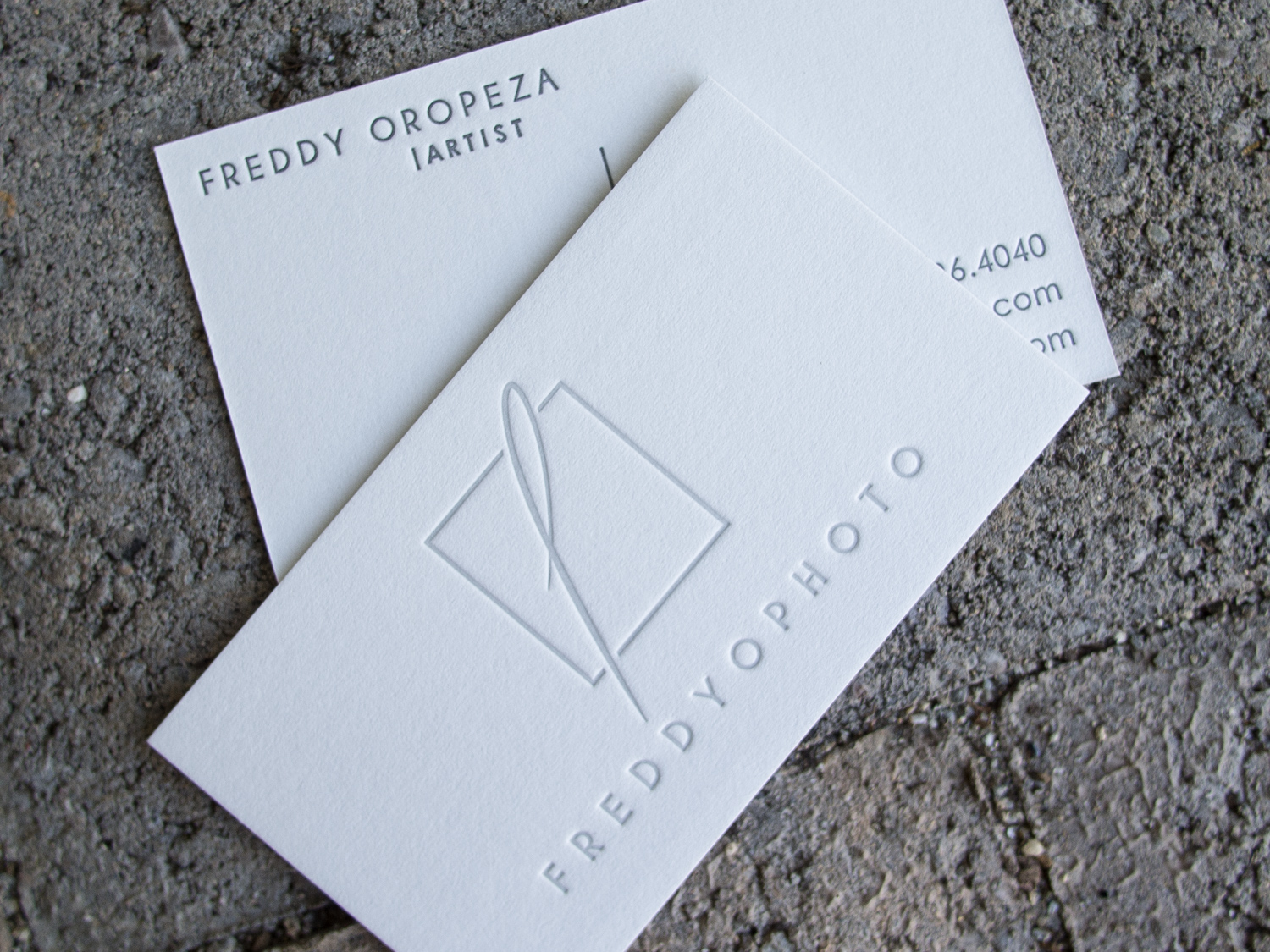
We printed these on 600g Gmund Cotton paper with a light tonal ink on the front and a darker gray on the back.