Mapping Napa

Nick and Hadley were drawn to the ever-popular Bookplate, and chose a color palette of fresh green paired with a soft gray (apple and dust inks). Their set included a map, custom-designed by Parklife Press, to guide their guests around the Napa Valley wedding events.

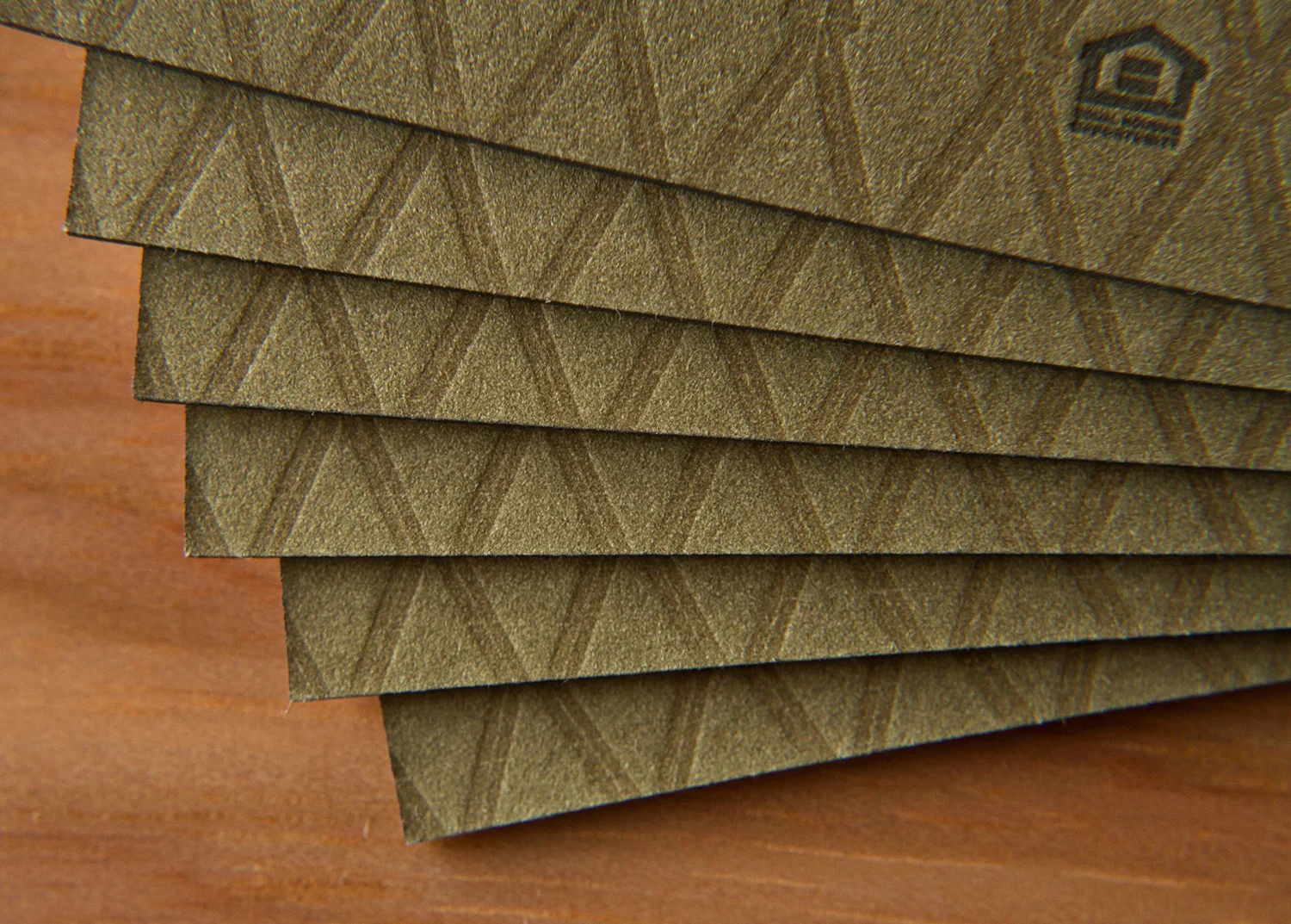
The set is comprised of three pieces printed on extra thick, 600g paper: an invitation, an RSVP card with a printed return envelope, and a map to the wedding site. The map shows both an overview of the area in Napa — with all-points directions and major roads — and a detail section of the Inn and resort grounds, noting entrance and parking areas and the specific reception hall.

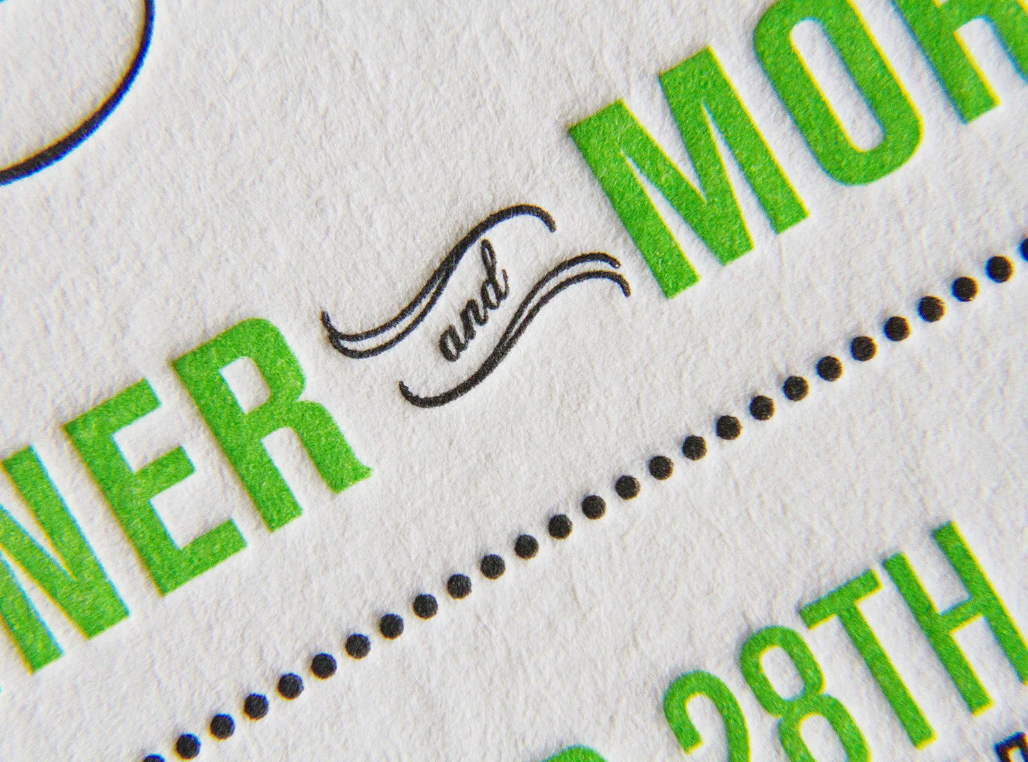
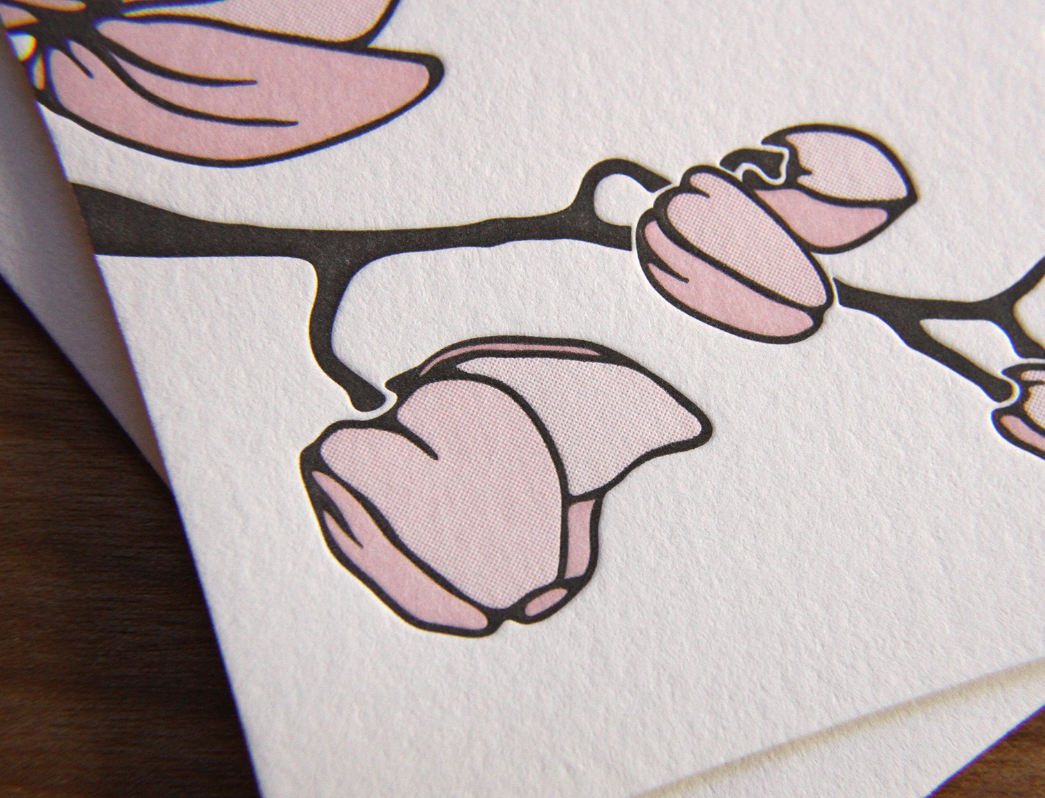
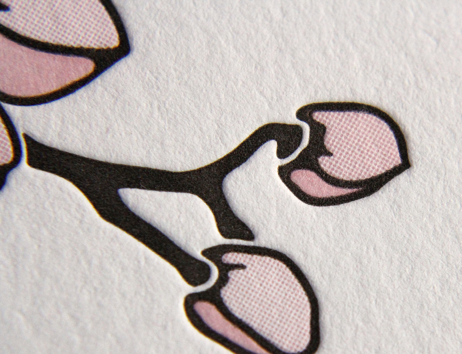
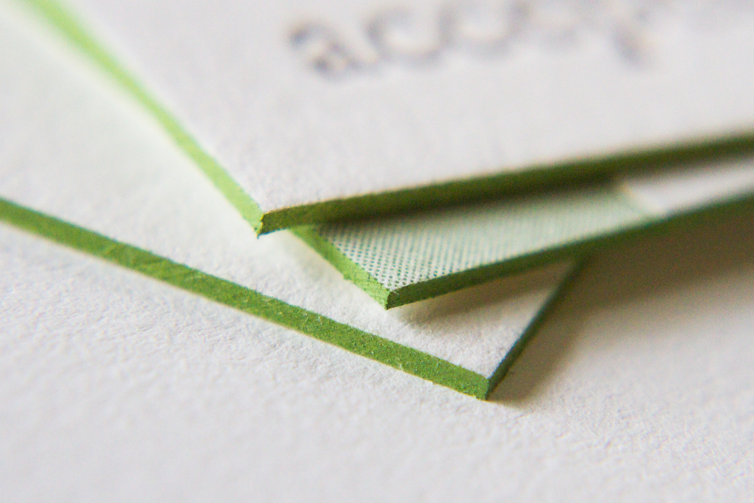
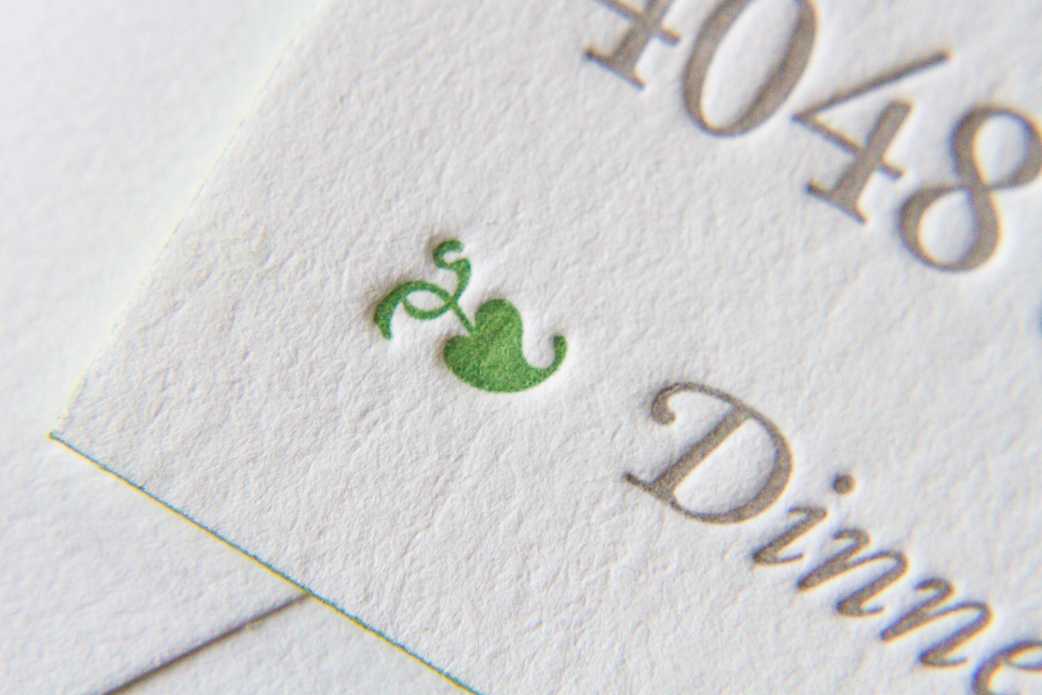
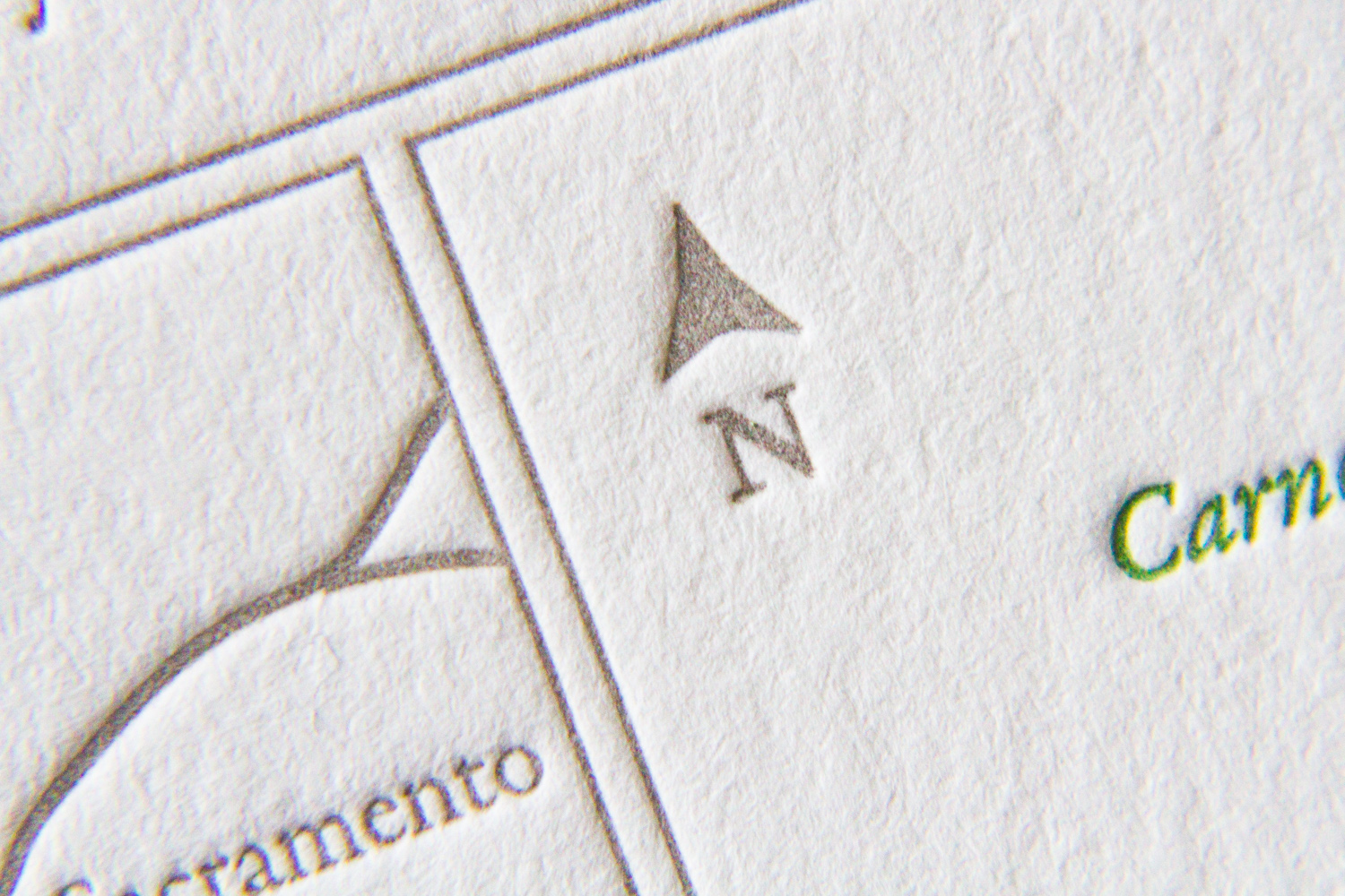
Bookplate has always been a popular style for Parklife Press; its clean, simple design — with plenty of white space — really highlights the beauty of the typography, and the color pop on the couple's names really draws the eye. And perhaps because the design is so elegant and uncluttered, the tiny flourishes pack a (visual) punch. Below, the edge painting on each the piece (the invitation, RSVP card, and map) shows off the extra-thick paper stock and unifies the color theme; the tiny green dingbat preceeding "Dinner to follow" draws attention to the reception note while adding visual interest; the typeface's blink-or-you'll-miss-them ligatures lend an old-world charm to a very modern design; and the extra-thin double rules on the map divide the sections in a beautifully understated way.

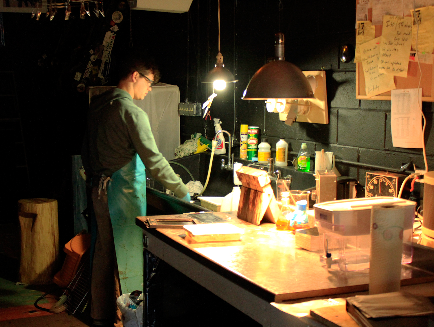
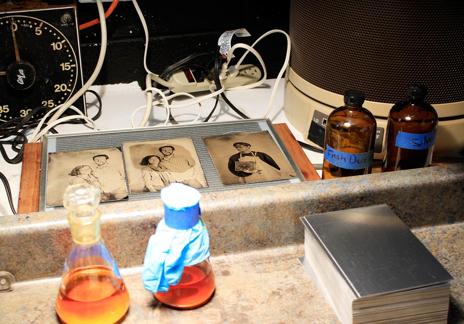
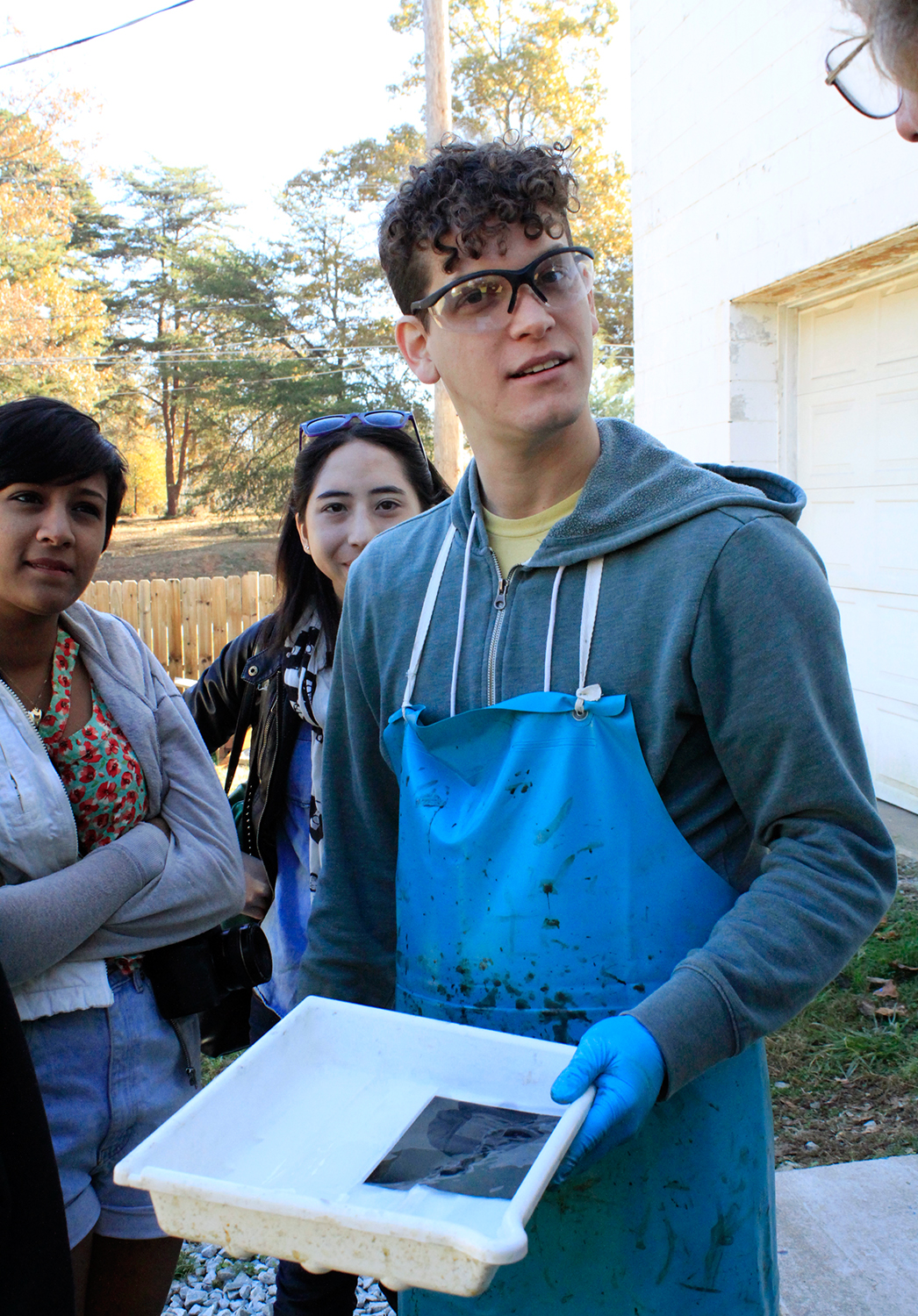
Bonus points for any fellow print nerds who noticed that our map design delivered two shades of green for the price of one, with the water — the Pacific Ocean, San Pablo Bay, and San Francisco Bay — shown in what appears to be a lighter tint. How did they do that, you ask? What alchemy have these mad geniuses wrested from their printing press? Short answer: a halftone screen. Longer answer here.

Photos by Sarah McCarty Arneson
Soiree for 70th

This was a fun invitation set to print. Designed by graphic designer Sarah Scott, it was a festive and classy way to invite guests to Suman's 70th birthday. Guests opened the outer envelope to find a sleeve — an Envelopments Portable Pocket with charcoal linen exterior and ecru linen interior, overprinted with fog ink – and withdrew the card. The striking invitation was printed in black and a custom green ink on heavy, 600g pearl white stock.

The design's details and touches abound — the v-opening of the pocket, the tiny script "and," the hat on the 70, the tone-on-tone printing over the textured enclosure — and it must surely have set the tone for a great party.

Photos by Sarah McCarty Arneson
Branding is Key

While business cards are a great vehicle for letterpress printing, we can't forget everyday business stationery. We had worked with Van Fletcher on a few projects, so we were happy to be able to help build his brand further with some new pieces. This time it was a flexible stationery set — a two-ink 120g "mini letterhead" (also known as note paper size; it's smaller than a full size sheet and folds in half to fit in envelope); a more stripped-down 300g note card; and a two-color envelope to house either piece.

This set is quite flexible — the more formal sheet bearing the full logo and listing multiple modes of contact, and a less formal card. The card is still "branded" with the key motif, but name and contact details are left off; it's perfect for notes to existing clients and associates. Note that the more minimalist note card is not without contact information: Van Fletcher's website is imprinted, subtly and without ink, at the card's base.

Photos by Sarah McCarty Arneson
Music Maker Relief Foundation: Tintype Meets Letterpress

Last year, Parklife Press was approached by Music Maker Relief Foundation to design, print and produce picture frames, customized to hold tintype images. You have questions! We know! Let's get into it.

First, a bit about Music Maker. The foundation, founded in 1994 by Tim and Denise Duffy and based in Hillsborough, NC, "was founded to preserve the musical traditions of the South by directly supporting the musicians who make it, ensuring their voices will not be silenced by poverty and time." Music Maker not only helps support Southern roots artists who have fallen on hard times (an excellent goal in and of itself), but also helps provide resources to get them performing and recording again, providing invaluable cultural documentation of Southern musical traditions. Per their website, since their founding, "we have assisted and partnered with over 300 artists, issued over 150 CDs and reached over a million people with live performance in over 40 states and 17 countries around the globe." It's a great organization, so be sure to check out their website and read more about it.

So ... tintypes? Tim Duffy, it turns out, is not only a music historian and philanthropist, but he's also a photographer. And what does a photographer do, when spending time his musical heroes, recording these living legends? He records their images, as well. And what better way to preserve the unique history of these artists, than with an old form of photography that produces one-of-a-kind images that will last hundreds of years? He honored the past, and learned to make tintypes — a photographic process more than a century and a half old. Together with colleague Aaron Greenhood (Music Maker's Artist Services Coordinator and tintype chemist) he produces these portraits, which are given to artists, used as donor gifts, and sold on their website to foundation supporters and music fans. (To learn more about the project, visit Music Maker's tintype page.)

Music Maker wanted a nice way to present these art objects, which are, essentially, 4.5"x 6.5" pieces of sharp-edged metal. Parklife Press designed, printed and assembled the frames, which incorporate Music Maker's logo. The black museum board and black/bronze-y ink are reminiscent of sepia tones, and the hand-crafted nature of letterpress printing itself pairs perfectly with the old-fashioned tin type process. The frame folds out to standing position, and holds the metal sheet securely in place — protected and perfectly positioned.

Each tintype is labeled with a "Music Maker Tin Type" label — which lists the subject, print number, date, photographer and chemist — and is then finished with an official, bright red "Music Maker Tin Type - Hillsborough N.C." stamp. Parklife Press designed both the label and stamp.

Tim, Denise, Aaron and the folks at Music Maker were nice enough to have us out to Hillsborough during one of their tin type shooting days, so we could get a sense of the process and see first-hand what our frames were framing. Below are some photos from that beautiful fall day. Most people have never seen a large-format camera like Tim's — at least in person — and many photographers these days haven't seen darkroom equipment in ages, if ever. (Hence the nostalgic photos of darkroom timers and developer pans!) You guys were so generous; it was a blast. Thanks for letting us be a part of this project.

Photos by Sarah McCarty Arneson
Shades of Blush

David and Allyson's invitation set was based on Petal, which features an original illustration by Parklife Press. The text, set in all-caps Gill Sans, is set off by the lightly-flourished script of their names. The asymmetry of the single, flowering branch — printed in tungsten and blush inks — provides a fresh and cheerful balance to the clean and modern design.

The branch design from the invitation was carried through on the RSVP card.

Letterpress is typically created with solid areas of ink impressions using individual, premixed colors. But here, by using halftone screens (read our post about letterpress and the halftone process here), three shades of pink were achieved using only one ink. This branch of blooming buds would still be pretty with solid, 100%-strength blush ink, but the design would lack depth; it wouldn't be as delicate, or as interesting.

Pastoral Elegance

Alan and Keith were getting married on their farm in Virginia and wanted to balance the solemnity of the event with the rustic quality of the setting. The grooms-to-be had created an online video save-the-date for their guests, but for the invitations, they decided that letterpress would help underscore the formality of the occasion.

The invitation, according to Alan, had to convey several things at once to set the tone: a sense of formality (despite the fact that the reception was to be held in a barn, it was not going to be a casual event); the fact that the ceremony itself was going to be quite traditional; and the occasion's overall blend of elegance and rusticity. In his words, "we needed an invitation that tempered the formal and traditional with some sort of country element."

They felt the Californian design was almost  there, but wanted to use a different oak tree image. The oak was their chosen motif, partly for symbolic reasons — the mighty, strong, sheltering, beautiful oak is an apt metaphor for a lifelong commitment — but it held literal meaning, as well. The couple planted a pair of young oaks on their farm, and are planning to watch them grow old together. As Alan said, "we hope we can look back on them one day and say, 'those were planted the year we got married.' "

Photos by Sarah McCarty Arneson