Posts in business cards
Just a Dream (About Letterpress)

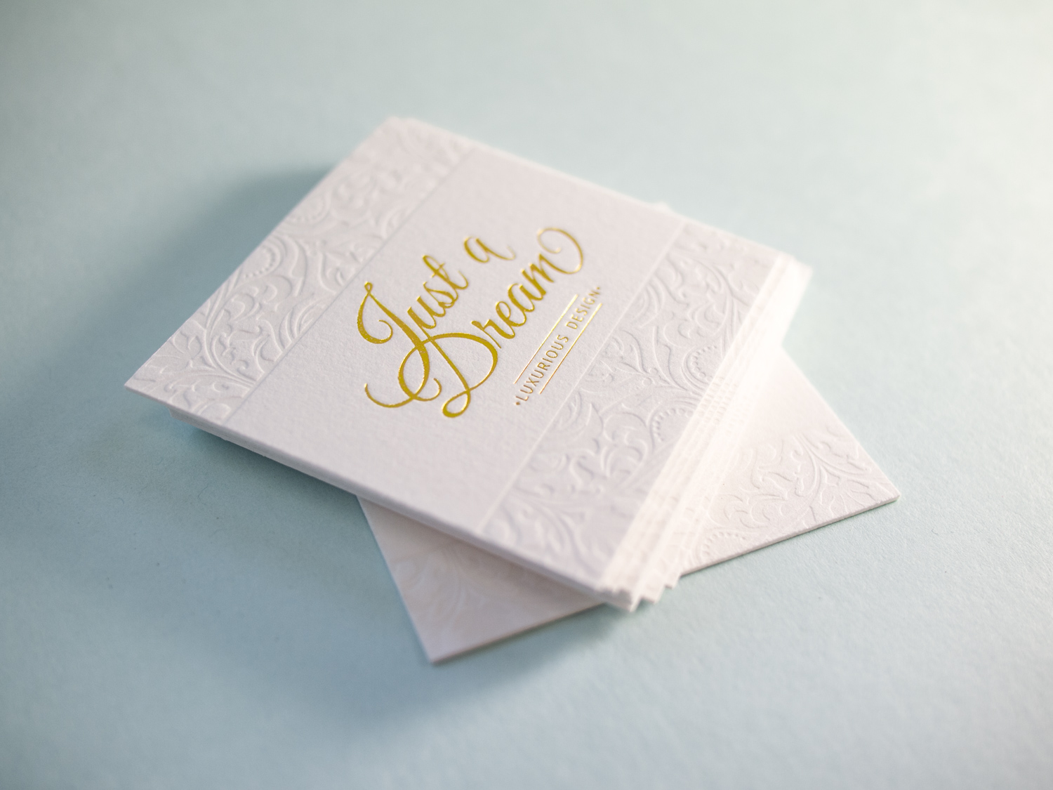
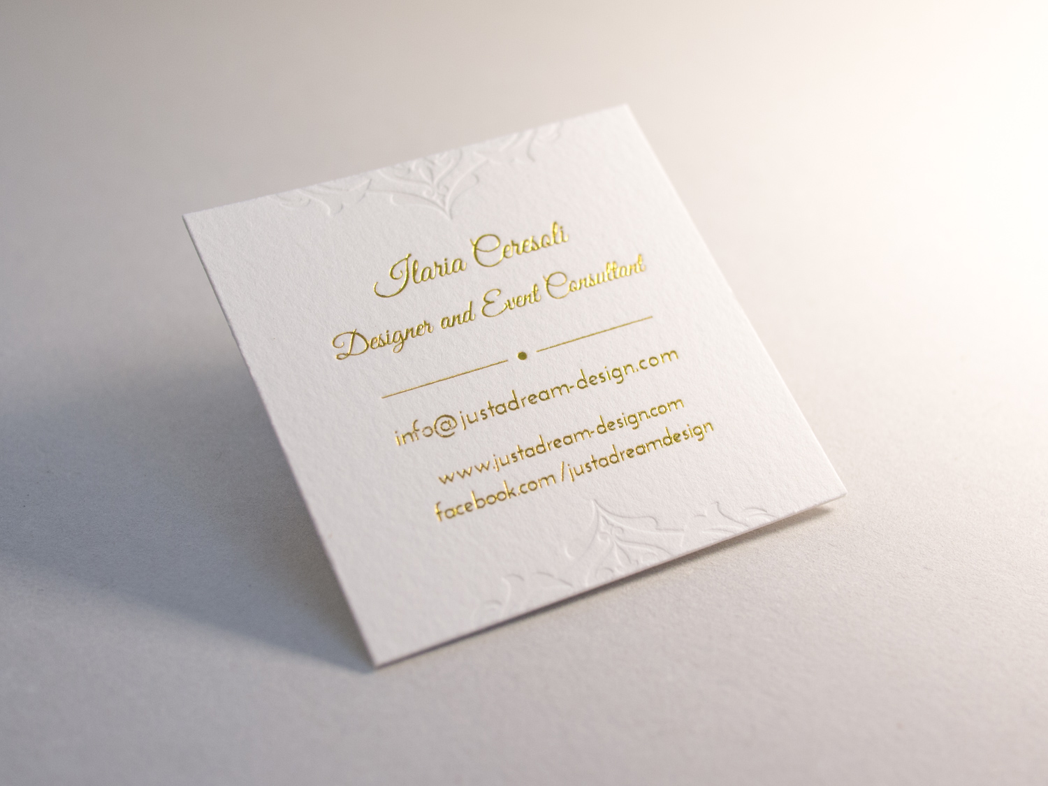
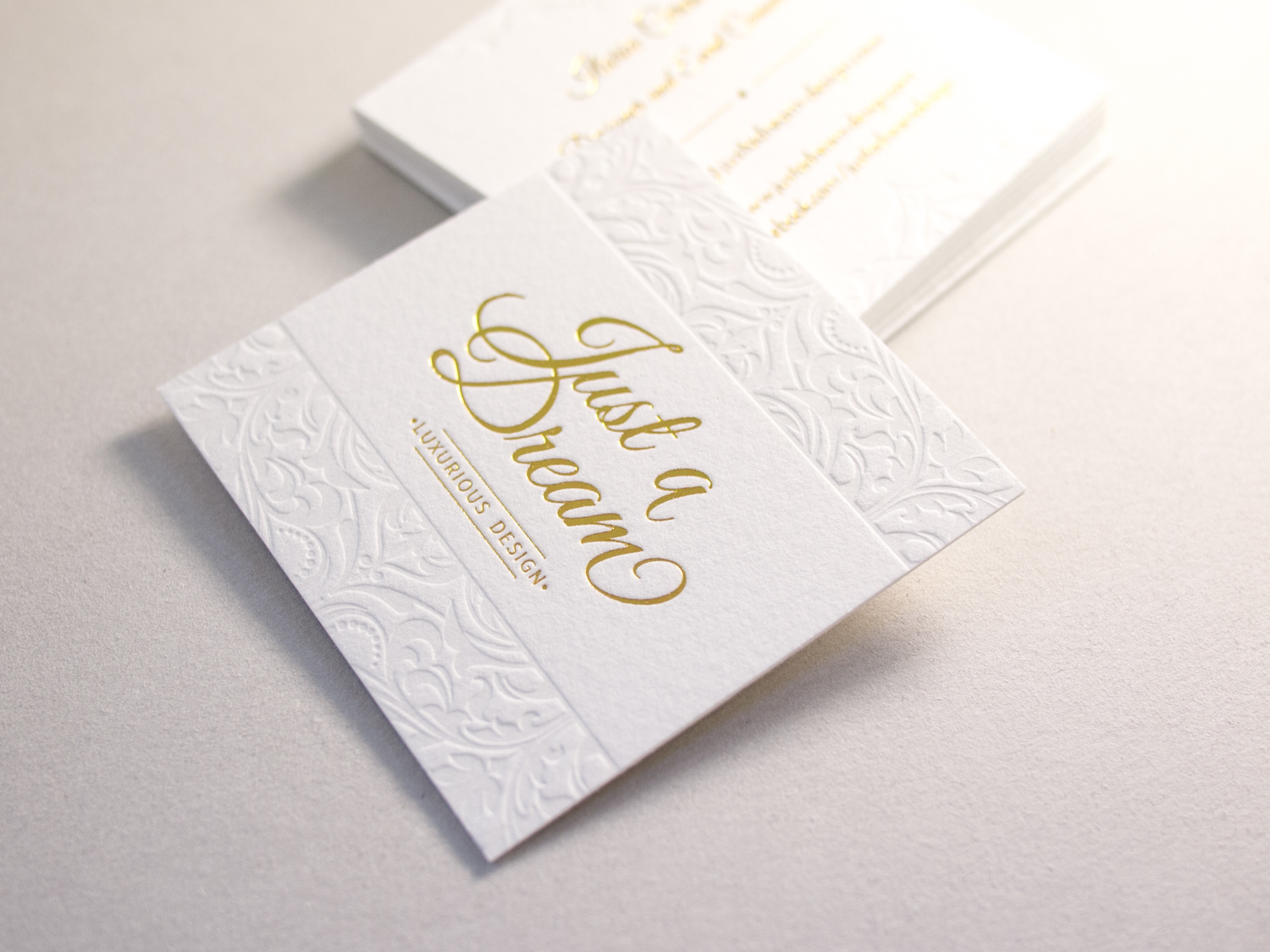
For designer and event consultant, Ilaria Ceresoli and her business Just a Dream, we printed these super-deluxe foil + letterpress business cards on 100% cotton Somerset paper.

Since Ilaria designed these with foil and a blind deboss on both sides, we printed the front and back on separate sheets of 330g Somerset paper, then duplexed them after printing so that the impressions didn't get flattened.

Business Set For Force Majeure Vineyard

Washington's Force Majeure Vineyard makes lovely Bordeaux and Rhone-inspired wines. We've been lucky enough to sample from their limited production and we think their wines pair beautifully with our custom letterpress stationery.

We printed business cards, folded notes, and envelopes for Carrie and Todd using espresso and silver-tinted opaque white ink on Ecru Lettra paper.

Letterpress Business Card Roundup

Time for another business card roundup! After you're done here, you might want to check out previous roundups from 2013, 2014, and just this past January.

Canadian designer and photographer Amanda Benincasa (benincasadesign.com) designed these cards, complete with a letterpress QR code. We printed them with custom green and gray inks on thick 600g Fluorescent White Lettra.

For long-time Parklife collaborator, Chad Martin of The G Brand (see more of his design work here and here), we printed these duplexed business cards with black ink on 300g Lettra for the front and gold ink on 2-ply Rising Museum Board for the back.

Like pretty much everyone (Parklife included), Gritchelle recently relocated to Portland. We printed these cards for our new neighbor on 300g Fluorescent White Lettra.

Some super-deluxe cards for Chapel Hill brand gurus, Immortology: Three inks on 300g Lettra for the front and white foil + a blind deboss on 350g Ebony Colorplan for the back.

Finally, a business card reboot for Dyfari Interiors featuring Espresso and Periwinkle inks with Periwinkle edge paint on 600g Pearl White Lettra. This is the third iteration in a series of cards we've printed for Diane, starting with this version in 2010.

Growing Businesses, One Card at a Time

You know how sometimes you have to move thousands of pounds of antique machinery from one edge of the country to another, and then get it all set up properly so you can keep your business running? Wait, you don't? Ah ... count yourself lucky. Parklife Press moved from lovely North Carolina to beautiful Portland, Oregon this summer, and setting up the new studio was a f… a fun opportunity for greatness! And truly, it turned out great. But it was a challenge. And you know who you need in your corner when facing challenging situations? (Especially ones which involve basic elemental needs like heat, power, and protection from the elements?) Talented professionals. You know it ... here begins a good old-fashioned business card round-up!

We did these cards as thank yous for the electrician and contractor who renovated the new studio. They were great to work with. They kept us dry, and (seasonally) warm or cool.

Each card has tiny graphic representations on blind deboss (ink-free) impressions — hammers for the contractor and electric bolts for the electrician. It was fun to get to work with these fellow craftsmen and small-business owners.

Speaking of growing a business: cards we did for Grow. These involved three custom letterpress inks on the front, offset flood and one letterpress ink on the back. They were hand-duplexed (two different paper stocks glued together) and edge-painted in a corresponding brick-colored ink. That sounds like a lot of press runs, right? Three runs just to make one side of this card! Oh, and, we did cards for 28 employees. Nothing says "we're glad you work here" than the boss handing an employee a box of beautiful, hand-crafted letterpress business cards.

PLP_20141201setV2-0496.jpg

Some detail shots are below. Check out Grow's subtle plant motif in black-on-black.

Listen, we're a bit late on giving thanks on this blog, but we figure gratitude shouldn't be limited to one month of the year. So to our new neighbors, fellow business owners, new clients and old: we are thankful for you. Thank you for your business, and for helping us (directly or indirectly) fix the roof over our heads and the electrical outlets for our presses. Wishing you and yours a happy, healthy and prosperous New Year.

Photos by Sarah McCarty Arneson
A Handful of New Letterpress Business Cards

We've added some great new cards to our business gallery. Take a look...

These double-sided cards for Cedarly, a media and web branding company in North Carolina, feature their logo printed with a tinted white ink. We could have just as easily blind-pressed the logo (no ink at all), but the tinted white helps it pop a bit more. This technique works beautifully with the logo's leaves and with its clean typeface, highlighting the deep impression of the thick 600g paper. On the other side of the card, the information is perked up with tiny icons in blue, which help distinguish at a glance the different methods of contact. We finished the card with painted edges, picking up the accent color.

John, the creative principle at Lake House Design Group, designed these rustic but modern cards. The logo style, the palette of the ink and paper colors, and the distressed typeface work together to evoke the familiarity and nostalgia present in the firm's name.

Matt Graif, a graphic designer in Missouri, submitted this excellent design for his business card that we printed for him on 600g fluorescent white Lettra.

This dramatic card for Eli Powell, a photographer in Boulder, Colorado, uses white space to its advantage. With the card's less-common vertical orientation and the artwork bleeding off the bottom, the design focuses squarely on the photographer's name but hints at sweeping landscapes and large, open skies. In blue ink on crisp, fluorescent white card stock, the snow-capped mountains are brought to life with just a few abstract shapes, connecting Powell to his region and to his clientele.

And finally, a card for Jean Woods Madge, a realtor at Distinctive Properties in Durham. Travis worked with her to create a new logo and a new look for her business cards, which were printed on 300g ecru white cardstock. The logo itself is distinctive and interesting, and the card layout was complete with a nice combination of script and serif typefaces.

Photos by Sarah McCarty Arneson