Kindly Save the Date

Halloween's over, midterm elections are in the rear-view mirror, and we're barreling toward Thanksgiving (which, in our modern era, is a blink away from Christmas and New Year's). Then, the recovery from all that, followed by the dull expanse of winter. HOW DID IT GET TO BE FEBRUARY ALREADY, you ask? Well, take a breath; we're not there. Yet.

But if you plan to send out invitations sometime this winter for a spring or summer (or fall) wedding, then you might want to start thinking about getting your nearest and dearest to mark your wedding date on their calendars. (Oh, hey — now that we mention it, we're having a sale on save the dates. Serendipity!)

The “official” rule would be to send the save the dates 4 to 6 months before your wedding. But like with any other wedding guideline, it really depends on the situation. Some people order them a year ahead, others 3 months. But it tends to be more important to send them early if you have a lot of guests who’ll need to travel.

To get started, above is a quick round-up of some save the dates from past sets we've written about. (If you'd like to explore them further, check out the posts here, here, here, and here.)

Now, on to our featured save the dates …

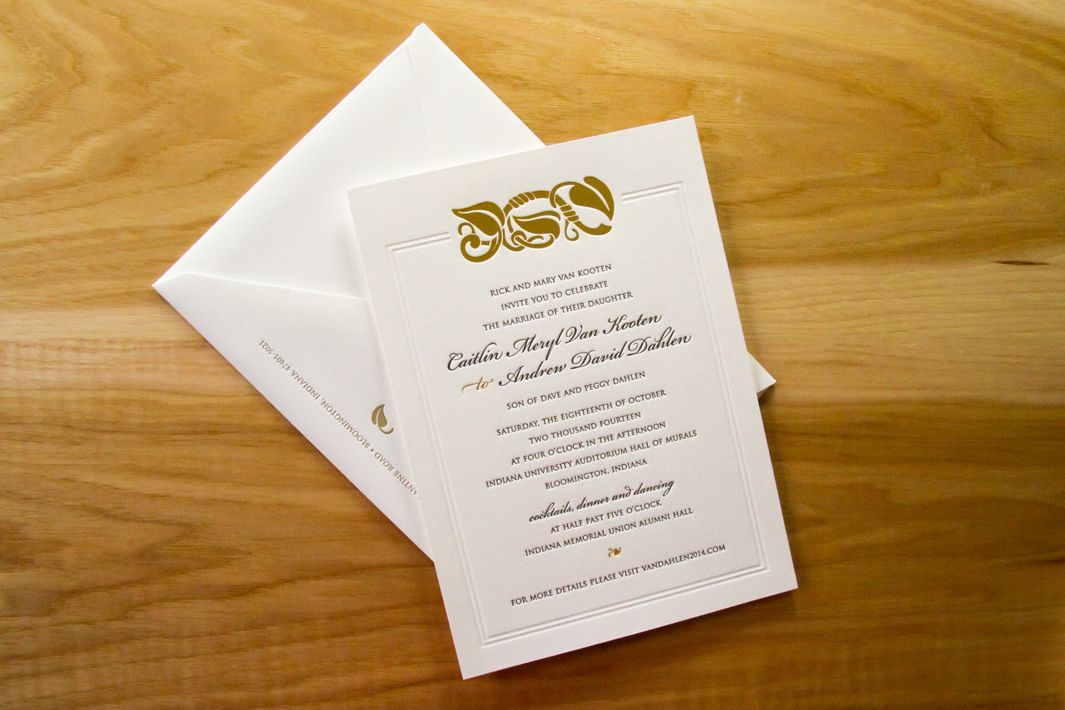
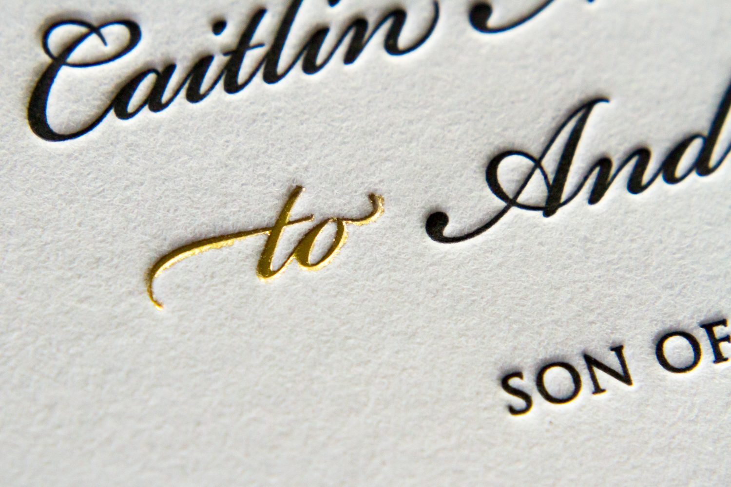
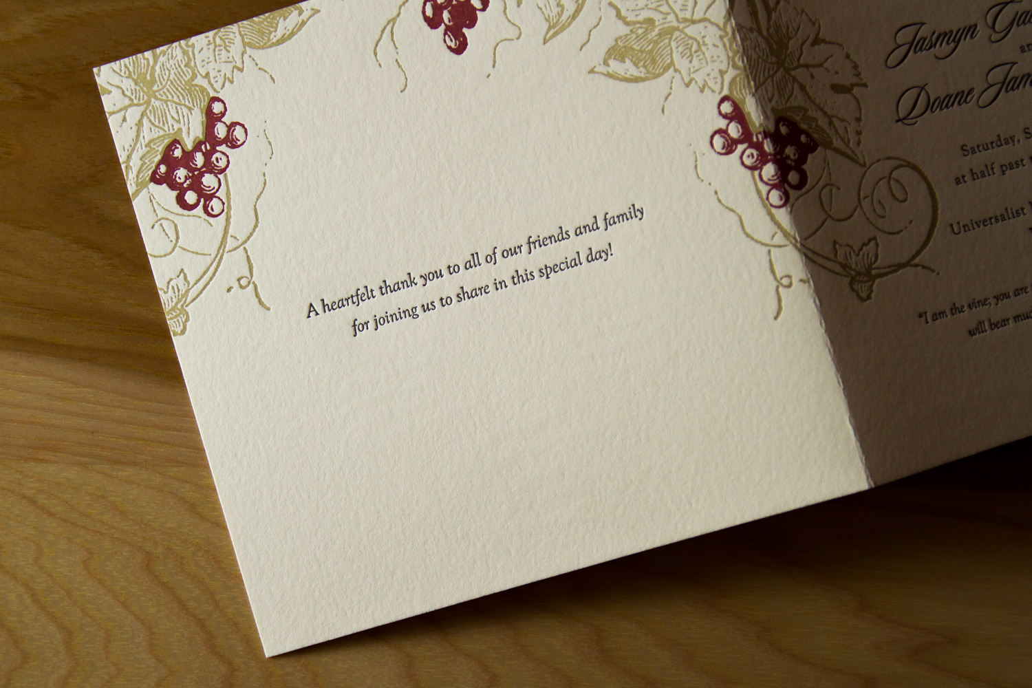
Customarily, save the dates are related to the invitations, design-wise. But they're usually much less formal, so people often opt to have a little fun with them. Parklife Press provides custom design work, included free (to a point) with a print order.

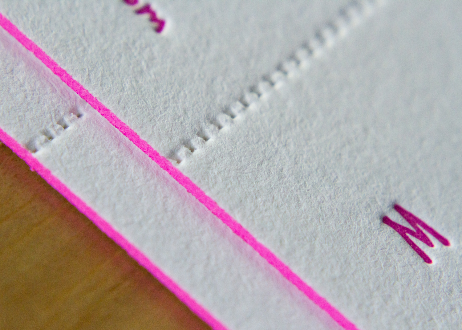
Here's a card that was designed for a pair of librarians. It was done on pearl white stock with midnight and fog inks. It resembles a library book check-out card, complete with an old-school typewriter font and custom monogram "stamp."

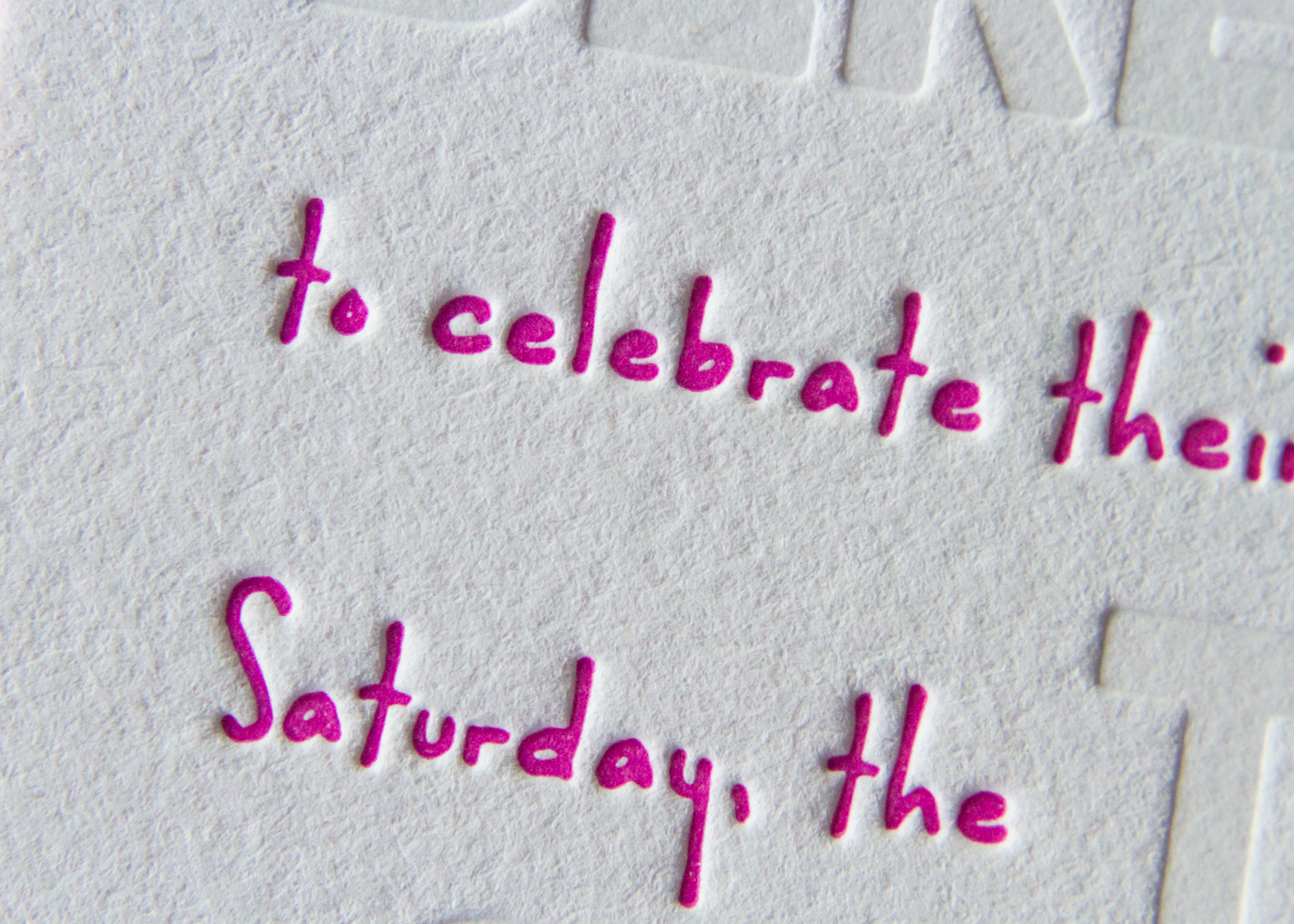
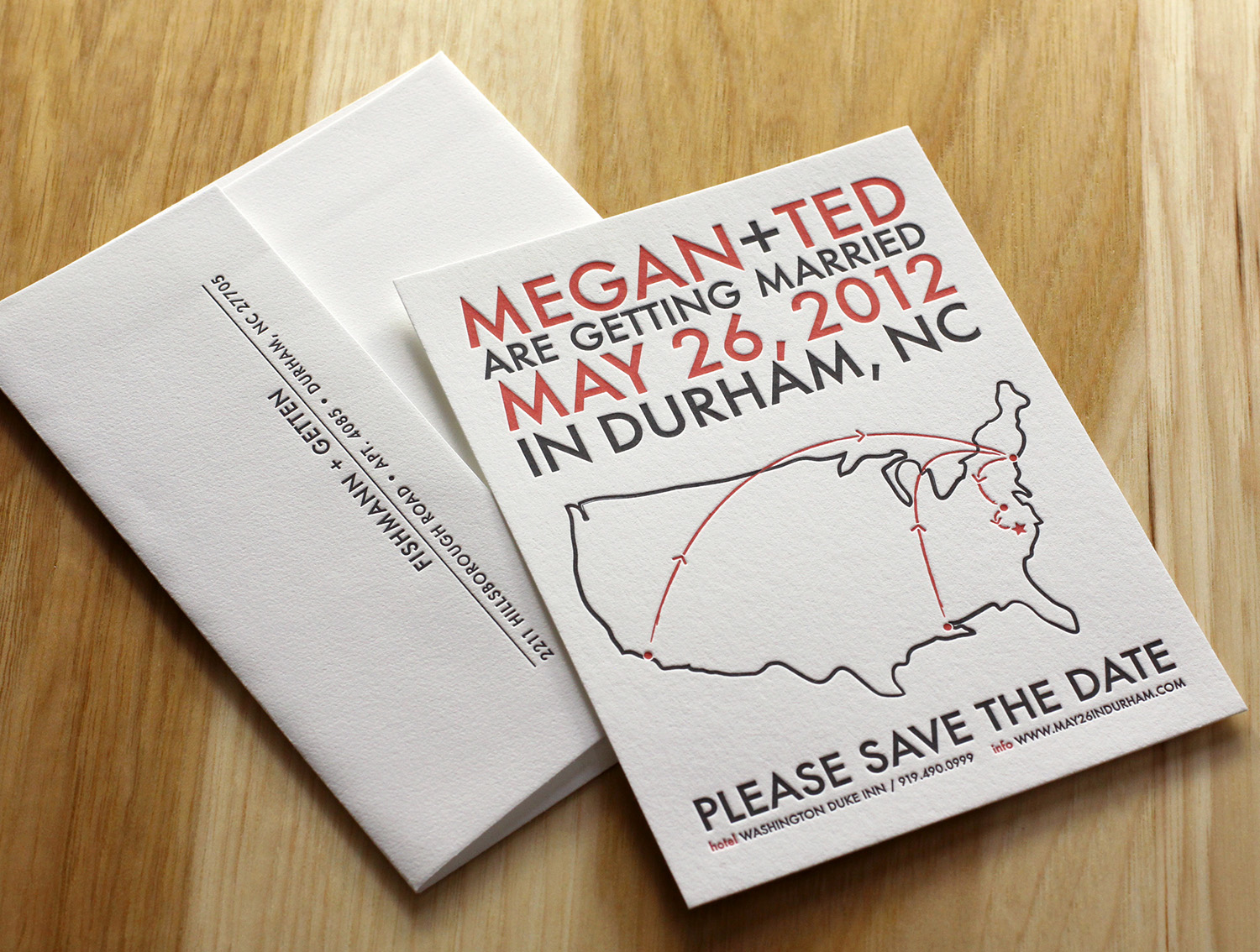
There is a lot of leeway in what's included on card, but the most common elements are pretty straightforward. The couple's names, some version of the phrase "save the date" ("mark your calendars," "reserve the date," etc.), and ... you guessed it: the date.

Then, add some version of the words, "formal invitation to follow." If you have a wedding website that has event details, including the URL is helpful.

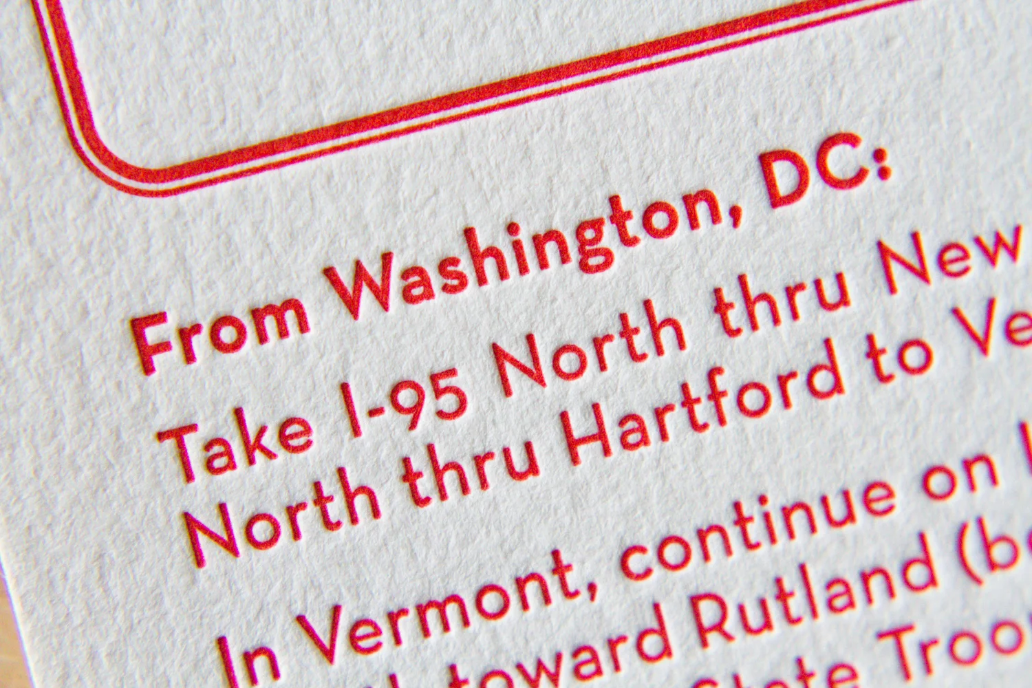
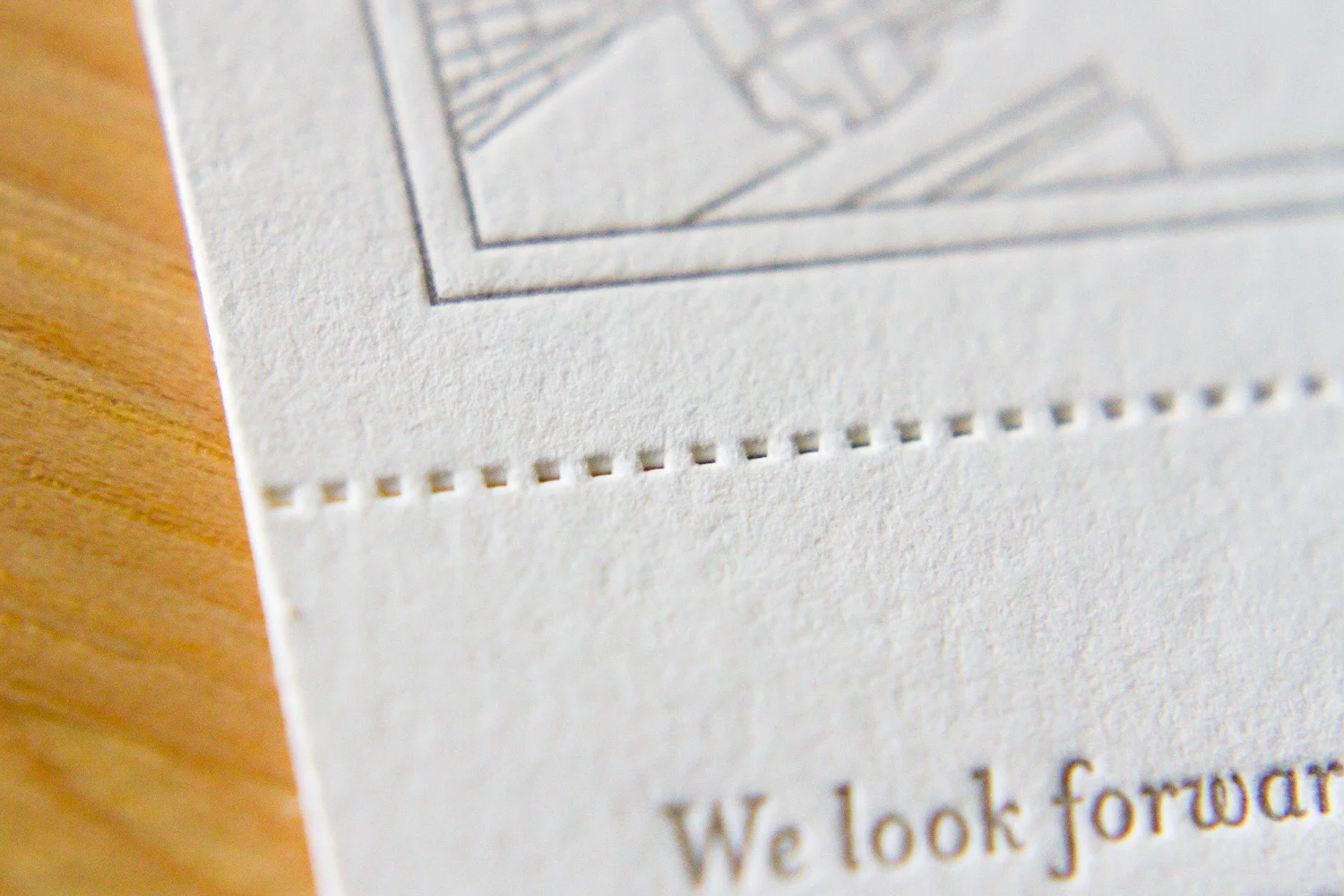
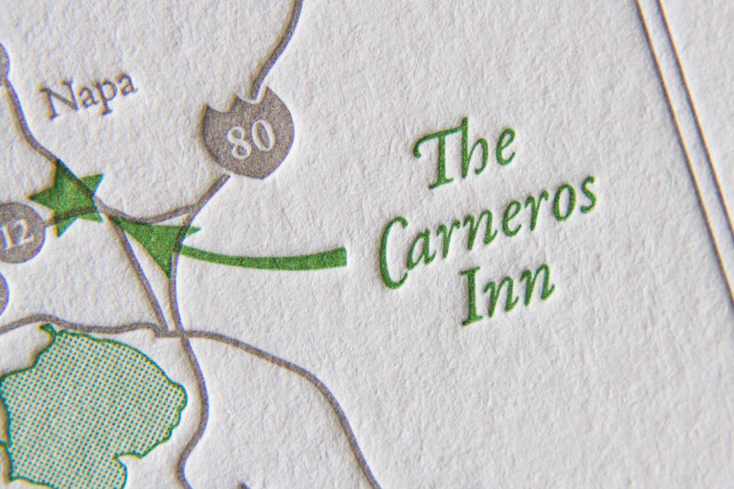
Some — like this one with a pale blue pinstripe and floral dingbat design — include the date, place, notice of invitation-to-come, but also include the accommodation information for those who like to make arrangements ASAP.

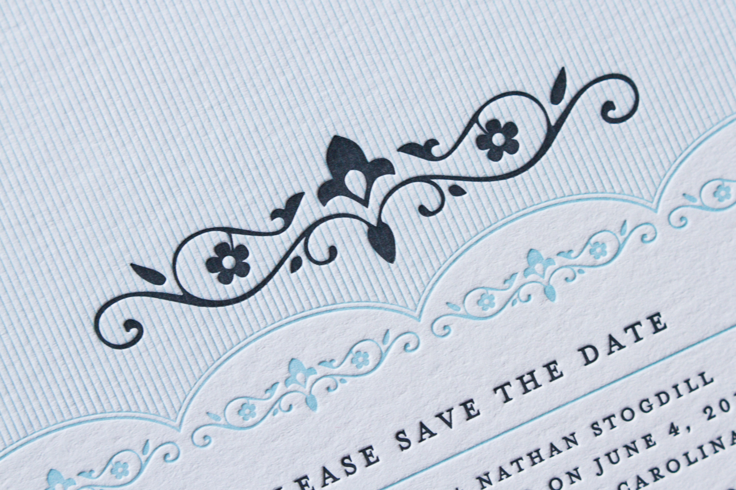
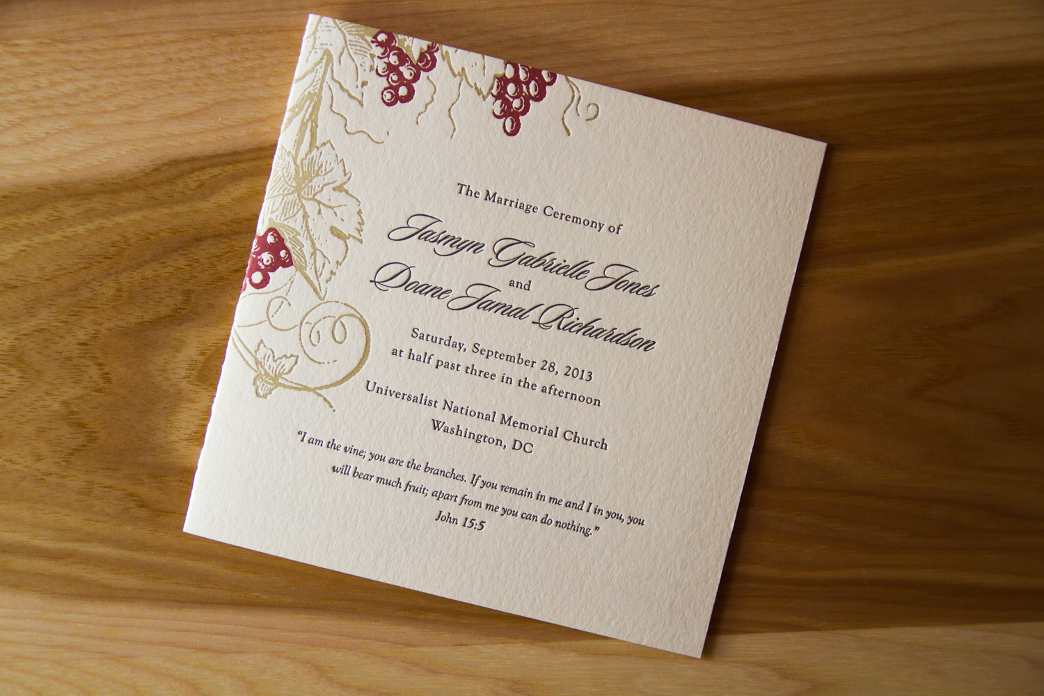
The card has lovely details — from the repeated floral vine to the scalloped pinstriped background to the repeated square dingbats — the set shows off the custom inks on the fluorescent white stock. It's based on Playbill design. We can create a save the date based on any of our plentiful invitation designs.

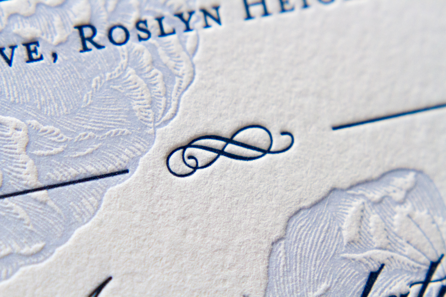
The card above, based on the Belvedere design, is more formal than some; it matches the invitation instead of just coordinating with the design elements. Note the large, swoopy dingbat, and and the custom border with floral motif impression offset by a double frame.

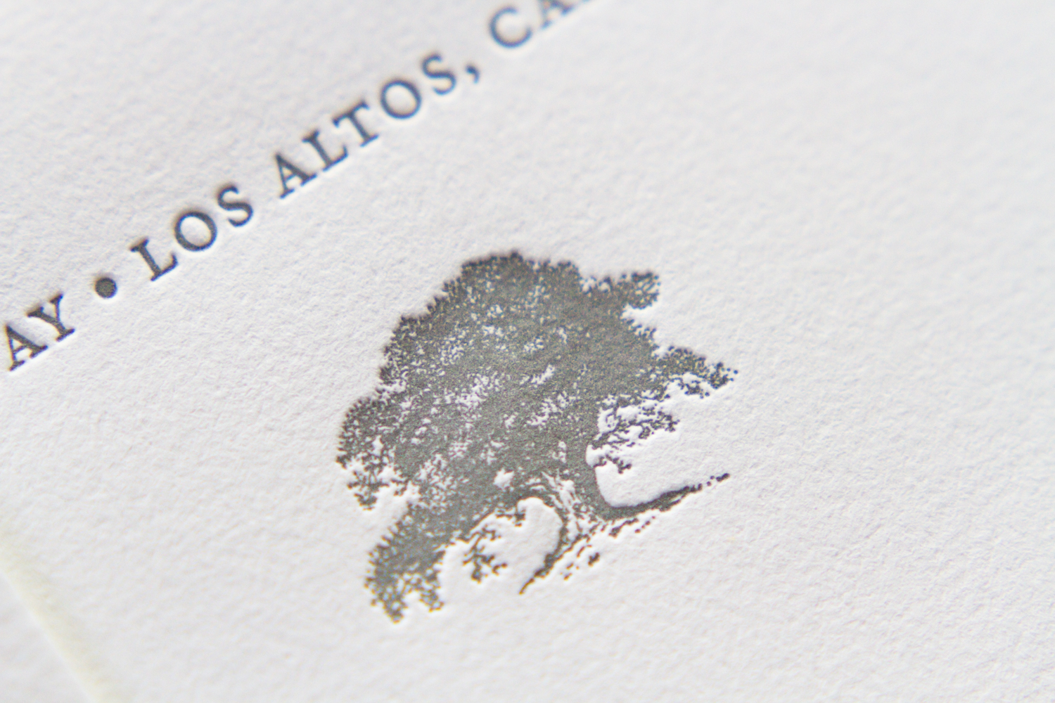
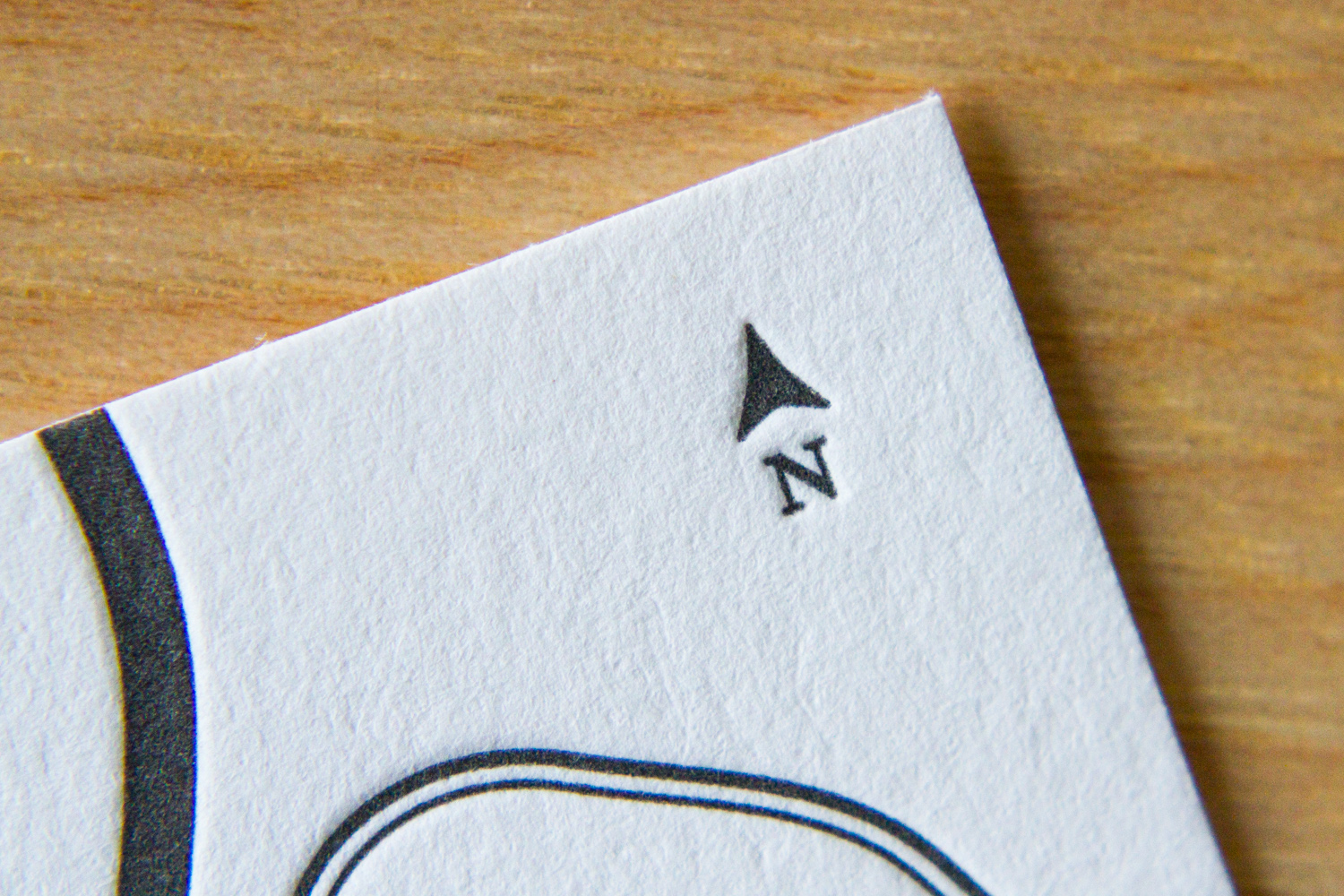
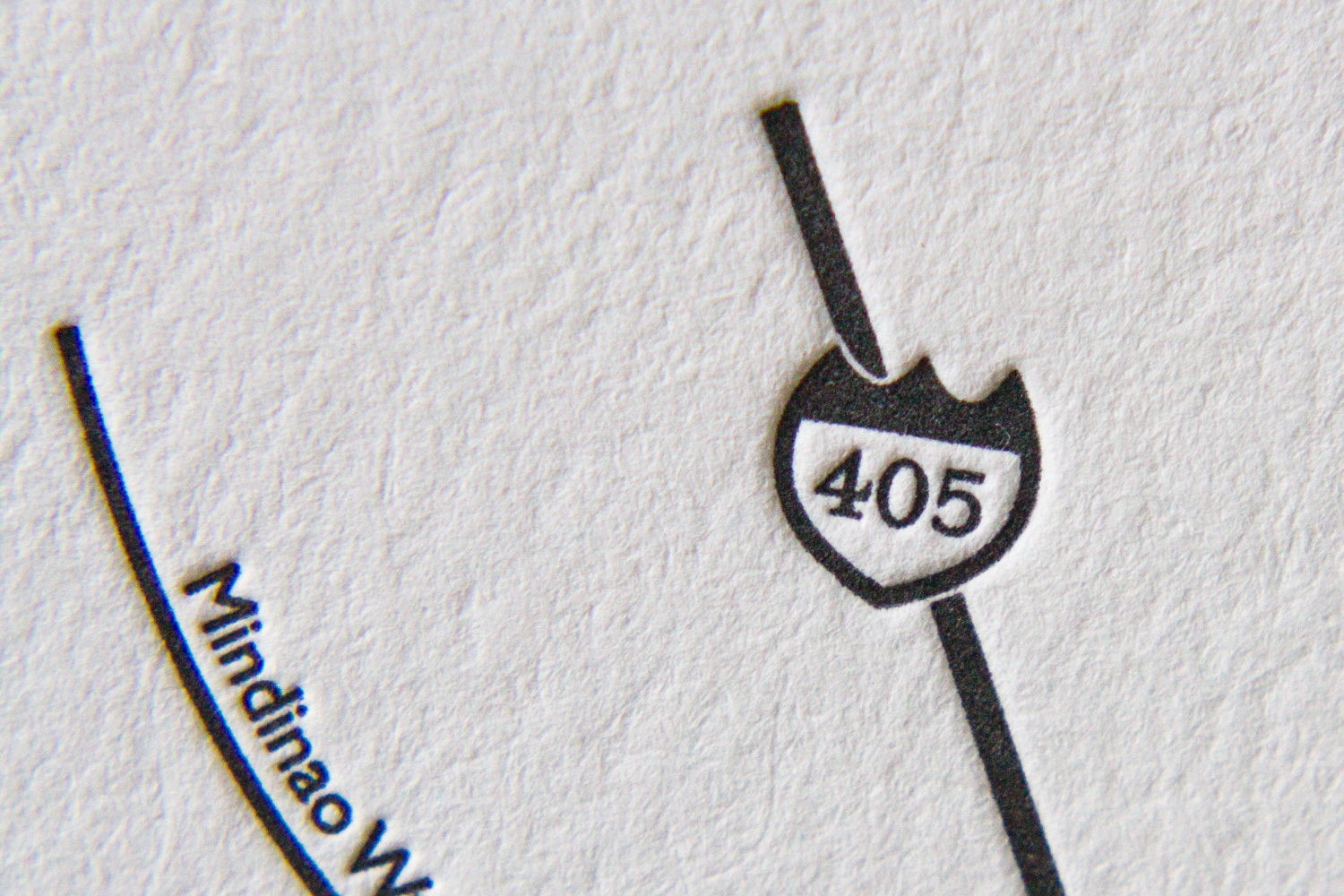
Location of the wedding is a frequent inspiration for save the date card motif. This is a playful one which focuses the well-known venue. The wedding will be held at historic Pinehurst Country Club in South Carolina. The card — printed in cheerful apple and sherbet inks on pearl white stock — features the club's logo and founding date.

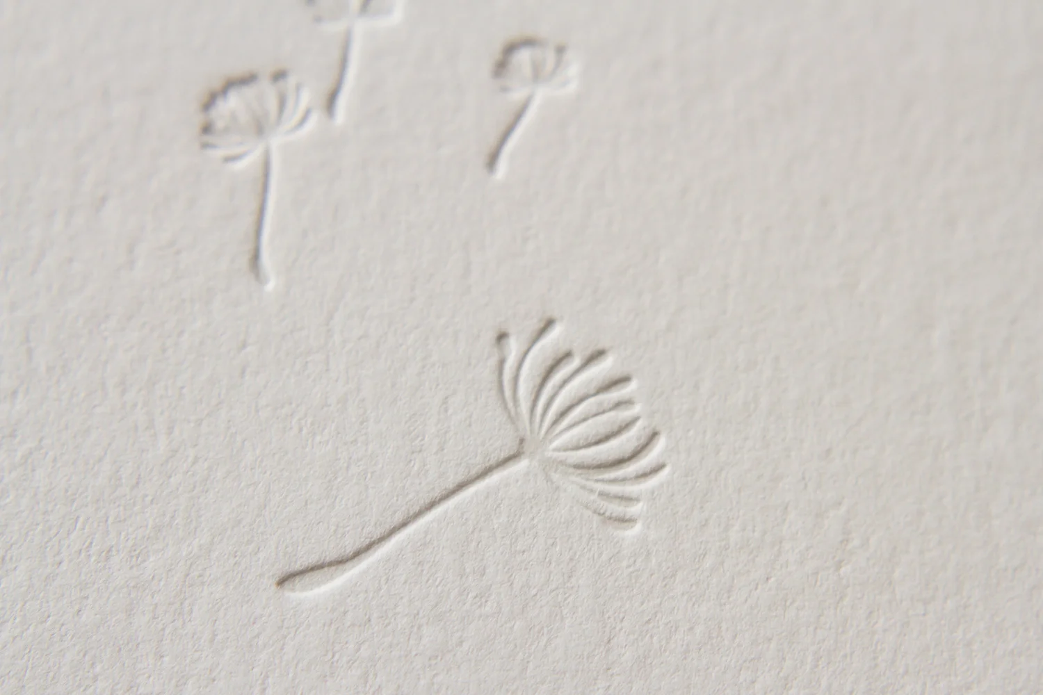
We're closing out this save-the-date round-up with a square card printed with espresso and white inks on pearl white stock. It's illustrated by breeze-blown dandelions and the words "Love is in the air."

And as you look over the detail shots of the lovely illustration, keep in this in mind: Days, weeks and months can float away as easily (and quickly) as seedlings in the wind. So, you know … get those save the date cards printed.

Photos by Sarah Arneson
Gold Leaves

Here's a set we did which shows off new technique. (Well, new to this blog … the technique itself is hundreds of years old.) Overall, it's sort of a modified combination of elements from Whirl and Vignette, with a custom, gold-foil-stamped art element. This set included an RSVP card with printed return address envelopes, and — as a nice additional piece — corresponding note cards for the couple's thank you notes.

The custom art motif was inspired by an architectural detail from the wedding venue: a brass inset from a handrail, depicting a golden tumble of leaves, stems and vines. Pretty sweet likeness, huh? The artwork is a perfect re-creation, but to really connect it to the brass original — to make it pop and shine — foil stamping was used throughout the set.

Foil stamping goes back to European Monks in the Middle Ages, but it was possibly inspired by the gold leafing techniques of ancient Egypt. It's a heat-transfer process: an impression is made, pressing metallic foil to the paper surface, and foil is left behind in the impressed design or bits of type. It's a separate process from letterpress (which doesn't apply heat, just pressure and usually pigment), and it creates a look you can't get with ink.

Below is a closer look, showing how the foil reflects light.

Of course, there are pros and cons to foil stamping, so it's best to use the process thoughtfully. As we've mentioned, it gives a shiny, mirrored look. (Yes, metallic ink is an option — but it usually looks only just slightly metallic when printed on cotton paper.) And because stamped foil is opaque, it can be printed on dark backgrounds; it will appear high in contrast, instead of taking on some of the paper's tone and blending in, as ink would to some degree.

Onto the (yes, inevitable) disadvantages: first, it's more expensive than ink. Not all letterpress printers do foil stamping themselves, so it has to be sent out, which can extend the turnaround time. And from a technical standpoint, the edges don't print as crisply as using the regular letterpress-and-ink process — so fine detail work isn't as clean.

For this job, however, it was the perfect solution. Above, see how the lovely details of the set are carried throughout: from the custom double border used on the invitation and the thank you card, to the gold foil-stamping used for the the  "to" and leaf dingbat, to the leaf motif used with the return address on the envelope flap. (Note the gold ink selected to match the the color of the gold foil accents.)

Letterpress printing with foil stamping, as it's used here, really is something special. And despite the the fact the processes have been around for centuries, most people have probably never seen both techniques used together — nor held in their hands something printed this way. Bits of shiny gold next to crisp, black text on a heavy pearl paper stock: this invitation sets the stage for an elegant, formal wedding.

Photos by Sarah McCarty Arneson
Calistoga Oak

This design is a testament to inspiration and collaboration, and to taking aspects from different designs to create your your dream union of design elements. To follow that metaphor, this set is a sort of marriage of the Californian and Vignette designs, with some art adopted from an earlier set.

The oak tree illustration is simple, yet incredibly detailed. Trees are common motifs for wedding invitations: they can represent vitality, strength, shelter, looking to the future. And they can also, of course, be more literal: depictions of the venue — in this case, a ranch in Calistoga, California — or they can be emblematic of a place special to the couple. The tree motif can embody all of these characteristics and connections.

This design is so clean and sophisticated. Because it has a lot of white space and isn't overly ornate, the little details really shine. The script has wonderful (in some case, overlapping) flourishes, and the custom double border really highlights the texture of the thick paper stock.

Photos by Sarah Arneson
Perforation Perfection

This was a really fun set. Designed by graphic designer (and groom) Derek Howles — who, incidentally, also designs these super-cool cartography poster prints — it was interesting and unconventional. And art-y! Which is fitting, since they got married at the North Carolina Museum of Art. The set was comprised of a save the date card and a combination invitation/tear-off RSVP.

First, the save the date card. The who, where and when details have the blind-deboss look, but they were actually printed with a tinted white ink. This method gives a slightly deeper look to the impression, and sets the text off a bit more than just making an impression alone. The playful pink wording puts the stats in conversational context, and the text concludes with a URL for more information.

The invitation followed the same format: large, white-tinted block text for the event's pertinent details, and tiny pops of pink filling in the rest of the words. The unconventional style is carried through to the RSVP's wording, with the options "Can't wait to be there!" or "Won't be able to make it."

The extra heavy paper stock is a great showcase for the dramatic edge painting, which ties together the set's color palette. The thick stock also helps the perforation stability — the RSVP card easily separates from the invitation for return mailing.

Photos by Sarah Arneson
Roses in Rockville Centre

This was a set based on the Franklin design. Printed on 600g Pearl White stock in Marine and Periwinkle inks, the design has striking text printed over a delicate, floral background. The invitation, along with a reception card, RSVP card and envelope, were held together within the outer envelope by a monogrammed belly band in the lighter blue accent color.

The design is of the invitation is traditional, but the off-center artwork bleeding off the bottom edge and the generous white space on the right gives it an unexpected modern feel.

An informational card, giving details the reception, echoes the design of the invitation. Ad graceful dingbat, flanked by to thin rules, divides the reception and accomodations information.

The corresponding response cardand printed return envelope set — text only, without accent art or color — is simple and traditional.

The details of this set are lovely: the fine lines of the floral art; the couple's monogram on the pale blue belly band; the simple, classic wording of the response card; the dingbats and flourishes of the typography. The fresh, bright palette of blues is perfect for a summer wedding on Long Island.

Photos by Sarah McCarty Arneson
Getting to the Chapel

Everyone has a smartphone, right? Or a car with some fancy navigation system? After all, it's 2014! Through the magic of satellites, people can just enter an address, then follow along as their moving-blue-dot avatars progress to their destination.

OK, for one thing — that isn't true. Smartphones are everywhere, but even if every last person had one, not everyone necessarily uses the map function with any regularity. But that isn't the point. What's most important: even the most sophisticated screen navigation can't include giant arrows pointing out tips and contextual information such as, "be sure to take the SECOND entrance into the country club for Kirsten's and Guillermo's reception! The parking is considerably more convenient, and the woodland paths — while charmingly rustic — can be tricky to navigate after dark!" Generalized maps can never provide such insights as, "please note that there is a guest block reserved in the hotel where Philip and Adam's reception is being held. If you were to stay there, you'd have a very short elevator ride from the ballroom to your hotel room. All other blocks reserved would involve a subway or cab ride between the open bar and your bed." A custom map and directions card gives an overview of the area, and it shows event-specific locations in relation to major landmarks.

As we discussed in recent post about wedding programs, it's best to keep your all your guests in mind when figuring out what information should be printed and shared. You can't show everything on a simplified, targeted map, but remember that you're mostly writing it for the out-of-towners. So even if the guest list for your Brooklyn wedding is heavily populated by your Park Slope friends, don't assume that all your guests will know what it means that your reception is at a restaurant in DUMBO. Your guests are going out of their way to come witness your milestone and celebrate your joy; for them, the high stakes of getting to the church on time (or to the meadow, or to the city-park pergola) are high. Especially in what may be — for any one of your guests — an unfamiliar place. A custom map can give guests an overview (literally) of the events' distance from major thoroughfares and airports and hotels, and that information can inform guests' travel and lodging decisions.

You can give an overview of a larger area, pointing out venue locations and listing addresses — like this one, above, showing the Mount Vernon area (with the Potomac River printed in a blue halftone screen).

Or you can show a tighter view, depicting a maze of city streets, like the one below.

Or you could do both overview and detail inset. This one was was featured in a recent post, Mapping Napa.

It's also very helpful, where space allows, to give written directions, or even list a URL where guests can find more information. (A wedding site, if you have one.)

The clever piece below served two functions: it's a useful map including all the relevant venue locations and addresses, printed along with an RSVP postcard. The two sections are divided by a perforation — guests could tear the response card and mail it back, saving the map and events information for future reference.

And did we mention it's a great design opportunity? Look at those sweet compass points! And those route markers and dotted rules! And the hearts and stars!

A nice custom map will look spiffy, and is a great courtesy to your guests.

Photos by Sarah McCarty Arneson
Get With The Program

Ah, the wedding program. Do you really need one? Isn't it just one more thing to do, on what seems like an interminable list of pre- "I do" to-dos? Won't people get the general idea, and understand that they are gathered together, that day, to join together two people in matrimony? Well ... yes, it is one more thing to check off a list. And sure, sans program, guests would likely still be able to follow the action. But. BUT.

They're really nice to have.

There are a couple of basic program formats: folded 4-panel and flat. Pricing for each depends on paper stock, number of ink runs front and back, etc. (More information on pricing is here, with the programs listed under "Additional Pieces.")

Sometimes you've got everything settled, and the big day is choreographed down to the last Corinthians. Then you're in luck; you can order programs which list every last detail. Parklife Press handles complete programs, providing design services if needed. Programs are usually printed and delivered closer to the wedding date, to give the couple time to craft the ceremony and confirm all the participants — all you need to do is remember to bring them to the venue.

But sometimes, those details are still being worked out. You're putting the final touches on it, it's this close to being finalized, but you and your betrothed need a bit more time to decide about whether the recessional song will be "Beautiful Day" or "Til There Was You." This brings us to the third, unofficial format: a semi-DIY option. Below are two letterpress program covers by Parklife. They show the basic info on the front and are designed to match the look of the invitations. But they're blank inside — they're designed to accommodate an insert, to be printed and then attached via ribbon or glue.

But wait, you say. That's all layout stuff. Parklife can help you figure out how best to arrange and present the information, depending on how much text you provide, and that's all very helpful. So ... how much text do you provide? What information goes into a program? What details need to be gathered?

To begin with, most simply, a program is a schedule of events. It gives guests a blueprint of what's happening, and a rough timeline of the service. Let's face it, there can be some waiting around on the guests' part. Many will want to get there early to get a good seat, and once they're seated, well, let's hope they haven't pulled out their phones. (No judgement, phone slaves!) But ideally, all they'll have in their hands to read is what was put there when they walked in … the story of your wedding.

A program for a wedding is just like a Playbill — it imparts information to the guests/audience, providing details of what they're about to see. How many acts will there be? What are the musical numbers? Who's in the supporting cast, and are there any important cameos to watch out for? Are there any messages from the directors?

When writing your program, think of the audience. For most weddings, the guest list is comprised of a wide range of acquaintances, running the gamut from "oldest dearest friend" to "the cousin/childhood playmate whom you haven't seen in years" to "husband of a woman who works with your dad." You write the program so that it addresses everyone, so each guest can follow along regardless of how well they know the couple.

Are there any religious or cultural traditions included in the ceremony? What music is used? Are the readings from the Bible, or are they from poems and song lyrics? Apache Wedding Prayer or a passage from The Velveteen Rabbit?

And who are all those guys standing up there with the bride and groom? Siblings? Soccer teammates? Sorority sisters and frat brothers? Co-workers? All of the above? Listing the wedding party in the program is not only a way to honor and thank those participants, but it's also thoughtful information to provide to the guests.

Tip: in listing the wedding party, you only really need each person's name. But if you have the space and inclination, it's extra nice to include some context, like "sister of the groom," or "godchild of the bride," or "friend of couple." It goes a long way to helping your guests understand the emotional connections between all the key players. ("Oh, look! Isn't that nice? The 'best woman' is the groom's sister, and the 'man of honor' is the bride's brother!" and "Oh, look, the bride will be accompanied down the aisle by both her parents!")

In the interest of making your little wedding-world a smaller, friendlier, more connected place, it also provides more information for guests to chat and interact during the reception or after-party. ("Oh, you're the best man. Nice to meet you. Did you go to Brown with Adam? I went there, too; class of 2010! What dorm were you in freshman year?") It's all about inclusion of your guests, and consideration of them as an audience. Except it's not just an audience — it's a collection of the people closest to you, to your spouse-to-be, and to your families — it's one big mash-up of "This Is Your Life."

Some other elements that can be included: a passage or quote which is meaningful to the couple can really set the tone of the ceremony (above, a line of scripture is paired with a sprig of lavender, carrying through the colors and motif of the wedding). Another extra: if the couple has a new address, the program can be a great place to share it officially with their guests — either on the back, or as a note at the end.

And finally, the wedding program is the perfect vehicle to share a little note of thanks to family and friends. Whether brief or long, formal or chatty, a heartfelt message from the couple is the perfect conclusion to a program, and it is always a gracious sentiment to include.

Photos by Sarah McCarty Arneson